
Drawer
A panel that slides in from the right or left of the screen.
 View in Storybook
 View Figma Specs
 View Source Code
Guidelines
When to Use
- Use to reveal supplementary content relevant to the trigger element that affects the main content, such as secondary navigation or filters.
- Use to reveal content without leaving the current page.
When Not to Use
- Do not use for critical information. Instead, display this information upfront on the page.
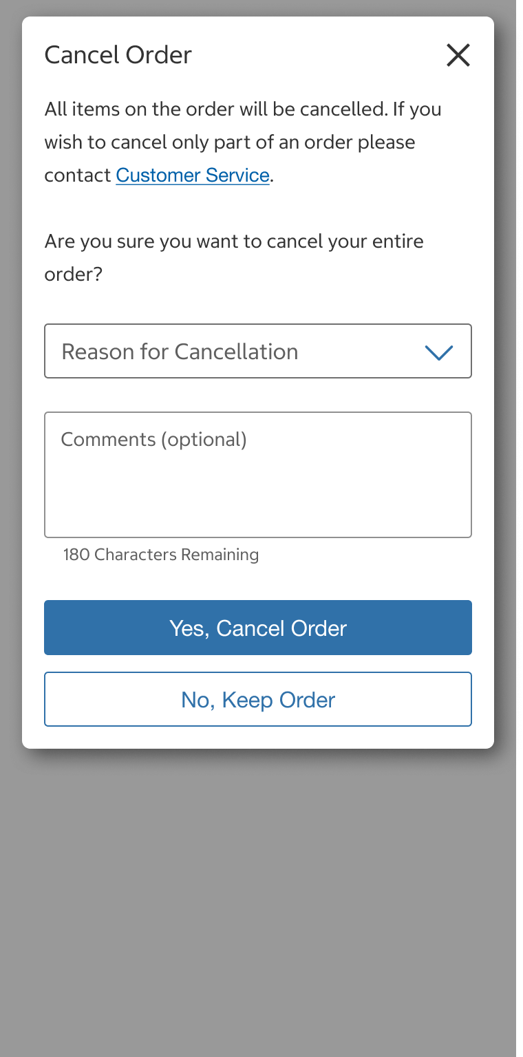
- Avoid using drawers to display confirmation or success messages — use a notification on the page.
Do
Do Not
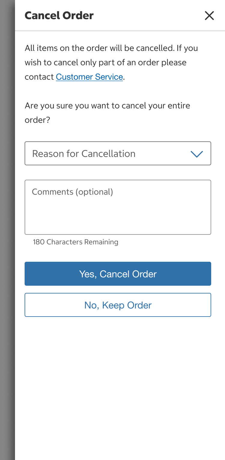
- Do not use for short and explanatory information — use a modal.
- Do not use for information that appears without user interaction — use a popup.
- Do not use drawers on top of other drawers.
Usage
Body Inset
- Use a body inset (hasBodyInset = true) option when no padding is built into the component that is being swapped in.
- Turn off the body inset (hasBodyInset = false) option when content needs to span full width, such as for dividers in a navigation drawer, or when padding is built into the component that is being swapped in.
Content
Drawer Header
- Drawer titles should be short and written in title case.
- The title should also describe the content. If the content requires a response from the user, start the title with a verb (e.g., Find a Warehouse).
- A back button displays to the left of the drawer title in the header’s sublevel variant.
Drawer Body
- If displaying secondary navigation, navigation links should be written in title case.
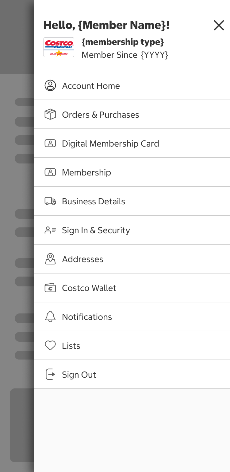
- If form elements, such as buttons, radio buttons, links, etc., display in the drawer, follow the element’s content guidelines and our Form Spacing Patterns.
- Body text should be written in sentence case and be broken into paragraphs or bullets if there is a lot of content.
Drawer Fixed Element
- Any component can be put into the optional fixed element, but it is typically used for buttons and text.
Behavior
- A drawer is triggered by a button and is onClick.
- The drawer will slide in from the left or right of the screen. It should slide in close to the trigger button’s location.
- If the content within the drawer is longer than the viewport's height, the drawer should be vertically scrollable.
- Drawers are dismissed by:
- Selecting the “x” (close) icon in the top right corner.
- Clicking/tapping anywhere outside of the drawer on the overlay background.
- Pressing the escape (esc) key.
- The main content shown behind the drawer is scrollable but not interactive.
- Only one drawer can be opened at a time.
- The drawer’s header can be configured to scroll with the body content or remain fixed.
- If a sticky bottom element is used, content in the drawer’s body will scroll above it so the sticky element is never overlapping content.
Placement
- Drawers slide in 0px from the left or right and should be close to the trigger button’s location.
- Drawers are shown on top of the main content.
- An overlay is shown behind the drawer.
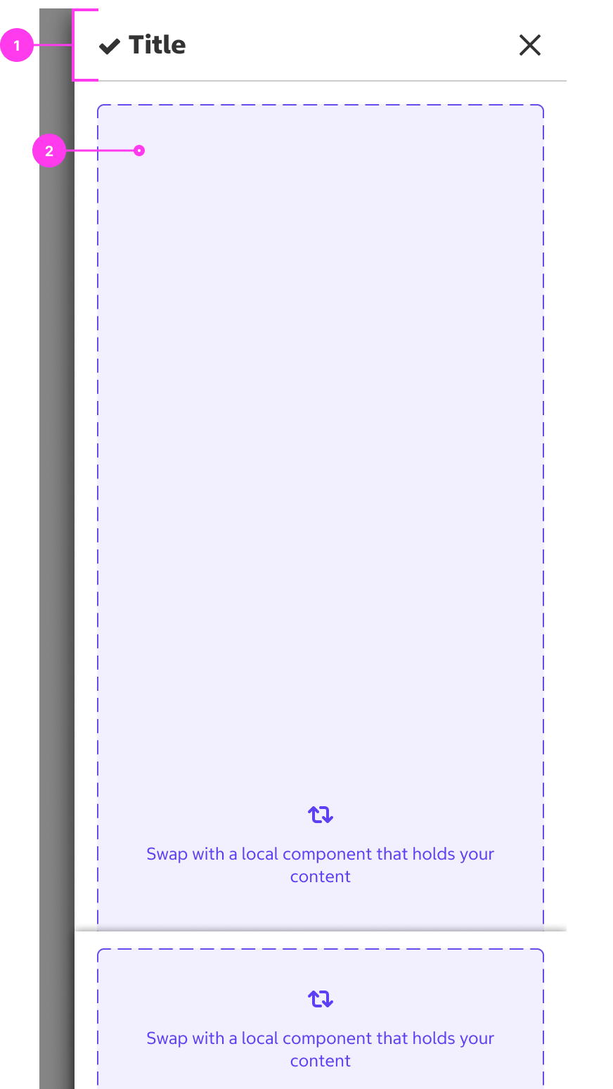
Structure
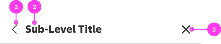
Drawer Header
- Drawer header
- Drawer title
- “x” (close) icon
- Body content

Drawer
- Drawer header
- Body content
- Fixed element (optional)
Sizing
- Drawers have a fixed width of 350px.
- The height of the drawer is always the full height of the viewport on all breakpoints.
Accessibility
Keyboard Accessibility
[AC1] When a drawer is triggered by the user:
- Focus moves to the drawer container.
- Focus is trapped inside the drawer. Page content beneath the drawer is not navigable. When the user reaches the end of the drawer tab order, focus either loops back to the close button or stops.
- Pressing ESCAPE closes the drawer.
- When applicable, pressing UP ARROW or DOWN ARROW scrolls the drawer contents.
[AC2] When a drawer is closed by the user:
- Focus returns to the element that triggered the drawer (ideally a button).
Screen Reader Output
[AC1] When a drawer is triggered by the user:
- Name: The name of the drawer is announced.
- Role: The role of “dialog” is announced.
- Page content beneath the drawer is not navigable with the screen reader. The screen reader is only able to browse content inside the drawer.
Example Output: “Find a Warehouse, dialog”
- Name: “Find a Warehouse”
- Role: “dialog”
Developer Notes
- Use aria-labelledby to give the dialog a descriptive title. Reference the ID of the dialog’s H2 title.
- Drawers have their own heading structure, starting at a heading 2.
- Use role=“dialog” to indicate to screen reader users that the drawer acts as a modal.
- Use JavaScript to make content beneath the drawer inert.
- Use aria-modal=“true” on the drawer container to communicate to screen reader users that content beneath the drawer is inert.
- Users should be able to zoom in and out inside the drawer.
- When body scroll is enabled for the drawer, the drawer body must have a tabindex=”-1” to ensure scrollability for keyboard users.
- Since tabindex=”-1” makes the container focusable, the body must also have role=”region” and an aria-labelledby pointing to the drawer title.
In the Wild
A drawer being used for Find a Warehouse