
Notification
A notification displays an important, succinct message to inform users of a change in our systems state or communicate feedback that may or may not be tied to a user’s action.
 View in Storybook
 View Figma Specs
 View Source Code
Guidelines
When to Use
- Use to highlight information that the user should be aware of or needs to address.
- Use to reaffirm to the user that prior action, likely in a different location or context, has been successful.
- Use to inform users of a change in the system’s state.
When Not to Use
- Do not use a critical notification for errors in forms caused by the user, such as not completing a required field. Instead, use the form controls' (such as Text Field, Select, Checkbox, and Radio Button) error states.
- Do not use to promote a product or service.
Variants
The color of the notification conveys its message type:
General (blue)
- Provides helpful information to the user. No immediate action is required to complete a task.
Alert (yellow)
- Identifies a potential problem or action that will need to be taken by the user.
Success (green)
- Confirms an action that has been taken or selected, such as when a user resets their password.
Critical (red)
- Identify that an action must be taken to proceed, or to indicate a system error that prevents core page functionality (e.g., when an API error prevents data from loading).
Multiple Notifications
- Avoid showing multiple notifications on a page if possible. If necessary, ensure each notification is placed in the same context as the content it relates to.
- If multiple notifications are present in the same location, order them from most to least severe.
Content
- Focus on a single theme or piece of information.
- Be concise and scannable.
- Use sentence case.
- Explain how to solve the issue if it's an alert or error.
- A title is optional.
- If using a title, use title case if it is not a complete sentence. Use sentence case if it is a complete sentence.
- An icon is both user-configurable and optional.
Behavior
- A notification persists until its conditions are met.
Placement
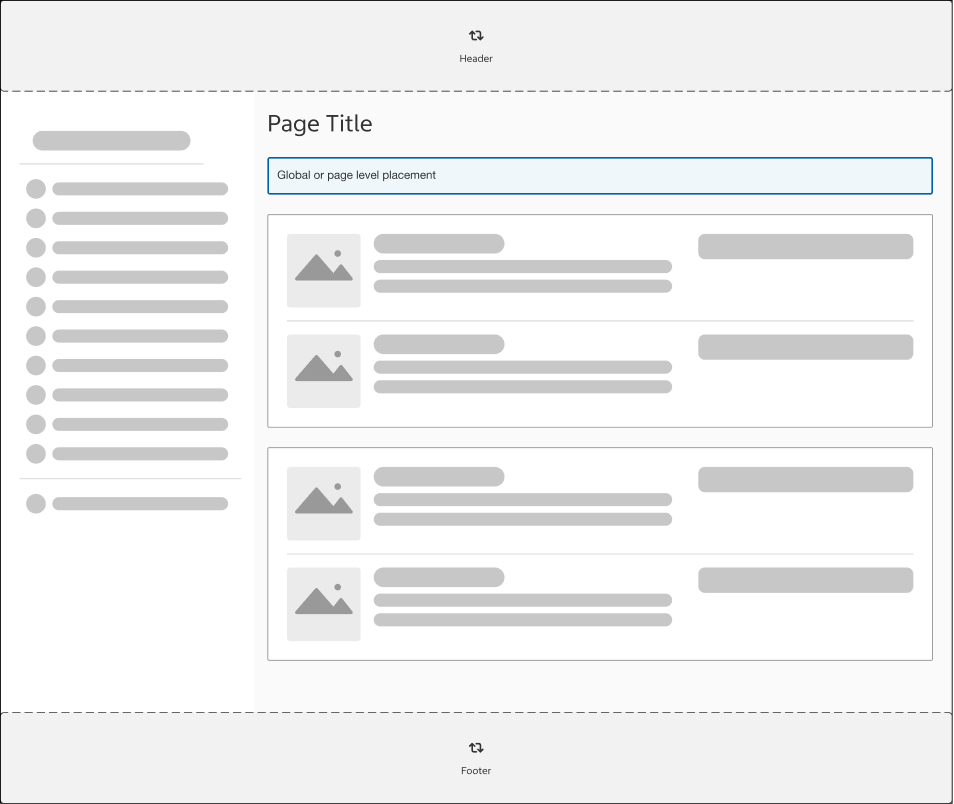
Global
The message that applies to the user flow or webpage/application as a whole needs to be displayed with prominence, but not specific to a task. Global and page level placement is below H1 tag, but above the main content area.
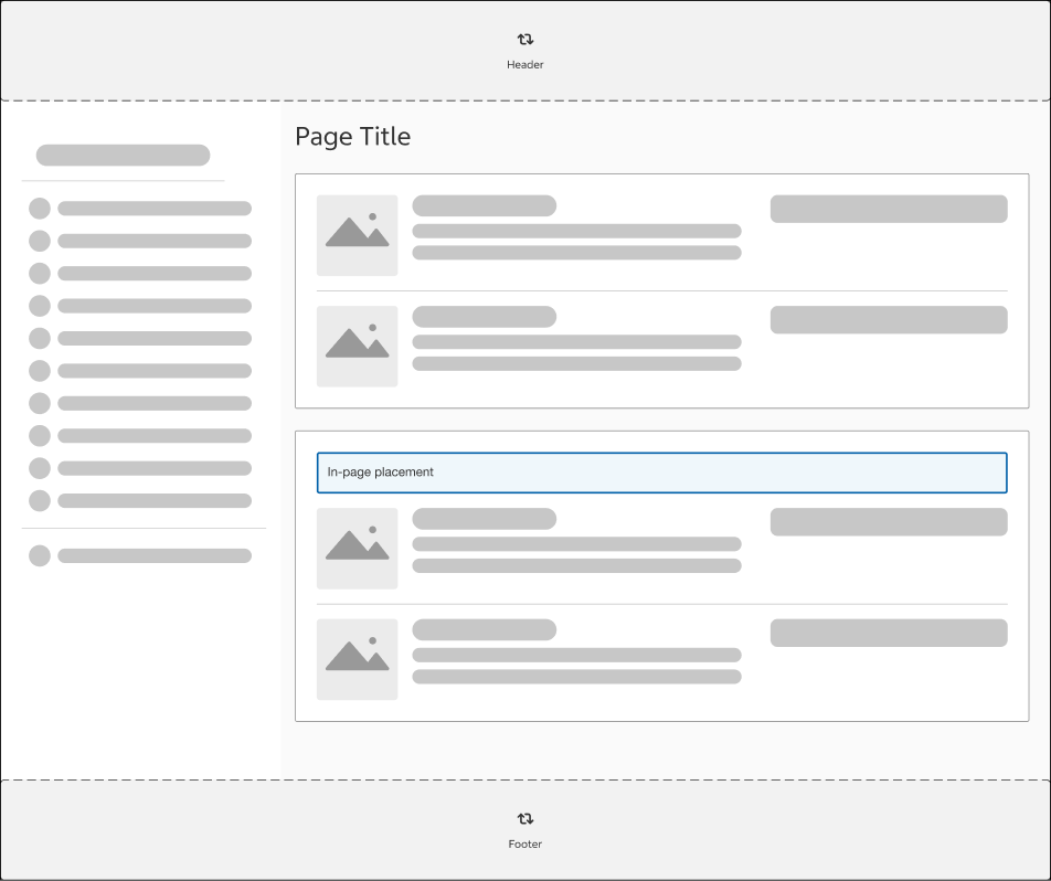
In-Page
Placed on a particular area of a page or on top of the components/actions it corresponds to.
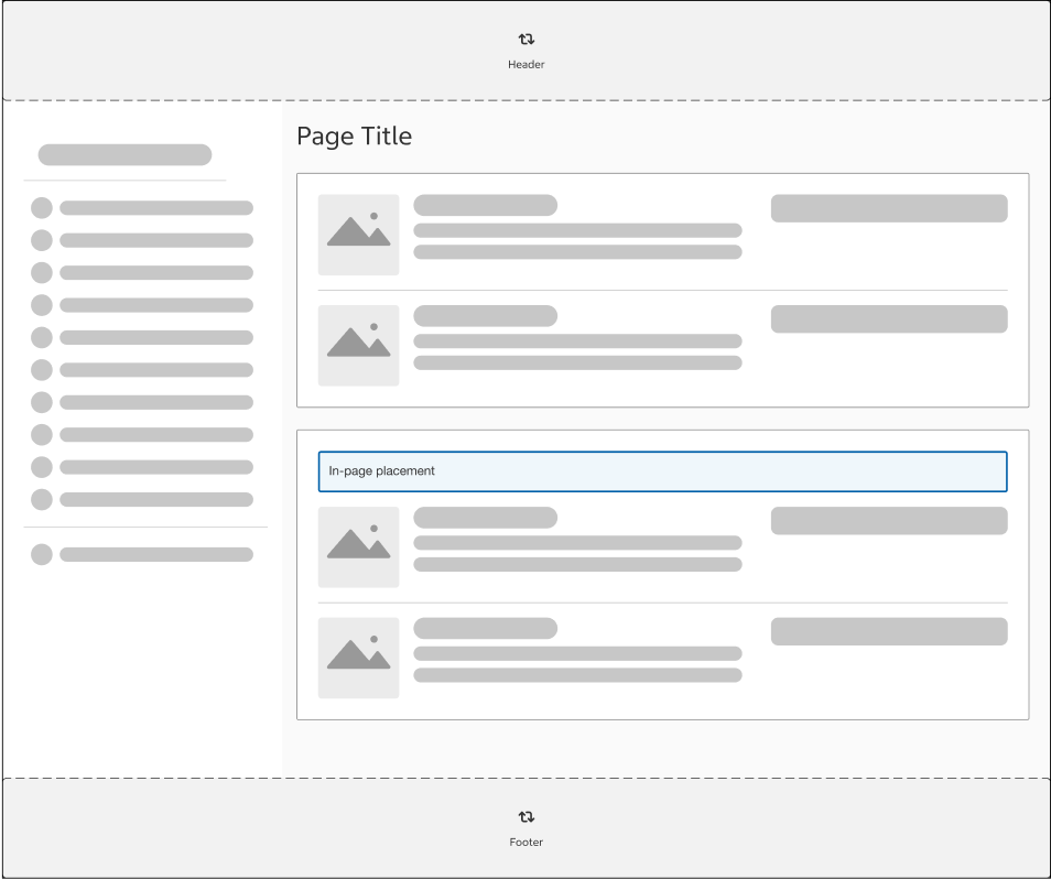
In-Line
Addresses issues or provides feedback inside of a content area for a particular item or status of an action.
Global Critical Notifications
Use a critical notification at the global level when a system error or backend failure prevents the page from functioning properly, such as when orders cannot be loaded in Orders & Purchases.
Structure
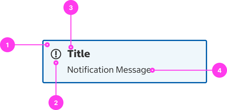
- Container
- Icon (optional): use an icon for additional emphasis
- The alert icon is always shown for critical notifications.
- Title (optional)
- Message
Sizing
- The width of the notification is always the full width of the container on all breakpoints.
Accessibility
It is important to distinguish between notifications and alerts. While notifications can be elements present on page load meant to draw visual attention to certain content, alerts are notifications that are triggered by a specific event (such as an error, warning condition, or the arrival of information that is important to the user’s task).
Alert notifications should be used sparingly as they are meant to be purposely disruptive to the user experience. Only use alert notifications for communicating critical information to the user.
If your alert notification is asking the user to take a specific action (ex. A confirmation alert that gives the options of “yes” or “no”), it is best to utilize an alert dialog.
Keyboard Accessibility
[AC1] When a notification has a focusable element:
- Focus can be moved to the element using TAB.
- When the element is in focus, focus is clearly visible.
Screen Reader Output
[AC1] When an alert notification appears on screen:
- The text content of the alert is announced.
- Focus is moved to the alert notification.
- Informative icons, such as an error icon, must have an accessible name. Otherwise, icons are hidden from screen reader users.
Example Output 1: “Your progress has successfully been saved.”
Example Output 2: “Error: Sorry, we are experiencing technical issues. Please try again later.”
Developer Notes
- To ensure all screen readers are properly notified, use role=”status” on the notification container and move focus to the notification when triggered.
- Avoid using toast notifications, especially for critical alerts or long messages. As they are timed and disappear automatically, assistive technology users may not be able to hear the entire message.