
Button
A button triggers an action. Buttons express what action will occur when selected.
 View in Storybook
 View Figma Specs
 View Source Code
Guidelines
When to Use
- Use to trigger an action.
- Use to progress or regress a user through a step in a flow.
- Use to submit a form.
When Not to Use
- Do not use to navigate users to a different section of the same page. Instead, use a text link.
- In many cases, if the action is to navigate users to a different page without a response from the server, such as viewing warehouses in a state, then consider using a text link instead of a button.
- Do not use buttons when users need to make a choice, e.g. selecting the colors of a shirt. Instead, consider a radio button.
Variants
Primary
-
Use a primary button for the next action to complete a task or to move forward in flow. For example, “Add to Cart”.
-
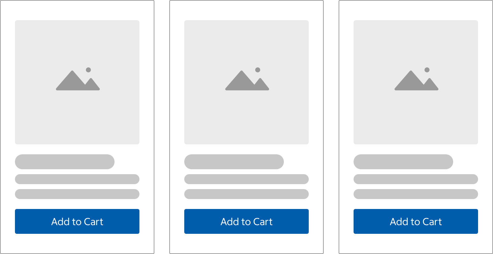
A primary button should only appear once per page. An exception to this rule is when there are repeating modular containers with equal-priority actions. An example of this is the product tiles on the product listing page (PLP).
-
A primary button is not required on every screen that has buttons. Consider using the secondary button instead if there are many equal-priority actions on a page and you want to reduce visual load.
Primary Alternate
- Use the primary alternate button for the primary action in the checkout flow.
- In some cases, this variant could be used to emphasize an action where the primary button already exists on the page, such as "Shop Same-Day Now."
Secondary
- Secondary buttons are for the second most important action or actions on a page (e.g. Add to List, Buy Again, or Cancel)
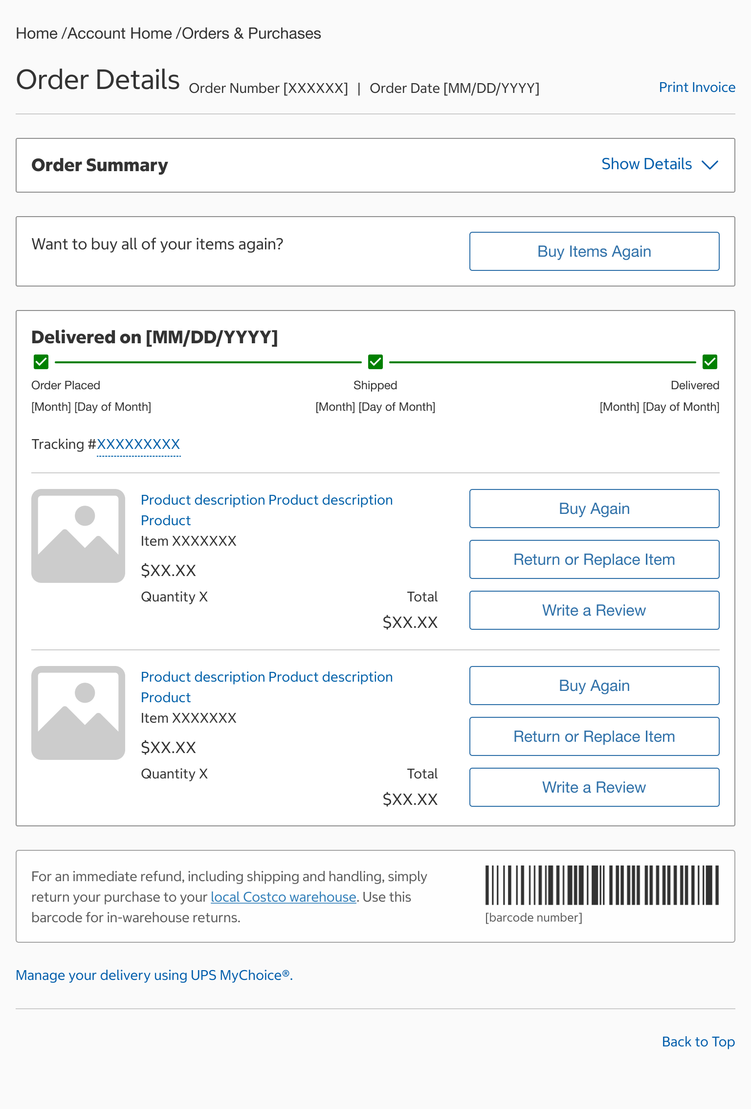
- Secondary buttons may also be used for multiple, equal-priority actions on a page. For example, on the Order Details page within My Account, users can perform many actions that are equally weighted, and these actions do not necessarily need the visual prominence of a primary button.
- When paired with the primary button, the secondary button may perform the opposing action of the set, such as “Cancel” or “Back”.
Tertiary
- Use the tertiary variant when you want to de-emphasize an action.
- Use when the primary and secondary buttons are already present and you want to show hierarchy.
- The tertiary can be paired with other buttons or used independently.
Text
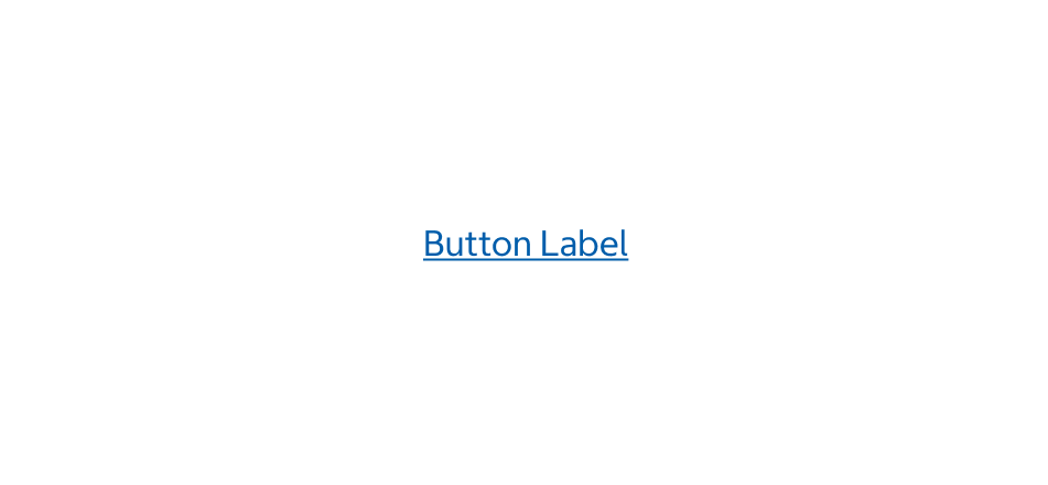
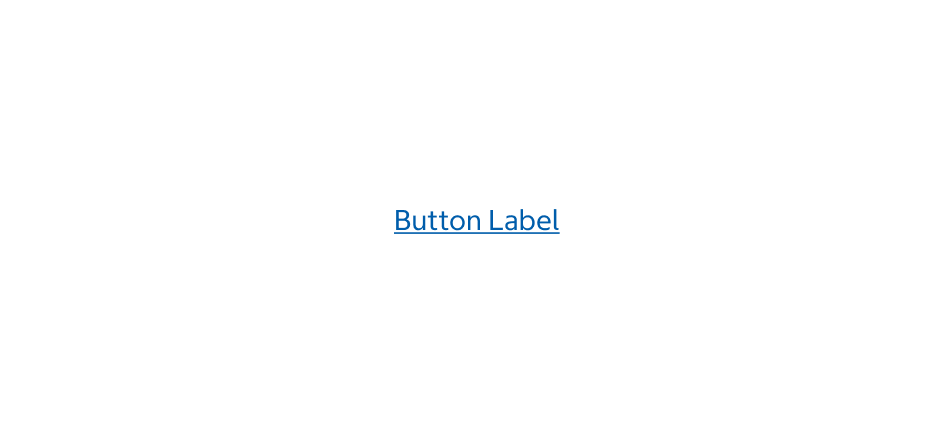

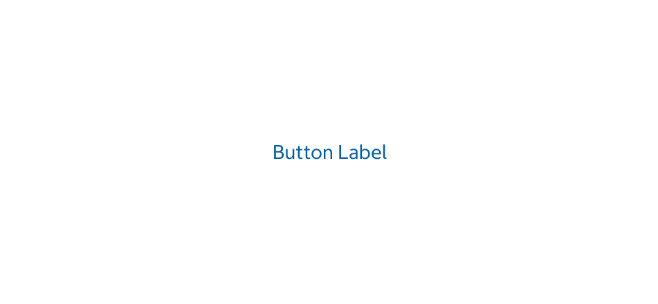
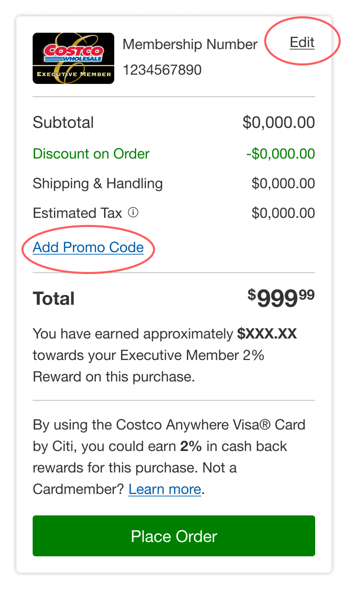
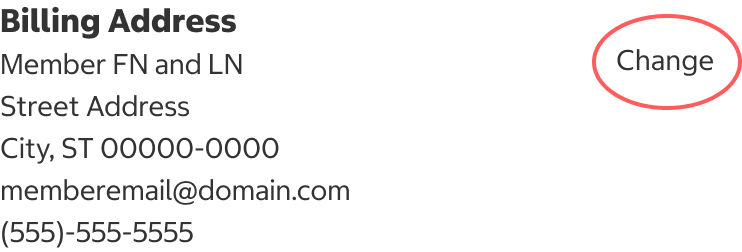
- Use the text variant when you need a button to have a similar level of visual emphasis as the tertiary button, but with the label left-aligned and without any padding.
- Use this variant when you need the button to be styled like a text link, but triggers an action instead of linking to another page.
- There are underlined and non-underlined versions of the text button. Use the underlined text variant when it may be unclear that the text button is interactive.
Ghost
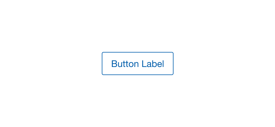
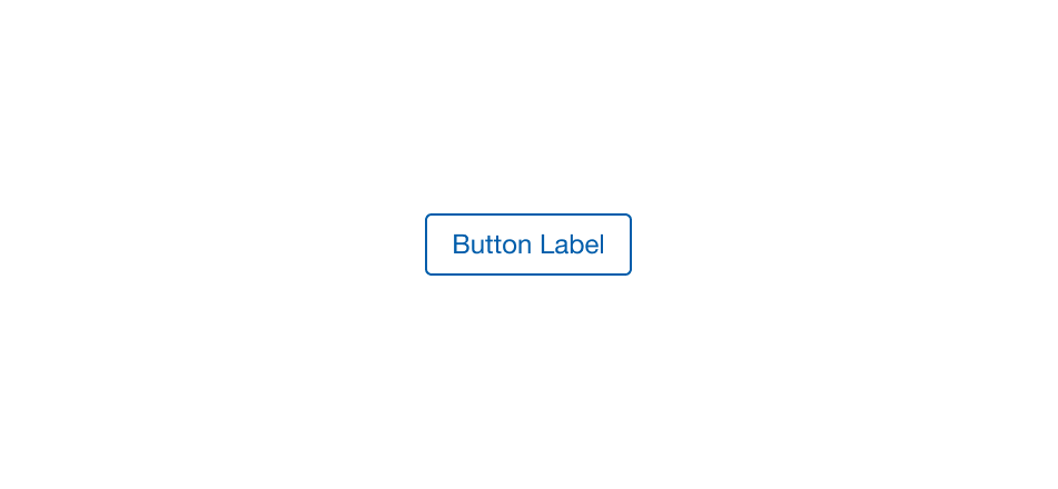
- Use on a limited basis, such as on marketing pages with a single CTA, and when other variants are not sufficient when placed on colored, textured, or gradient backgrounds.
Sticky Button
- Use the sticky button variant when the primary action needs to stay in a fixed position. Currently, the sticky button is only fixed at the bottom of the viewport on the phone breakpoint.
- The sticky button interaction has two modes of display:
- Appears upon page load.
- Appears when the user scrolls past the initial primary action.
States
Skeleton
- Use this state whenever data is being loaded to help establish a user's mental model of the component's shape and the page layout.
- Use when the majority of page elements are loaded from API calls.
- The skeleton is temporary and should disappear once the data is loaded.
Disabled
- We do not recommend using disabled buttons. If you must use a disabled button, provide help text or a description near the button about what is needed for the user to continue.
Loading
- Use this state when the associated button action is in progress and is like to take less than 2 seconds. For example, on the Buy Items Again page, when the application requests which items are available to buy again via the API, the loading state should be displayed until the server fills the request.
- If an action usually takes more than 2 seconds consider using the indeterminate or determinate loading indicators instead.
- A button in the loading state is not considered disabled, but the user will be unable to interact with the button while it is in this state.
Content
- Use title case.
- Be descriptive and concise. The words should be long enough to explain the outcome of the action without ambiguity, but also try to use as few words as possible.
- Example: “Review” vs “Write a Review” (better)
- Start with a verb and pair with an object: “Add to Cart” and “Buy Items Again”
- Avoid using punctuation at the end of button labels.
- Use the same language across the website or application.
- An icon may be used with a text label for additional emphasis. The icon must have a strong association with the label text.
- An icon can be used without the label, but only when the action is universally understood like the close icon.
Behavior
- Selecting a button performs an action, e.g., submitting a form.
- For the sticky button that appears upon page load, the button is always fixed to the bottom of the viewport on the phone breakpoint.
- For the sticky button that appears when the user scrolls past the initial primary action, the button is fixed to the bottom of the viewport. The sticky button is hidden when the user has scrolled above the action.
Placement
Buttons are placed at the bottom of forms and wizards where the user must make a decision after completing the form or reviewing the content.
Alignment
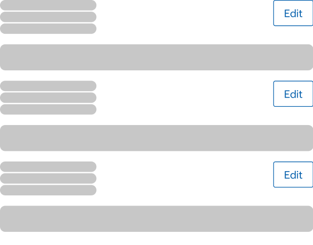
Align buttons based on the viewing pattern of the user.
Left Alignment Use left alignment where users are likely to follow an F-shaped reading pattern. Buttons follow the left alignment of other content elements like headings, lists, and input labels.
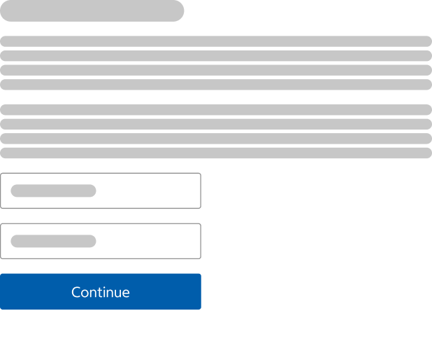
Center Alignment Use center alignment where content is centered. The purpose of this is for accessibility. If the user is zoomed in and scrolling through a form, they will not see the button(s) when it is aligned elsewhere.
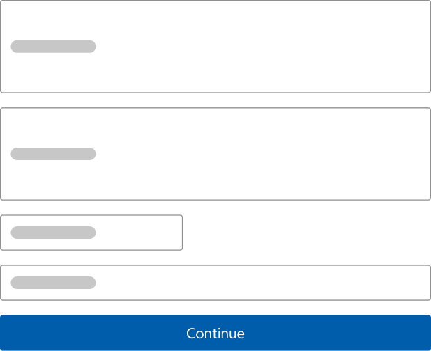
Right Alignment Use right alignment where buttons are constrained within multi-page forms, wizards, and when there are multiple editable blocks of content
Order
- For left-aligned and full-width button groups, affirmative actions and primary actions are placed on the left side of the button group.
- On phone breakpoints, where buttons are stacked vertically, the primary button is at the top.
- For right-aligned button groups, affirmative action and primary action are placed on the right side of a button group.
- When stacked vertically in a button group, the primary button is at the top.
Button Groups
- Button groups can be used to group similar or related actions together to emphasize their relationships.
- Horizontally stacked buttons should be spaced based using the grid, 32px apart.
- Vertically stacked buttons should be spaced 12px apart.
- If using the text button in the T6 size, there should be at least a 2px margin on the top and bottom of the button so the touch target is sufficiently spaced away from other interactive content.
Structure
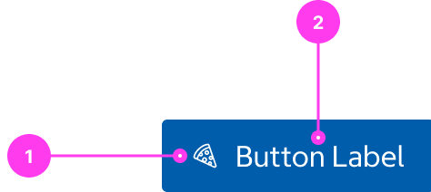
- Icon (optional)
- Label
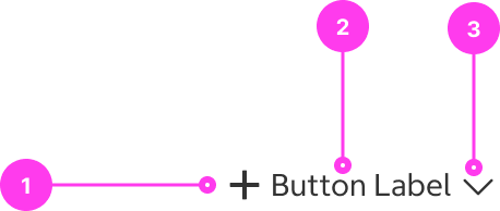
- Start icon (optional)
- Label
- End icon (optional)
Sizing
- Full-width buttons grow to fill the parent container.
- On larger breakpoints or landscape mode, if the parent container is wide and results in a long button, consider using the flexible width button, constrain the width, or place the button side-by-side with other elements.
- On phone breakpoints, buttons should be full-width of the screen.
- Flexible width buttons adjust to fit the button label.
- For both full-width and flexible buttons, the button label will wrap to multiple lines, which also increases the button height if there is not enough horizontal space to fit the label. This should be avoided if possible.
Native App Considerations
There are no Native App specific considerations for this component.
Accessibility
Keyboard Accessibility
[AC1] When there is a button on the page:
- Focus can be moved to the button using TAB.
[AC2] When a button is in focus:
- The focus indicator is clearly visible.
- Pressing SPACE or ENTER triggers the corresponding function of the button.
Screen Reader Output
[AC1] When a screen reader user TABS to a button:
- Name: The name of the button is announced.
- Role: The role of “button” is announced.
- State: If applicable, the current state of the button is announced (ex. pressed).
Example Output: “Remove from favorites button pressed”
- Name: “Remove from favorites”
- Role: “button”
- State: “pressed”
Developer Notes
- Use <button> or <input type=”button> to create a button.
- It is important to understand the difference between links and buttons. Links should take the user somewhere, while buttons should trigger a change on the current page. Assistive technology users rely on these expectations as they navigate, so links and buttons must be implemented so that their programmatic role matches their functionality.
- If applicable, be sure to correctly indicate a button’s state using HTML attributes or ARIA
- If a button triggers an expand/collapse, use aria-expanded=”true/false”
- If a button can pressed use aria-pressed=”true/false”
- Avoid using disabled buttons that provide no feedback, making it difficult to determine why the button is unusable. Instead, use validation and errors to indicate what needs to be done.
- For icon-only buttons, include alternative text or an aria-label.
- If a button already has a visible label, do not add alternative text or an aria-label. This creates redundancy for screen reader users.
- Screen reader users read elements without the context of visual formatting, so button labels should be comprehensible and differentiable when isolated.
- Avoid generic call to action buttons, such as “Yes” or “No”. Instead, opt for more specific labels like “Cancel” or “Submit”.
- Avoid repeating the same label across multiple buttons on the same page (ex. having multiple “Edit” buttons). Visually hidden labels that provide additional context for assistive technology (ex. “Edit Primary Address”) is also an option if screen space is limited.
- For all states, including hover and down, buttons use the default arrow cursor. The only exception occurs on the web; if the button uses the href property, the pointer cursor is displayed instead.