
Link
Actionable text used to navigate to other locations.
 View in Storybook
 View Figma Specs
 View Source Code
Guidelines
When to Use
- Use to direct users to another page that does not require a response from the server.
- Use to jump to another element within the same page.
- Use to make text within a sentence or paragraph actionable.
When Not to Use
- Other than anchor links, do not use when an action is triggered within the same page -- instead use Text Button.
- When an action triggers a data submission or progresses a user through a series of steps on separate pages, use Button.
Variants
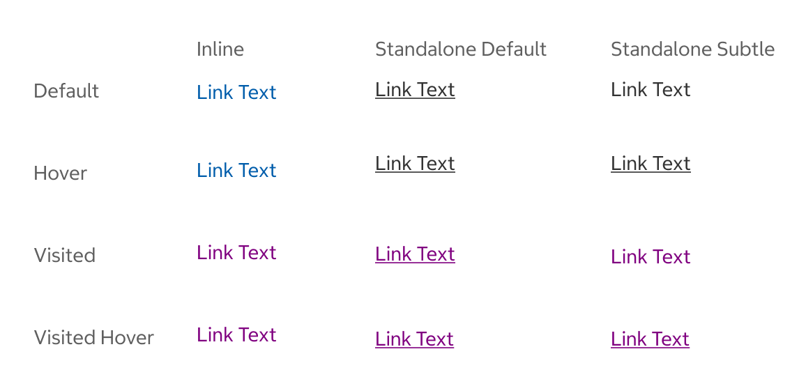
Inline
- Use when the link is within a line or body of text.
Standalone Default
- Use Standalone Default when the link is separated from a body of text and when it is not immediately clear that it is a link. This variant is underlined and should be used when it may be unclear that the text is actionable. Consider using the standalone default option when it’s unclear if the links are indeed links when scanning.
Standalone Subtle
- Use Standalone Subtle when the link is separated from a body of text and when additional context helps indicate it is a link.
States
Default
- The state before the link is hovered, focused, or visited.
Hover
- The hover state appears while the pointer is over the link and indicates that it is interactive.
Visited
- Shows when a link has been previously selected. The visited state only applies to the inline link.
Usage
Link vs. Text Button
Links should be used to navigate to another page. Text buttons look like links but trigger an action on page, such as opening a modal.
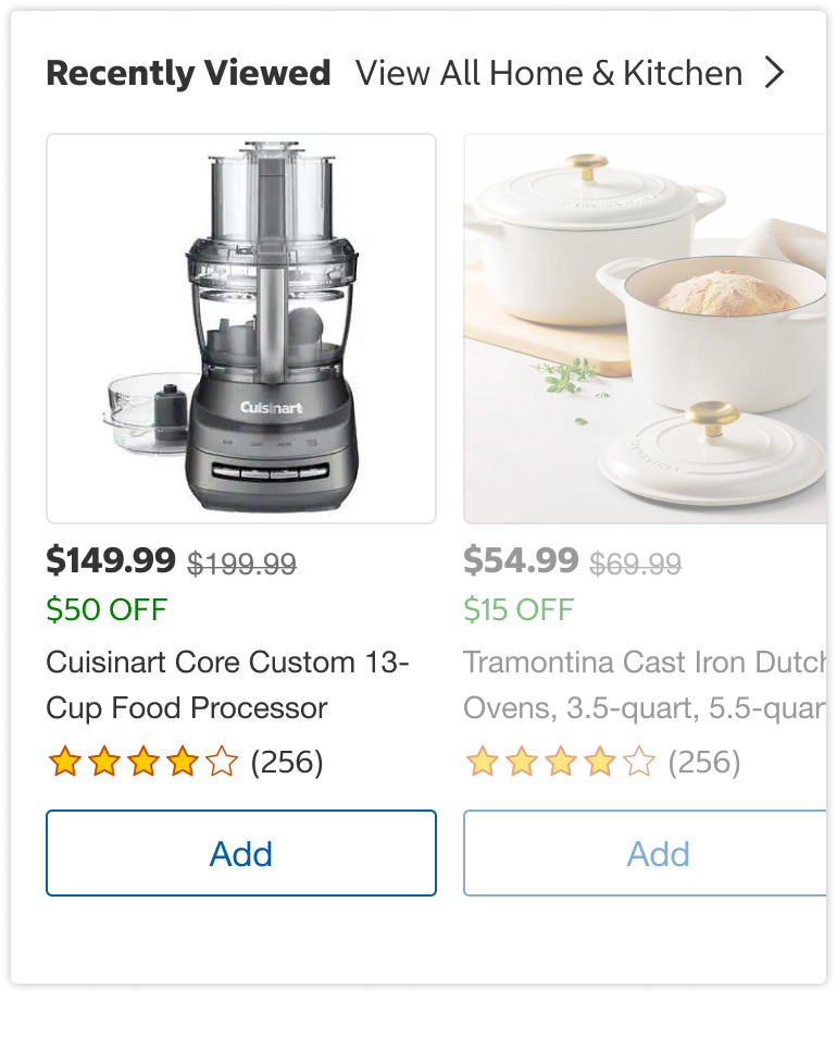
Standalone Subtle
Text Button
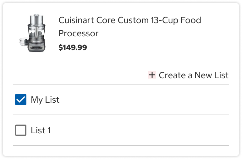
Link vs. Button
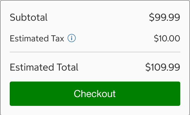
Links should be used to navigate to another page without a response from the server while buttons are used to submit or request information, such as in a form.
Do
Do Not
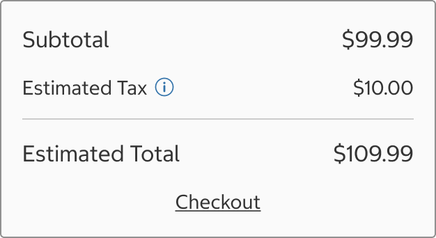
Links with Icons
- Icons can be used with standalone subtle links.
- The icon’s color should match the text.
- Icons should match the size of the link text and will typically be 18x18px, but can be altered if the icon looks too large or small next to the text.
- Icons may be placed before or after the link text.
- Only use one icon with a link.
Content
All Links
- Link text should be descriptive, meaningful and clearly indicate the link’s destination. Users should be able to understand what will happen when they select a link.
- Links should not display the actual url of the destination. The url or href is the destination, and link text is the visible text the user sees and selects. The link text is read to screen readers, so instead of the url such as: https://costco.interstatebatteries.com/, use link text such as: Costco Interstate Batteries.
Do

Do Not

Inline Links
- Inline links appear within a body of text so the linked portion should indicate where the user will go.
- Only single words or small parts of phrases should be linked because it is better for localization. If a full phrase is linked and the word order changes for another language, then the link would break into parts.
Standalone Links
- Standalone links are not full sentences so punctuation should not be used, unless using question marks for text like “Forgot Password?”
- Use a verb + noun pattern for standalone links, such as “View Details”.
Do

Do Not

Behavior
- When navigating to a new page, links should typically open in the same window. Only open a link in a new window or tab if the user needs to reference the content to complete the task.
Structure
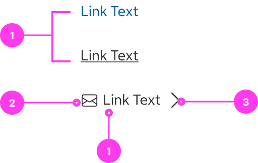
- Link text
- Start icon (optional)
- End icon (optional)
Sizing
- Inline links should use the same text size as the surrounding text in which it is found.
- Standalone subtle links come in two sizes: L1 and T4. When choosing a size, select the text size that complements the content near it.
- When using an icon with a standalone subtle link, the icon’s size should typically be the same size as the link (18x18px), but can be altered if the icon looks too large or small next to the text.
Spacing
- When using an icon with a standalone subtle link, the spacing between the link and icon is 4px.
- If using the standalone subtle or default type in the L1 size, there should be at least a 2px margin on the top and bottom of the link so the touch target is sufficiently spaced away from other interactive content, such as links in a list.
Accessibility
Keyboard Accessibility
[AC1] When there is a link page:
- Focus can be moved to the link using TAB.
[AC2] When the link is in focus:
- The focus indicator is clearly visible.
- Pressing ENTER selects the link.
Screen Reader Output
[AC1] When the screen reader user presses DOWN ARROW to a link:
- Name: The name of the link (i.e the link text) is announced.
- Role: The role of “link” is announced.
- State: If applicable, the current state of the component (ex. visited) is announced.
- Link text must be meaningful out of context, meaning that the link text alone should convey the function and purpose of the link. Avoid “Click Here”, “More”, or “Read More”.
Example Output: “link Contact Us Visited"
- Name: “Contact Us”
- Role: “link”
- State: “Visited”
Developer Notes
-
Links should use the <a> element and have a valid href attribute (use href=”#” if there is no definitive link for the href attribute).
-
If the visual design requires multiple links with the same link text (ex. a page with cards where each card has a “learn more” link), utilize aria-labels to make each link text unique for screen readers.
- Code Example: <a href=”/learn-more-heart-disease” aria-label=”Learn More About Heart Disease”> Learn More </a> <a href=”/learn-more-malaria” aria-label=”Learn More About Malaria”> Learn More </a>
-
It is important to understand the difference between links and buttons. Links should take the user somewhere, while buttons should trigger a change on the current page. Assistive technology users rely on these expectations as they navigate, so links and buttons must be implemented so that their programmatic role matches their functionality.
- Correct Example: An <a> element that directs the user to the “Contact us” page.
- Incorrect Examples:
- An <a> element that opens a modal.
- An <a> element that expands an accordion.
- An <a> element that submits a form.
In the Wild
Example from the returns process