
Popup
A content overlay on the screen that doesn’t interrupt or prevent other website interactions.
 View in Storybook
 View Figma Specs
 View Source Code
Guidelines
When to Use
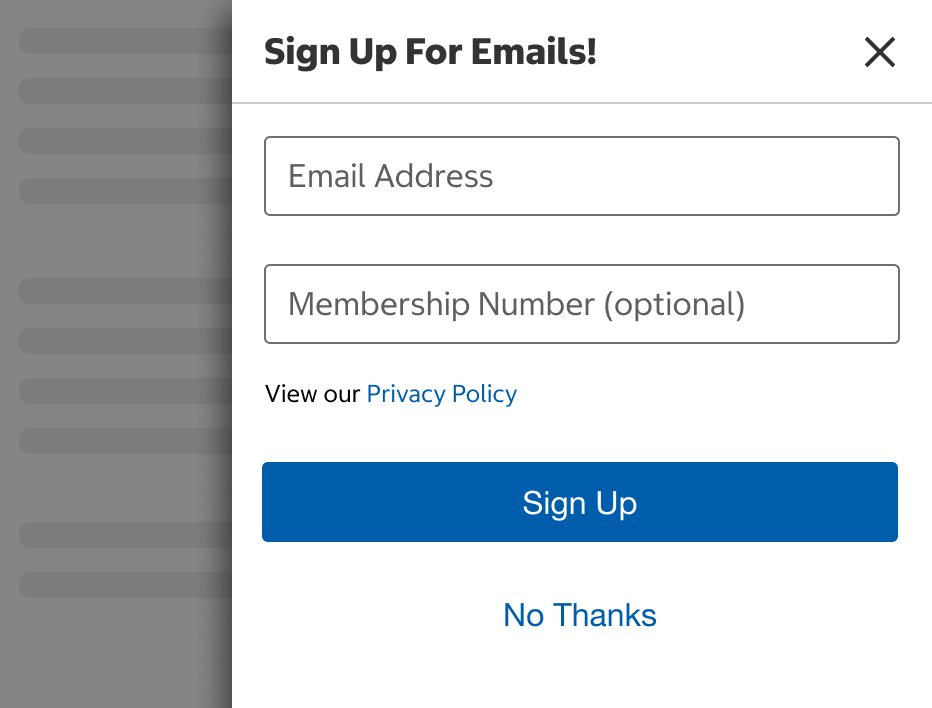
- Use when presenting optional information to a user without interrupting their interactions with the website.
When Not to Use
Variants
Closable
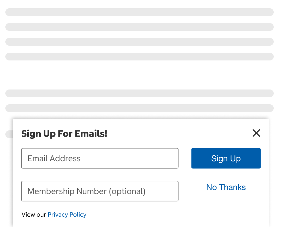
- Use the closable style when the content can be completely dismissed.
- Use when surfacing informative content to the user.
- Supports a limit to the frequency it's shown, such as a 30-day period before showing an email sign-up form again.
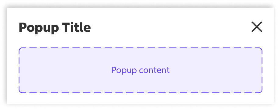
Collapsible
- Use the collapsible style when the content can be collapsed and expanded (shown or hidden).
- Use when the information is part of a secondary flow.
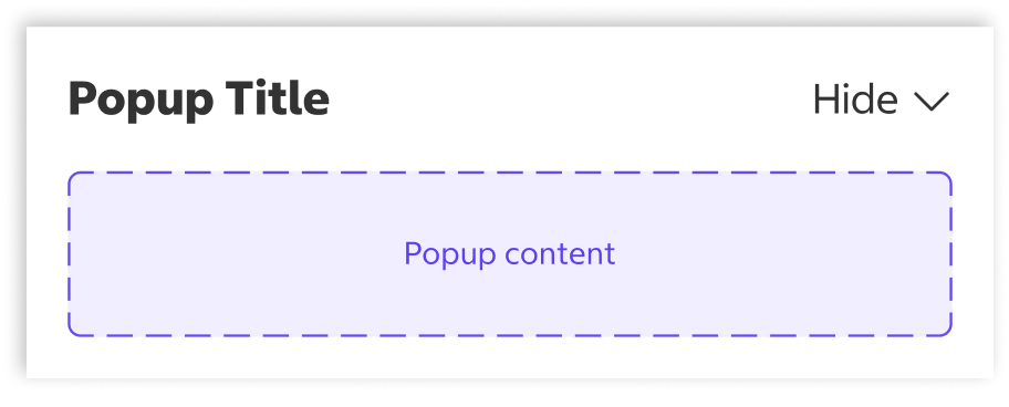
States
Collapsible - Expanded
- The title, hide button, and content are all visible.
Collapsible - Collapsed
- Only the title and show button are visible.
Usage
Closable Popup vs Drawer & Modal
Do
Don't
Collapsible Popup vs Drawer & Modal
Do
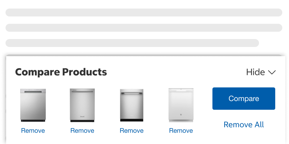
Don't
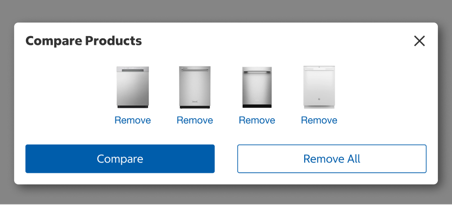
Content
- Popups must always have a title.
- When the title is an incomplete sentence, use title case formatting without end punctuation.
- When the title is a statement or complete sentence, use sentence case with end punctuation.
- The title will wrap to the next line if it does not fit in the available horizontal space.
Behavior
Closable
- When displayed, the popup slides up from the bottom of the screen with a 500ms animation to show the entire container.
- When closed, the popup slides down and disappears with a 300ms animation.
Collapsible
- When expanded, the popup slides up from the bottom of the screen with a 500ms animation to show the entire container.
- When collapsed, the popup slides down with a 300ms animation to only show the title bar and Show button.
- When the component has no content, the popup slides down and disappears with a 300ms animation.
Placement
- Popup windows should be anchored towards the right at the bottom of the screen.

Structure
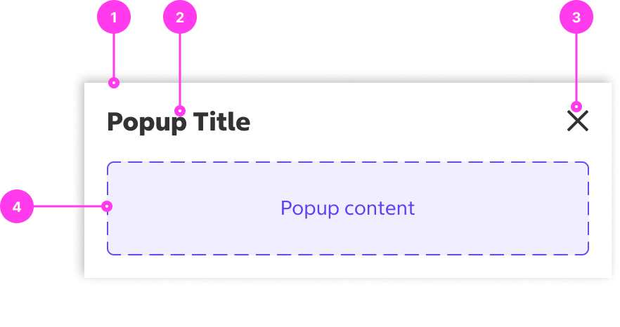
Closable Popup
- Container
- Title
- Close Button
- Body Content
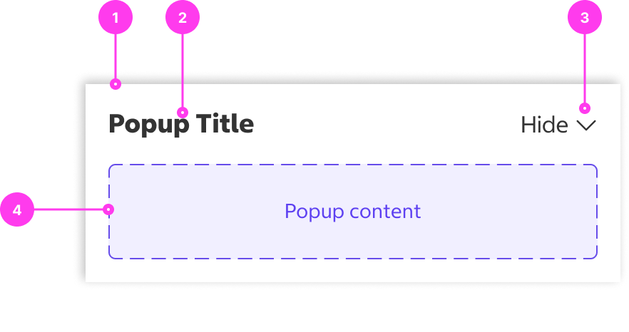
Collapsible Popup
- Container
- Title
- Hide/Show Button
- Body Content
Sizing
- Popups are 375px width by default.
- The width of the popup can change based on designer's discretion and can match the width of the browser window.
- All content within the popup frame has a maximum width of 1400px.
- Popups grow in height with the body content.
Accessibility
Keyboard Accessibility
[AC1] When there is a popup on the page:
- Focus can be moved to interactive elements inside the popup using TAB.
- Focus does not automatically move to the popup.
- Focus freely moves in and out of the popup (i.e focus is not trapped inside the popup).
[AC2] When focus is on the Show/Hide button for a collapsible popup:
- The focus indicator is clearly visible.
- Pressing ENTER toggles the expand/collapse state of the popup.
Screen Reader Output
[AC1] When a screen reader user presses DOWN ARROW to the popup container:
- Name: The title of the popup container is announced.
- Role: The role of “region” is announced.
Example Output: “Cookie Preferences region”
- Name: ”Cookie Preferences”
- Role: “region”
[AC2] When a screen reader user TABS to the Show/Hide button for a collapsible popup:
- Name: The name of the button, “Show” or “Hide”, is announced. The title of the popup should also be announced.
- Role: The role of “button” is announced.
- State: The current state, “Expanded” or “Collapsed” is announced.
Example Output: “Show Compare up to 4 products button collapsed”
- Name: ‘Show Compare up to 4 products’
- Role: “button”
- State: “collapsed”
[AC3] When a screen reader user presses DOWN ARROW to the close button:
- Name: The name of the button, “Close”, is announced.
- Role: The role of “button” is announced.
Developer Notes
- Popups that contain high priority information (legal notices, cookie banners, etc.), should be placed as the first element in DOM. As a result, the popup will be the first element on the page for keyboard and screen reader users.
- Popups that appear dynamically might require a screen reader announcement. For example, if checking a checkbox triggers a popup, a <div> with aria-live should be utilized to trigger an announcement for screen readers - “Compare Region Updated”.
- The popup title should be implemented as an <h2>.
- Use role=”region” on the popup container to create a region for screen reader users.
- Label the region by adding an aria-labelledby that points to the ID of the popup title.