
Radio Button
An input control that allows users to select only one option in a radio group.
 View in Storybook
 View Figma Specs
 View Source Code
Guidelines
When to Use
- Use radio buttons when there is a list of two or more options and the user can select only one option.
- Use radio buttons to allow users to easily see and compare available options.
When Not to Use
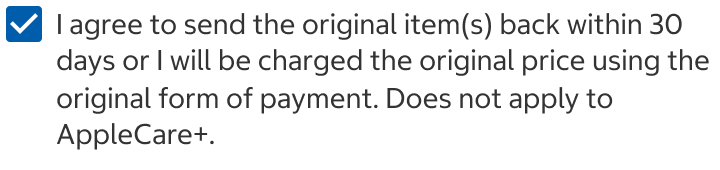
- Do not use radio buttons when there is a list of options and the user may select any number of the choices. Use a checkbox instead.
- Consider using a select instead of radio buttons when:
- There are five or more options in a radio group, and space is constrained.
- The options are familiar to users.
Selector Radio Button
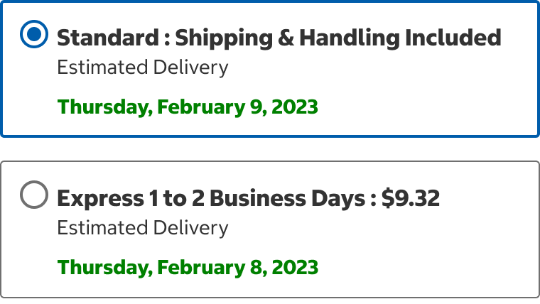
Select
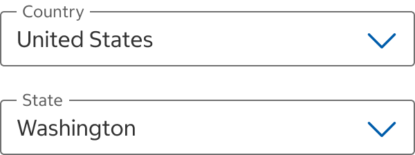
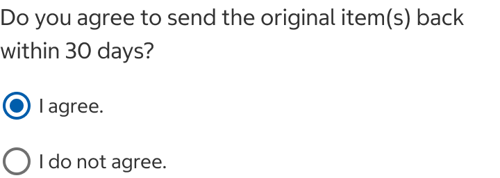
- For a single option that can be turned on or off, use a stand-alone checkbox instead of two radio buttons.
Do
Do Not
Variants
Radio Button

Selector Radio Button

States
Radio Buttons and Selector Radio Buttons
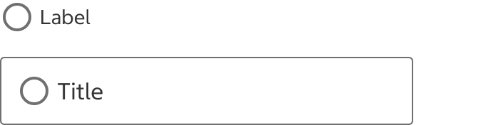
Unchecked
- Option is not selected.
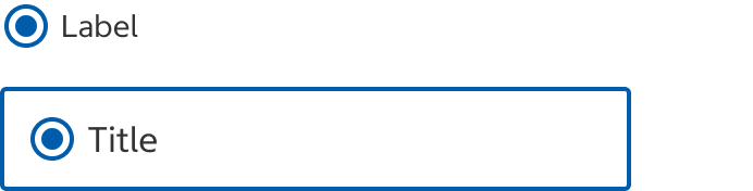
Checked
- Option is selected.
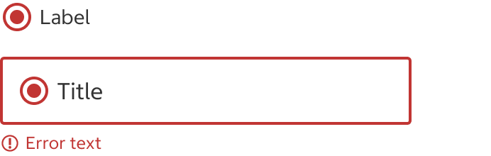
Error
- An error has occurred. See behavior section for error handling guidelines.
Skeleton
- Use this state whenever data is being loaded to help establish a user's mental model of the component's shape and the page layout.
- Use when the majority of page elements are loaded from API calls.
- The skeleton is temporary and should disappear once the data is loaded.
Selector Radio Button
Hover
- Visual feedback when a pointing device hovers over the option to show that it is selectable, it is only shown on the unchecked state.

Usage
Radio Button with Label vs. Selector Radio Button
- Use a selector radio button to show complex content.
- Consider using a selector radio button when the options are longer than a few words, especially when they are sentences.
Radio Groups
- Do not use the radio button with label and selector radio button in the same group.
Content
Label
- Always include labels unless the context is sufficient and the design is reviewed by an accessibility expert.
- Be concise and scannable. Consider using the selector radio button full variant when the options are longer than a few words, especially when they are sentences.
- When the label is not a sentence, use title case without end punctuation.
- When the label is a sentence, use sentence case with end punctuation.
- When appropriate, change text weights and colors to highlight information.
Order of Options
- List the options in a logical and meaningful order:
- Most to least frequently selected
- Positive to negative
- Simplest to most complex
- Safest to most risk
- Numerical or alphabetical (Keep in mind that the alphabetical order will change when the labels are localized)
- When appropriate, offer users the option to not make a selection. For example, include a “None” or “Other” option as the last option in a group.
Behavior
- Radio buttons allow users to select only one option from a radio group.
- When an option in a radio group is known to be the most likely to be selected or is the suggested one, the option can be selected by default. In other cases, it is generally best practice to leave all options unchecked. This ensures that users review the options carefully and make an intentional choice.
- When the radio button is in an unchecked state and is selected, the state changes to checked.
- When the radio button is in a checked state and is selected, the state does not change.
- Selecting a radio button should not immediately implement the selection. A selection is implemented only if the entire form is submitted.
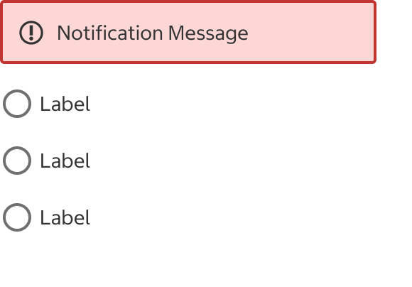
Field Set Level Error
- When a selection is not made, a Critical Notification should display instructions on how to fix the error. Place the notification below the legend and above the radio group.
Legend
Legend
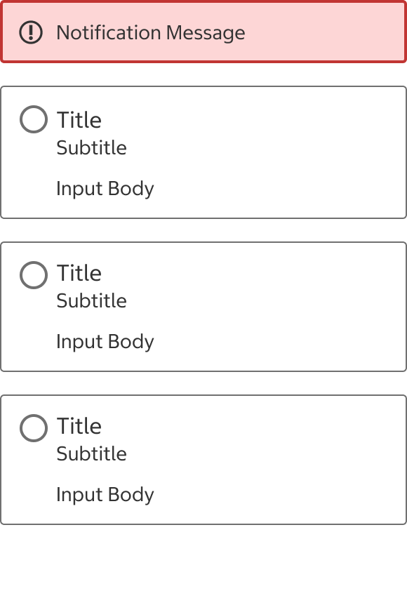
Item Level Error
- When the selection isn’t accepted, an error message should display instructions on how to fix the error.
- Radio Button: Place a critical notification below the legend and above the radio group.
- Selector Radio Button: Place the error message below the selected option.
Legend
Legend
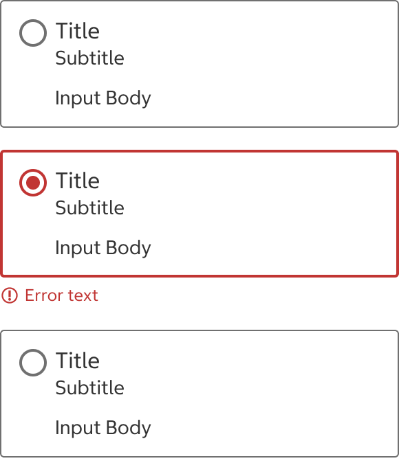
Structure
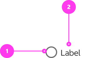
Radio Button
- Radio Button: Positioned to the top left of its label.
- Label: Describes what the user is selecting.
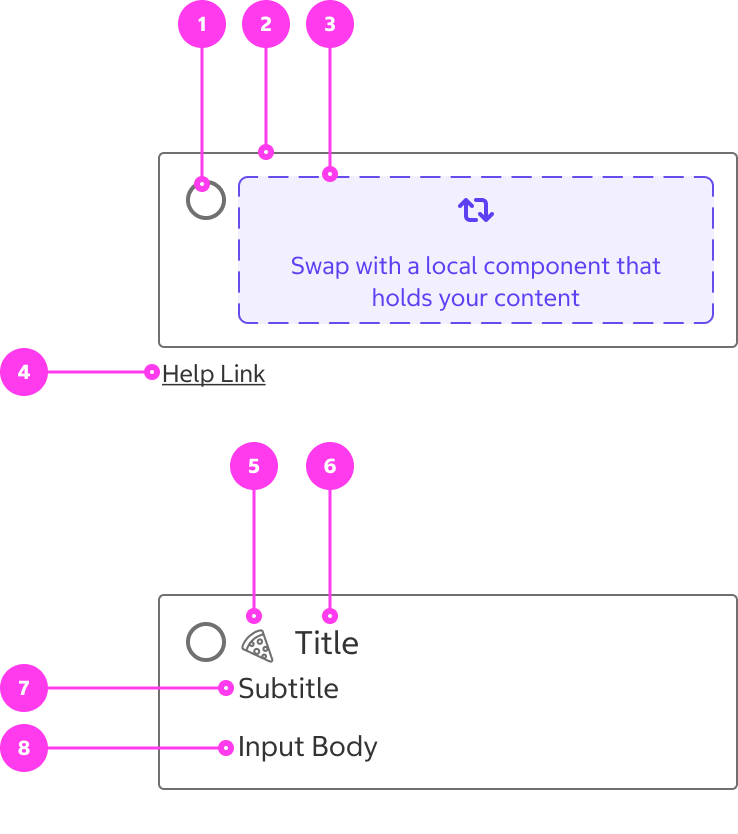
Selector Radio Button
- Radio Button
- Container
- Body: “Slot” that accepts a subcomponent of any type.
- Help link (optional)
- Icon
- Title
- Subtitle
- Input Body
Spacing
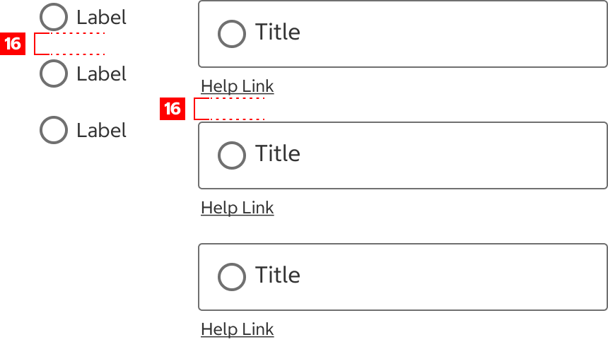
Options in a radio group should be vertically spaced 16px.
Native App Considerations
There are no Native App specific considerations for this component.
Accessibility
Keyboard Accessibility
[AC1] When there is a radio group on the page:
- Focus can be moved to the current selected radio button using TAB. If a radio button has not been selected, focus moves to the first radio button in the group.
[AC2] When a radio button is in focus:
- The focus indicator is clearly visible.
- Focus can be moved between radio buttons using the arrow keys (LEFT ARROW/UP ARROW moves to the previous radio button, RIGHT ARROW/DOWN ARROW moves to the next radio button).
Screen Reader Output
[AC1] When a screen reader user presses DOWN ARROW into the radio group:
- Name: The name of the radio group is announced.
- The radio buttons are announced as a “group”.
Example Output: “Pizza Crust grouping”
- Name: “Pizza Crust”
[AC2] When a screen reader user presses DOWN ARROW to an individual radio button:
- Name: The label of the radio button is announced.
- Role: The role of “radio button” is announced.
- State: The current state (“checked”, “unchecked, or “selected”) is announced.
Example Output: “Stuffed crust radio button unchecked 2 of 3”
- Name: “Stuffed crust”
- Role: “radio button”
- State: “unchecked”
[AC3] When a screen reader user presses DOWN ARROW is on an unselected radio button and presses SPACE:
- State: The change in state (“Selected” or “Checked”) is announced.
[AC4] When focus is moved to a radio button in an error state:
- Name: The name of the radio button is announced.
- Role: The role of “radio button” is announced.
- State: The current state (“checked”, “not checked”, “selected”) is announced.
- The corresponding error message is announced.
Example Output: “Pick Up Kirkland Warehouse radio button checked 2 of 3 Invalid entry Error: Pick-Up is unavailable. Change your warehouse or select a different delivery method to continue Checkout.”
- **Name: “**Pick Up Kirkland Warehouse”
- Role: “Radio button”
- State: “Invalid entry”, “checked”
- Error Message: “Error: Pick-Up is unavailable. Change your warehouse or select a different delivery method to continue Checkout.”
Developer Notes
- Use semantic HTML:
- Use <fieldset> to group the radio buttons together.
- Use <legend> for the group label.
- Use <input type=”radio”> for each radio button.
- Use <label> to label each radio button.
- Make sure that the label is correctly referencing the radio button by adding the input ID to the label’s “for” attribute.
- Add the “required” attribute to the fieldset if the radio group is required.
- For custom components:
- Use role=”radio” to indicate a radio button.
- Use aria-label to add a label to each radio button.
- Use aria-checked to express state.
- Use role="radiogroup" to take the place of a <fieldset>.
- Use aria-labelledby to associate an element as a label.
- aria-label can also be used if there’s no label with an ID.
- Error states:
- If the entire radio group is in error, add aria-invalid=”true” to the <fieldset> and add an aria-describedby to associate the error with the <fieldset>.
- If an individual radio button is in error, add aria-invalid=”true” to the <input> and add an aria-describedby to associate the error with the <input>