
Modal
A pop-up window that conveys important information to the user. This is an interruptive pattern that requires user input to continue.
 View in Storybook
 View Figma Specs
 View Source Code
Guidelines
When to Use
- Use to display interruptive information that requires a response from the user.
- Use to communicate simple and essential information.
- In some cases, a modal is used to share important information that doesn’t belong on the page itself, but that is too robust to fit in a tooltip.
When Not to Use
- If content is very long, consider opening a new page instead of displaying content in a modal with scrolling content.
- Avoid using modals to display confirmation or success messages—use a notification on the page.
- Avoid using modals to display page or system status errors, unless the entire flow is shown in modals, or there is a critical stop or check that requires confirmation from the user.
- Do not use modals on top of modals.
Variants
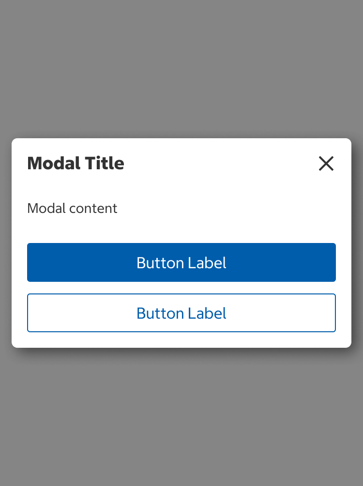
- Non-Scrollable (Default)
- By default, modals do not scroll
- Use non-scrollable modals when content can fit in the viewport without clipping
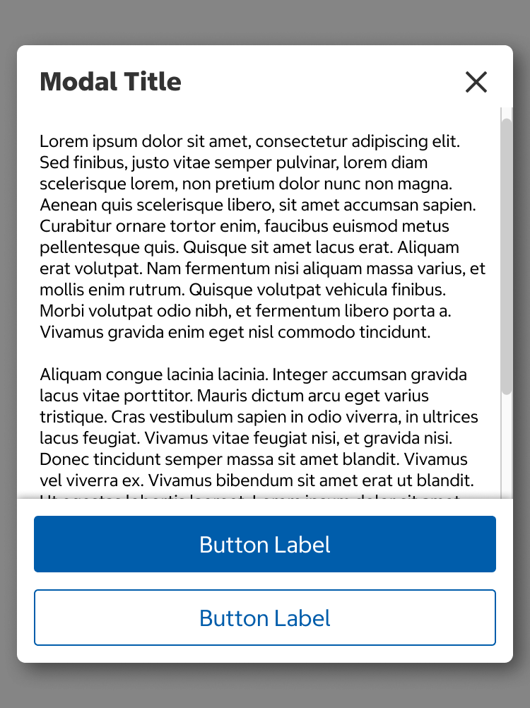
- Scrollable
- Use scrollable modals when the content in the non-scrollable version exceeds the viewport height.
Non-Scrollable
Scrollable
States
Skeleton
- Use this state whenever data is being loaded to help establish a user's mental model of the component's shape and the page layout.
- Use when the majority of page elements are loaded from API calls.
- The skeleton is temporary and should disappear once the data is loaded.
Content
- Modal titles should be short and written in title case.
- The title should also describe the content. If the content requires a response from the user, start the title with a verb (e.g., Add Membership Number).
- Body content should be written in sentence case and be broken into paragraphs or bullets if there is a lot of content.
- If body content exceeds the size of the modal viewport, a scrollable modal variant should be implemented.
- Modals that require a response should have primary and secondary buttons. The primary button should have an action label and the secondary button should be “Cancel.”
- Modals with informational content should have a “Close” button as a primary button.
Behavior
- When a modal displays, an overlay is shown behind it.
- In scrollable modals, only the body content scrolls while the header and buttons remain fixed.
- Modals are dismissed by:
- Selecting the “x” (close) icon in the top right corner.
- Selecting the “Cancel” or “Close” button.
- Clicking/tapping anywhere outside of the modal on the overlay background.
- Pressing the escape (esc) key.
Placement
Modals should be centered both horizontally and vertically.
Structure
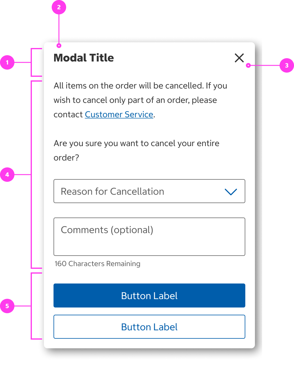
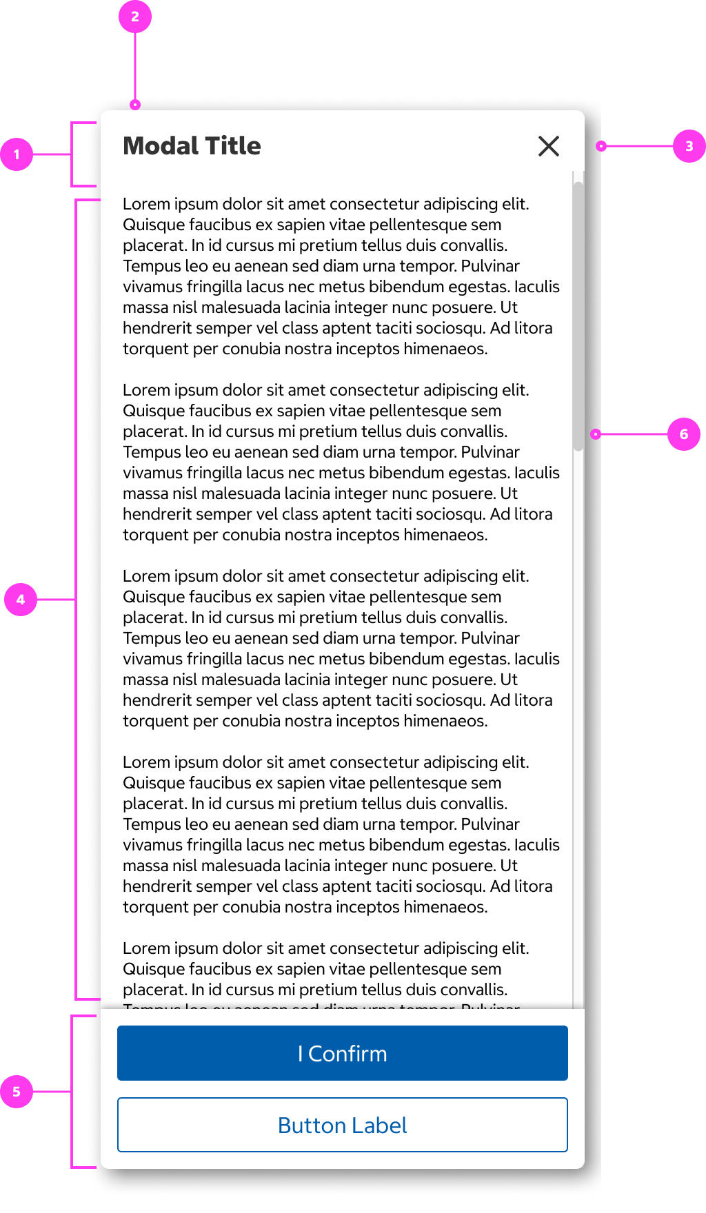
- Modal header
- Modal title
- “x” (close) icon
- Body content
- Buttons
- Scrollbar
Sizing
- Small viewport modals are a minimum width of 296px and grow as the viewport grows to maintain left and right margins of 12px; medium and large viewport modals are a fixed width of 600px.
- Non-scrollable modals grow in height with the body content.
- Scrollable modals fill the height of the viewport with top and bottom padding.
Accessibility
Keyboard Accessibility
[AC1] When a modal is triggered by the user:
- Focus moves to the first focusable element (typically the close button).
- Focus is trapped inside the modal. Page content beneath the modal is not navigable. When the user reaches the end of the modal tab order, the focus either loops back to the close button or stops.
- Pressing ESCAPE closes the modal.
[AC2] When a modal is closed by the user:
- Focus returns to the element that triggered the modal (ideally a button).
Screen Reader Output
[AC1] When a modal is triggered by the user:
- Name: The name of the modal is announced.
- Role: The role of “dialog” is announced.
- Page content beneath the modal is not navigable with the screen reader. The screen reader is only able to browse content inside the modal.
Example Output: “Configure Delivery dialog”
- Name: “Configure Delivery”
- Role: “modal dialog”
Developer Notes
- Use aria-label or aria-labelledby to give the modal a descriptive title.
- Modals have their own heading structure, starting at heading 2.
- Use role=“dialog” to indicate to screen reader users that the element is a modal.
- Use JavaScript to make content beneath the modal inert.
- Use aria-modal=“true” on the modal container to communicate to screen reader users that content beneath the modal is inert.
- Use the inert attribute on content beneath the modal to ensure the greyed out content is hidden from both keyboard and screen reader users.
- Users should be able to zoom in and out inside the modal.
- If the modal is used to interrupt a user’s current workflow or conveys important information, utilize role=”alertdialog”.
- Ex. A confirmation dialog that appears after a user attempts to discard something.
- If applicable, users should be able to scroll to view all content within a modal.
In the Wild
The modal style seen above is not currently in production. Below is an example of our old modal style being used in Checkout.