
Text Field
An input control that allows users to enter or edit text.
 View in Storybook
 View Figma Specs
 View Source Code
Guidelines
When to Use
- Use text fields to allow users to enter free-form text that can’t be selected from a predefined list.
- Use text fields to allow users to edit pre-populated input text.
When Not to Use
- If the user can select an option only from a predefined list, use a checkbox, radio button, or select instead.
- If the user needs to enter a number, consider using a quantity selector.
- If the user needs to select a date, use a date picker instead.
- Avoid using a disabled or read-only text field as it’s not clear if the input text is editable.
Variants
Text Field
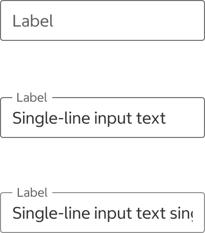
- Use Text Field for single-line text input.
Multiline Text Field
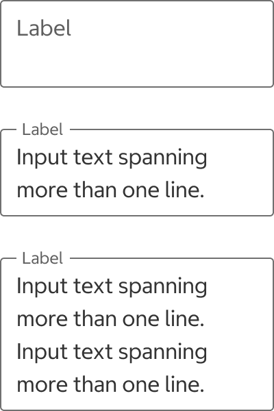
- Use Multiline Text Field for text input spanning more than one line, such as comments.
Text Field + Button
- Use Text Field + Button to display a single-line text field with an action button such as search or submit.
Selecting a Variant
Text Field vs. Multiline Text Field
- A text field is the default variant that is used for single-line text input. Use a multiline text field when the expected input could be more than one line.
Text Field
Multiline Text Field
Help Text vs. Info Icon Button
- Keep in mind that an info icon can be missed if the user doesn’t interact with it, while help text is always visible to the user. Use help text to display any necessary information to complete the field.
States
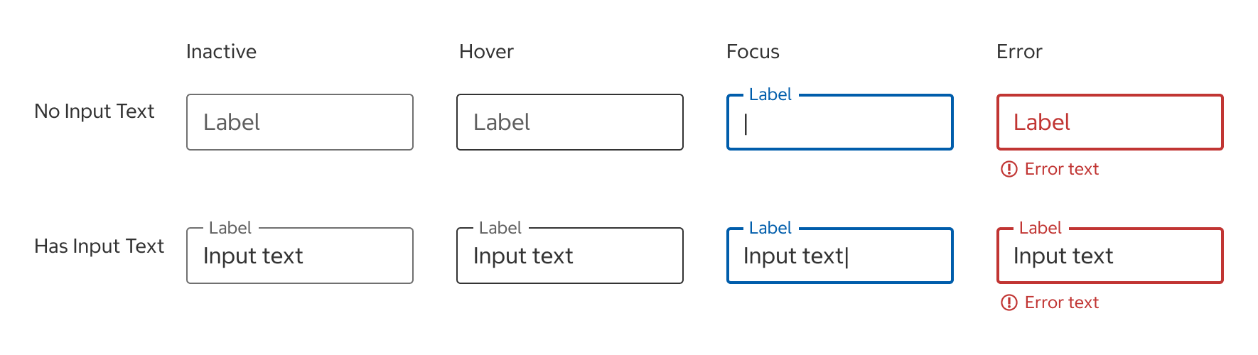
Inactive
- The default state before the text field is hovered, focused, or selected.
Hover
- The hover state appears while the pointer is over the text field and indicates that it’s interactive.
- The hover state only applies to pointer devices and is not visible on touch devices like phones.
Focus
- The focus state appears when the user has tabbed to the text field or is entering text.
Error
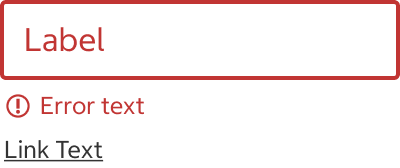
- When a text input isn’t entered into a required field or is not accepted, an error text should display instructions on how to fix it.
Skeleton
- Use this state whenever data is being loaded to help establish a user's mental model of the component's shape and the page layout.
- Use when the majority of page elements are loaded from API calls.
- The skeleton is temporary and should disappear once the data is loaded.
Content
Label
- Label text describes what needs to be entered in the text field and is required for all text fields.
- Keep label text concise and always visible.
- Use title case.
Label Overflow
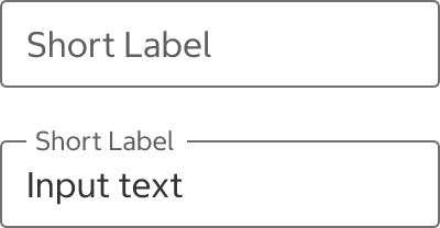
- In most cases, labels shouldn't be truncated or take up more than one line.
Do
Do Not
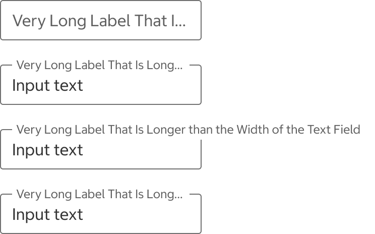
- If your label text is longer than the width of the text field, try to shorten your label and apply the following recommendations:
- Extend the width of the text field to fit the label text in one line. Full-width text fields are recommended for small devices. Keep in mind that French translations are often longer than English labels.
- Use help text or fieldset legend to provide additional context about the text field.

- If your label still has overflow text, the label will be truncated with an ellipsis.
Optional Field Indicator
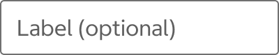
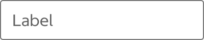
- Label optional fields with "(optional)." Any fields not labeled with (optional) are required.
Optional
Required
Input Text
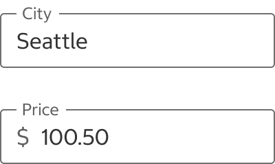
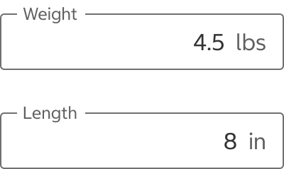
- Most input text should be left-aligned. If an end adornment text is present, the input text can be right-aligned.
Left-Aligned Input Text
Right-Aligned Input Text
Adornment
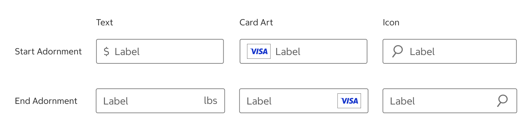
Text
- Text fields can display a currency symbol or measurement unit.
- Card Art
- Text fields can display an appropriate card art for the expected or entered input text.
Icon
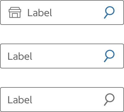
- Decorative: Decorative icons describe the type of input a text field requires and help users understand it at a glance. A decorative icon is displayed on the left-hand side of the input area.
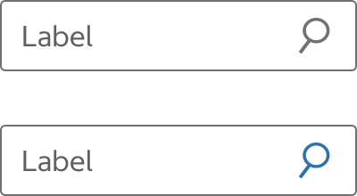
- Interactive: Interactive icons are nested click targets for additional actions associated with the input, such as clearing, showing, or hiding the input. An interactive icon is displayed on the right-hand side of the input area and can be highlighted in blue for clarity.
- Avoid using two decorative icons in the same text field.
Decorative Icon

Interactive Icon
Do
Use with Caution

Do Not

Help Text and Link
- Keep clear and concise.
- When the text is not a sentence, use title case without end punctuation.
- When the text is a sentence, use sentence case with end punctuation.
Help Text
- Help text provides an example or specific format for the input, or instructions on how to complete the text field.
- Avoid repeating the label text if the label clearly explains the purpose of the text field. Do not overuse help text.
Do
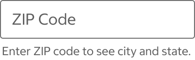
Do Not
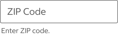
Help Link
- Help links open a modal or a web page in a new tab where the user can find additional context.
- If using help text, a link can be appended to the end of the line of text. Help text and help link elements should not be used together.
Error text
- Error text provides instructions on how to fix the error.
- Use sentence case with end punctuation.
Behavior
Label
- When a text field is selected, its label moves to the top of the text field. Do not use placeholders instead of labels.
Inactive Label
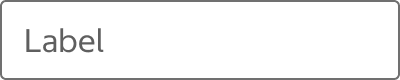
Floating Label
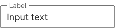
Input Overflow
- Text Field
- Text Fields have a fixed height. If the input text unexpectedly exceeds the width of the text field, the overflow text can horizontally scroll as the user moves the cursor inside the text field.
- Multiline Text Field
- The default height should fit up to two lines of input text.
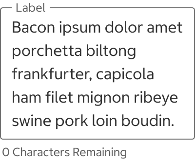
- Overflow text will wrap, and the height of the text field will grow with the input text. The entire input text should be visible.
No Input Text
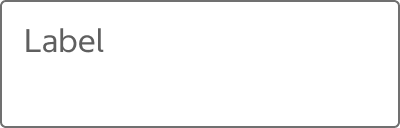
1-2 Lines
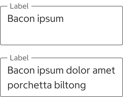
3+ Lines
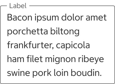
Error
- Form validation should occur when the entire form is submitted (onsubmit event). In rare cases such as email address, validation may occur when the text field loses focus (onblur event).
- Error text appears below the text field. If using a help text or link, error text should appear above the help text or help link.
- Error text is displayed until the error is fixed.
Error State with Help Text
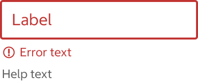
Error State with Help Link
Line Break
- In multiline text fields, users should be able to press [Enter] to insert a line break.
Auto-Format
- Input text can be automatically formatted to help users easily enter text in the correct format and prevent errors. For example, dashes in phone numbers and a slash in credit card expiration dates.
Multiline with Character Counter
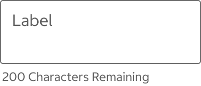
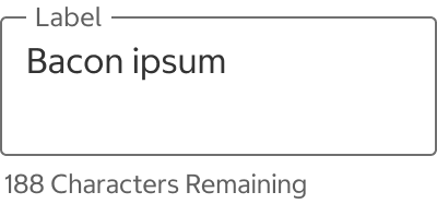
- Help text should display a character counter if there is a character limit. A character counter indicates the remaining number of characters allowed.
No Input Text
Has Input Text
Max Characters
Info Icon Button
-
See Icon Button for the info icon button's behavior.
Virtual Keyboard
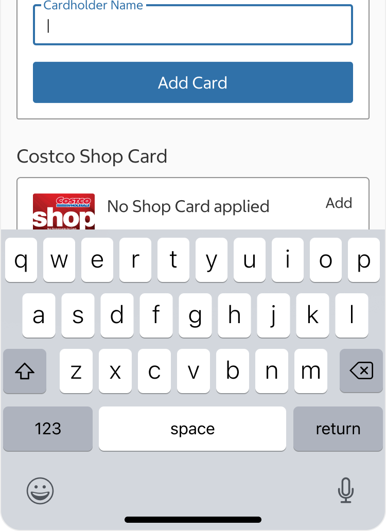
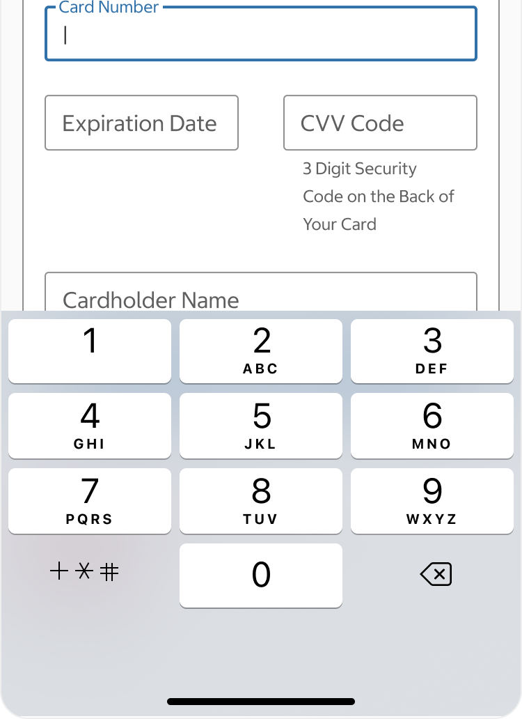
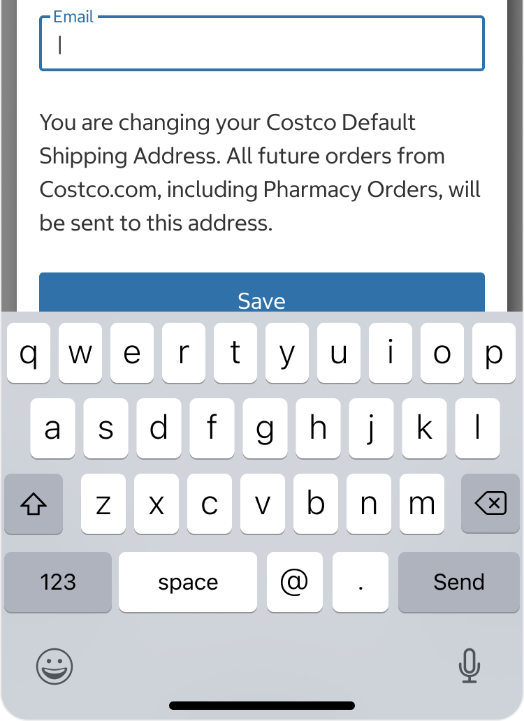
- Make sure to choose the correct keyboard type for the expected input type.
- Ensure that focused fields remain visible above the keyboard by automatically adjusting the viewport.
- Support platform-native behaviors such as:
- iOS autofill suggestions
- Android Input Method Editor (IME) actions
- Return key customization
- Clipboard paste support
Text Keyboard with Auto-Correct Disabled
Numeric Keyboard
Email Keyboard with “@” and “.”
Placement
- Place text fields in a form, modal, and filter with a button to submit the text input or move forward to the next step in a flow. A text field + button variant can be placed individually on a page.
- Use a logical and predictable order.
- Do not use more than two text fields on a single line in the phone view.
Structure
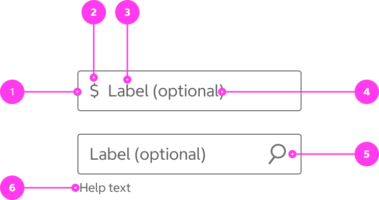
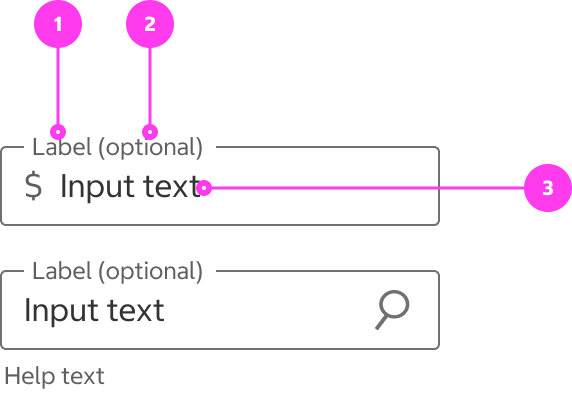
Text Field
- Input area
- Start adornment (optional)
- Label
- Optional field indicator
- End adornment (optional)
- Help text or help link (optional)
Text Field with Input Text
- Floating label
- Optional field indicator
- Input text
Sizing
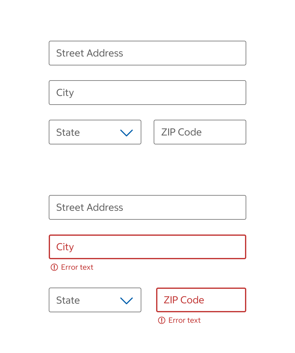
- A single-column layout is recommended in most cases. Avoid using excessively wide text fields; the width of a text field should reflect the expected length of the text input.
- When appropriate, multi-columns can be used, and related short-answer fields can be grouped together in a row. Multi-column rows can wrap on smaller screens.
Spacing
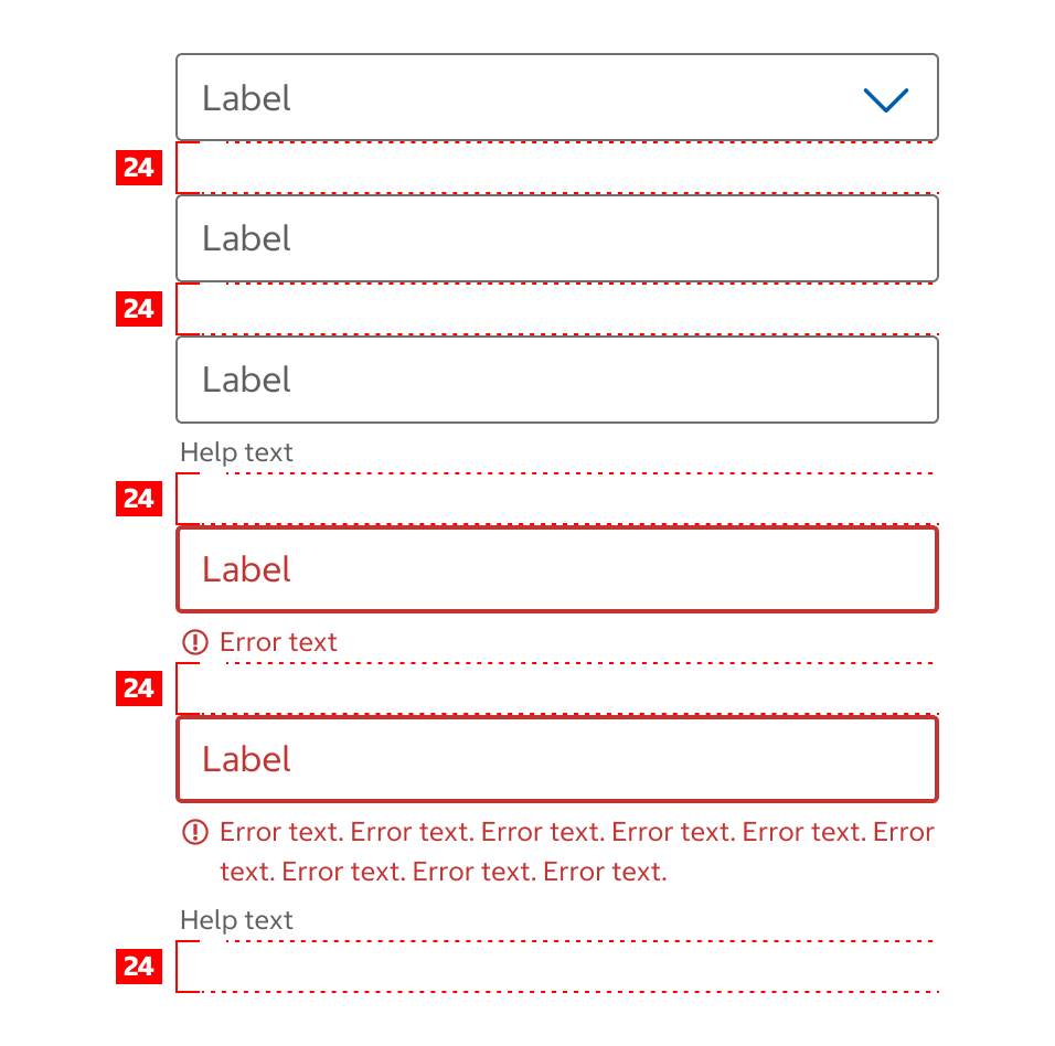
- Text fields should be vertically spaced 24px on all breakpoints.
- The 24px spacing is measured from the bottom of the text field component and includes its assistive text region (helper text, error messages, character count).
- If using a multi-column layout, horizontal spacing is managed by Grid Layout.
Native App Considerations
There are no Native App specific considerations for this component.
Accessibility
Keyboard Accessibility
[AC1] When there is a text field on the page:
- Focus can be moved to the text field using TAB.
[AC2] When the text field is in focus:
- The focus indicator is clearly visible.
- Text can be typed inside the text field.
[AC3] For text fields with button adornments:
- Focus can be moved to the button using TAB.
- When the button is in focus, the focus indicator is clearly visible.
- When the button is in focus, pressing SPACE or ENTER triggers the corresponding function of the button.
Screen Reader Output
[AC1] When a screen reader user TABS to a text field:
- Name: The name of the text field is announced.
- Role: The role of “edit” is announced.
- State: If applicable, the current state (ex. invalid, disabled, etc.) is announced.
- If invalid, the error message is announced.
- If required, the field should be announced as “required”.
- If applicable, the current value inside the text field is announced.
- Any associated help text is announced.
- If applicable, text adornments should be announced.
Example Output: “Phone Number edit required”
- Name: “Phone Number”
- Role: “edit”
- State: “required”
[AC2] When a screen reader user TABS to a button adornment:
- Name: The name of the button is announced.
- Role: The role of “button” is announced.
- State: If applicable, the current state of the button is announced (ex. pressed or disabled).
Example Output: “Find warehouse button”
Developer Notes
-
Use semantic HTML:
- Use <input type=”text” id=”ID_REF”> for the text field element.
- Use <label for=”ID_REF”> to label the text field element.
- Use <button> for a button adornment.
- If required, add the HTML “required” attribute to the input element.
-
If there is associated help text, use aria-describedby to associate the help text with the text field.
-
If <label> can not be used, use aria-label to label the text field.
-
Labels for text fields should always be visible to ensure users can always see the instructions for a field.
- Don’t hide labels on focus.
- Don’t use placeholder text as labels.
-
For button adornments with generic button text (ex. “Go”, “Search”), additional context should be added through an aria-describedby or aria-label. This allows screen reader users to discern the difference between buttons on the same page.
-
Example announcement with aria-describedby: “Go” versus “Go (Get Email Offers)”.
-
Example announcement with aria-label: “Search” versus “Find warehouse”.
-