
Icon Button
Icon buttons are used without visible labels and allow users to take supplementary actions
 View in Storybook
 View Figma Specs
 View Source Code
Guidelines
When to Use
- To simplify the UI when the meaning of the icon is clear without a label such as the close button and back button.
- Icon Button can be used for repeated or persistent actions.
- Use info icon buttons to trigger either a modal, drawer, or sheet showing supplemental, contextual information. See Info Icon Button Behavior for more information
When Not to Use
- Use a button for primary and secondary actions.
- Consider using a button instead of an icon button if the meaning of the icon can be confusing or the button triggers a destructive action.
- Do not use info icon buttons for critical information. Instead, show the information inline so it is visible to users.
- Do not use info icon buttons to show errors or other interaction feedback - use form field error handling or notifications.
Variants
Standard
- Standard icon buttons show a transparent background for minimal
visual emphasis.
- Note: Only display the info icon in the standard variant.
Note: Only display the info icon in the standard variant.
Contained
- Use a contained icon button when the component requires more visual separation from the background. This variant puts a higher emphasis on the action than the standard variant.
Standard

Contained

States
Default
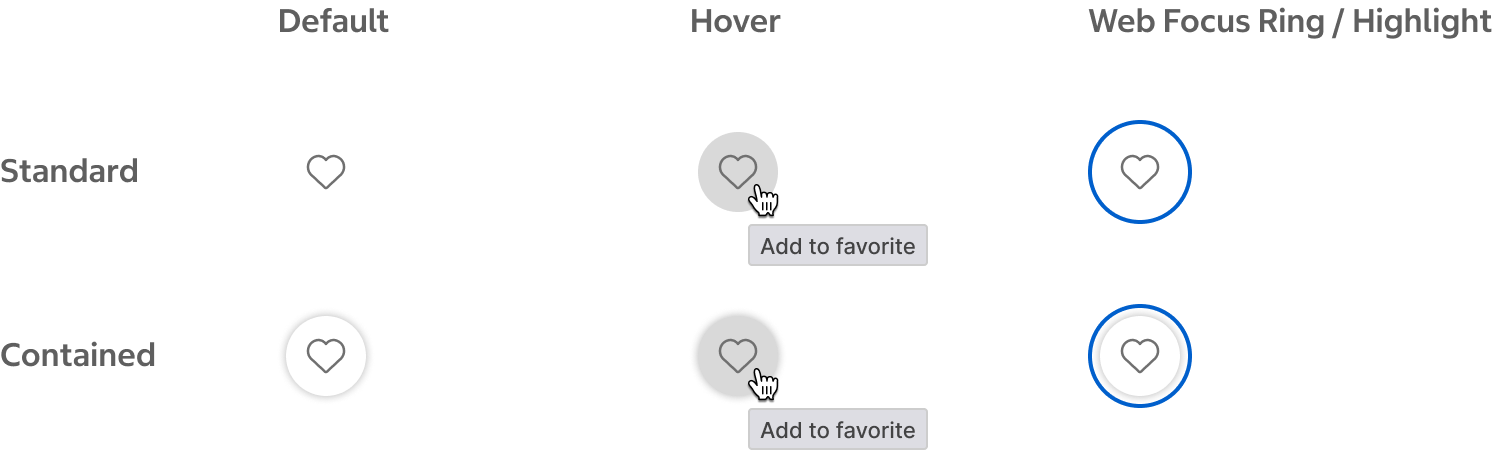
- The default state before the button is hovered, focused, or selected.
Hover
- The hover state and the browser’s default title attribute appear while the pointer is over the icon button’s touch target. The gray tooltip shown here is for placement only.
- The hover state only applies to pointer devices and is not visible on touch devices like phones.
Web Focus Ring / Highlight
- The web focus ring or highlight should be a 2px offset outline. The browser’s default focus ring or highlight appears when the user has tabbed to the icon button. The blue focus ring shown here is for placement only.
Toggle Button States
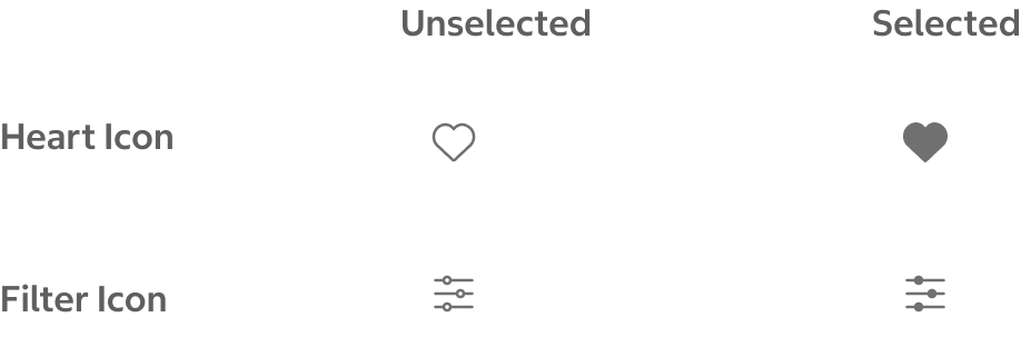
Icon buttons may show toggle states.
- A default, unfilled icon is used for the unselected state.
- A filled icon is used for the selected state.
Content
Selecting an info icon button triggers a modal, drawer, or sheet to display. The content in the modal, drawer, or sheet should align with the content guidelines for those components.
Behavior
- On hover, the browser's default title attribute is displayed for the icon button. Because hover interactions and title attributes are unavailable on touch devices, ensure icons are universally recognizable.
- On click/tap, the icon button triggers an action. If the icon button shows toggle states, it alternates between states when selected.
Info Icon Button Behavior
- On the web, selecting an info icon button opens a modal or drawer depending on the length of the content. Shorter content (1-3 sentences) displays in a modal, while longer content displays in a drawer.
- On the native app, selecting an info icon button opens a half or full sheet depending on the length of the content. Shorter content (1-3 sentences) displays in a half sheet, while longer content displays in a full sheet.
Placement
- Icon buttons are commonly used as a nested element in another component or as part of a series of icon buttons.
- An info icon button should be positioned directly to the right of the content for which it provides supplemental information.
Structure
Standard Icon Button
- Icon
- Icon container

Contained Icon Button
- Icon
- Icon container

Sizing
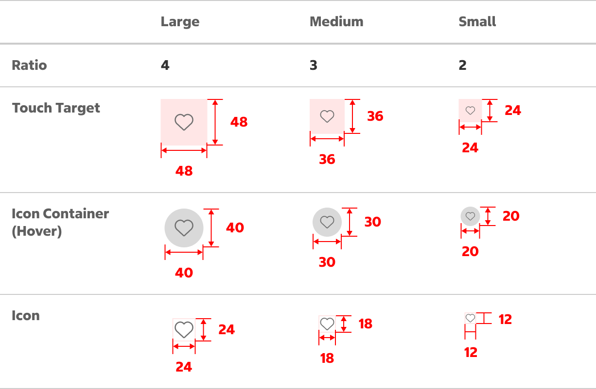
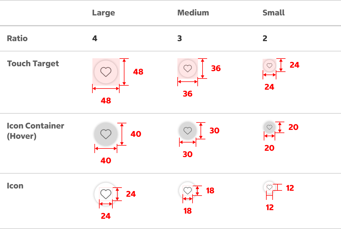
The size of an icon button may be determined by accessing the visual balance between the icon button and neighboring elements. Consider the following size recommendations:
- Large: Use large icon buttons to ensure maximum touch area. Large icon buttons are ideal for the top and bottom areas of a touch device screen.
- Medium and Small: Medium and small icon buttons are ideal for compact areas and desktop screens where the user can make a precise selection with an input device. Medium and small icon buttons can be used in the main content area of a touch device screen.
Standard Icon Button Measurements (pixels)
Contained Icon Button Measurements (pixels)
Native App Considerations
There are no Native App specific considerations for this component.
Accessibility
Keyboard Accessibility
[AC1] When there is an icon button on the page:
- Focus can be moved to the button using TAB.
[AC2] When an icon button is in focus:
- The focus indicator is clearly visible.
- Pressing SPACE or ENTER triggers the corresponding function of the button.
Screen Reader Output
[AC1] When a screen reader user TABS to a button:
- Name: The name of the button is announced.
- Role: The role of “button” is announced.
- State: If applicable, the current state of the button is announced (ex. pressed).
Example Output: “Remove from favorites button pressed”
- Name: “Remove from favorites”
- Role: “button”
- State: “pressed”
Developer Notes
- Use <button> or <input type=”button> to create a button.
- If applicable, be sure to correctly indicate a button’s state using HTML attributes or ARIA
- If a button triggers an expand/collapse, use aria-expanded=”true/false”
- If a button can pressed use aria-pressed=”true/false”
- Use alternative text on the icon or an aria-label on the <button> to provide an accessible name.
- Avoid using disabled buttons that provide no feedback, making it difficult to determine why the button is unusable. Instead, use validation and errors to indicate what needs to be done.