
Select
Select is an input control that expands to display a predefined list of options.
 View in Storybook
 View Figma Specs
 View Source Code
Guidelines
When to Use
- A select menu is used to display a list of choices when users interact with them, while taking up minimal space on the page.
- Use a select menu when there are 5 or more options or when space is constrained.
When Not to Use
- If there are 4 or less items in a list, consider using radio buttons.
- If the user needs to select multiple items from a list, consider using checkboxes.
- If options are long or require additional descriptive information, consider using radio buttons or checkboxes.
- If there are more than 15 options, consider whether it would be easier for users to type the answer into a text field.
States
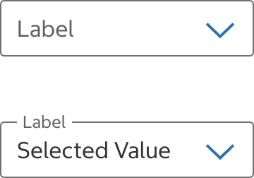
Inactive
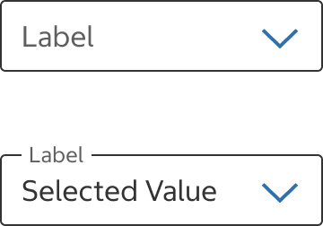
Hover
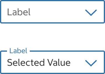
Focus
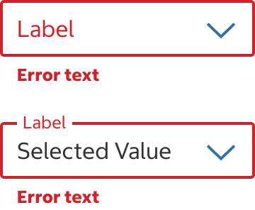
Error
States
Select Field
Inactive
- The default state before the select field is hovered, focused, or selected.
Hover
- The hover state appears while the pointer is over the select field and indicates that it’s interactive.
Focus
- The focus state appears when the user has tabbed to the select field or is entering text.
Error
- When no selection is made for a required field or an unavailable option is selected, error text should display instructions on how to fix it.
Skeleton
- Use this state whenever data is being loaded to help establish a user's mental model of the component's shape and the page layout.
- Use when the majority of page elements are loaded from API calls.
- The skeleton is temporary and should disappear once the data is loaded.
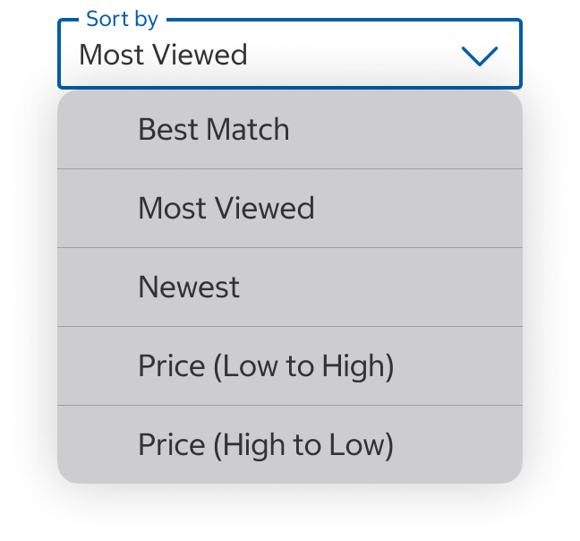
Mobile
Desktop
Custom
List Items
- Inactive – The default state before the list item is hovered, focused, or selected.
- Hover – The hover state appears while the pointer is over the list item and indicates that it’s interactive.
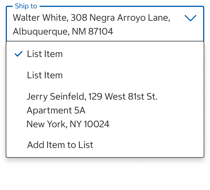
- Selected – Selected list items are marked with a check mark.
Content
- Make sure label and list items are clear and concise.
- When applicable, show a preselected value in the select field. Examples:
- If the customer has set a default payment method, preselect that payment method.
- On a search results page, the select field has a default value of "Most Viewed" for the sort option because this is how the content is sorted on page load.
Label
- Label text describes the type of content that the user will see in the list options. For example, if a user is selecting from a list of states, such as Illinois, Indiana, and Iowa, “State” would be the appropriate label for the select menu.
- Use title case without end punctuation.
- If the content in the select menu needs more explanation than the label can provide, use help text below the field.
Label Overflow
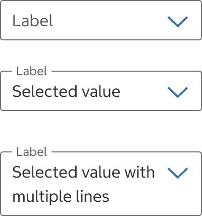
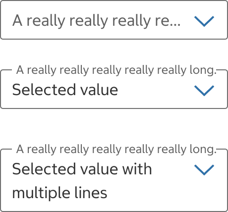
- In most cases, labels shouldn't be truncated or take up more than one line.
Do
Use with Caution
Do Not
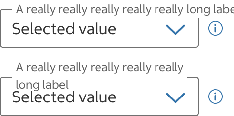
- If your label text is longer than the width of the select field, try to shorten your label and apply the following recommendations:
- Extend the width of the select field to fit the label text in one line. Full-width select fields are recommended for small devices. Keep in mind that French translations are often longer than English labels.
- Use help text or a fieldset legend to provide additional context about the select field.

- If your label text is longer than the width of the select field, try to shorten your label and apply the following recommendations:
- Extend the width of the select field to fit the label text in one line. Full-width select fields are recommended for small devices. Keep in mind that French translations are often longer than English labels.
- Use help text or a fieldset legend to provide additional context about the select field.
List Items
- Keep list items clear and concise.
- Order list items in a way that makes the most sense for the context (e.g., alphabetically, numerically, most frequently selected, etc.).
Help Text & Help Link
- Help text is located below the select field and provides extra guidance or instructions. When the label doesn't clearly explain the purpose of the input, use help text to provide necessary information to complete the field.
- Avoid repeating the label. If the label provides sufficient context for completing the action, help text is not needed.
- When the help text is not a sentence, use title case without end punctuation.
- If using help text, a link can be appended to the end of the line of text. Help text and help link elements should not be used together.
- Help links are located below the select field and help text and open a modal or a web page in a new tab where the user can find additional context.
Info Icon Button
- Info icon button is located to the right of the select field. See Icon Button for more details.
- Use a info icon button for secondary information. It can be used in addition to the help text.
- Don’t use info icon buttons for important information that the user needs to complete their task. If information is critical, use help text because it is always visible to the user.
Error Text
- Error text appears below the select field. If using help text or a help link, error text should appear above the help text and help link.
- Display error text until the error is fixed.
Behavior
Select Field
- If there is no selected value, the label displays inline within the select field.
- Once a value is selected, the label moves to the top of the select field.
Select Menu
- When a list item is chosen, the selected option is reflected in the select field and the select menu closes.
- The select menu closes if users click or tap anywhere else on the page (including the select field) or if they choose “Esc” on the keyboard. The menu will close and the current selection will be retained.
- When triggered, the select menu should display fully within the bounds of the viewport. If there is not enough room to display all of the list items, users should be able to scroll the select menu to view the remaining list items.
- The selected list item is displayed in the select menu list with a check mark.
Native Select Menu (Default)
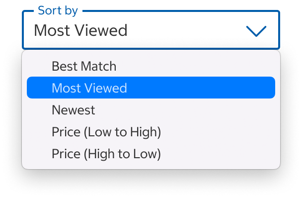
- By default, interacting with the select component will open the system/native select menu.
Mobile
Desktop
Custom Select Menu
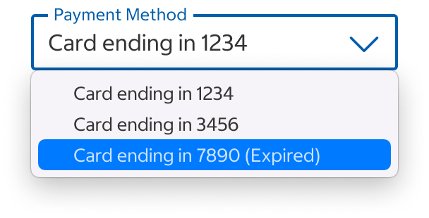
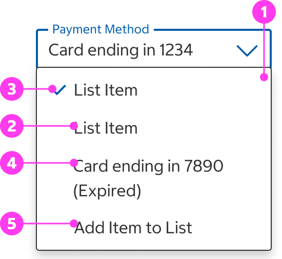
- This is used when the select menu contains multiline options and/or a list action (e.g., “Add New Address”).
Unavailable Items
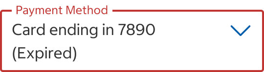
- Unavailable list items should be displayed and selectable within the select menu with a brief reason in parentheses (e.g., “expired,” “out-of-stock”).
- If a user selects an unavailable item, the select menu should close and the select field should switch to the error state. If applicable, remediation instructions should be included in error text.
- Do not use a disabled state (not selectable) for unavailable list items as it will cause some screen-readers to skip over them.
Info Icon Button
- See Icon Button for the info icon button’s behavior.
Placement
- Place a select in a form, modal, and filter with a button to submit the input or move forward to the next step in a flow.
- Place a select at the top of a section to filter or order the content within that section.
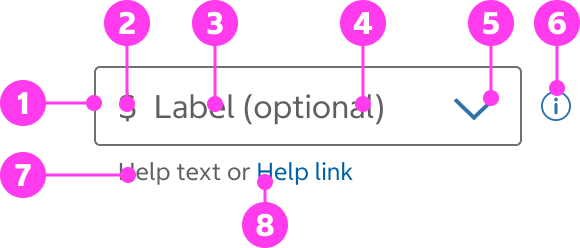
Structure
Select Field
- Input area
- Start adornment (optional)
- Label
- Chevron
- Tooltip icon (optional)
- Help text (optional)
- Help link (optional)
Select Field with Selected Value
- Floating label
- Selected value

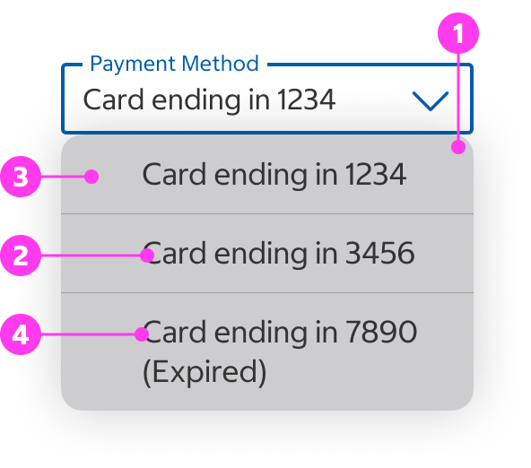
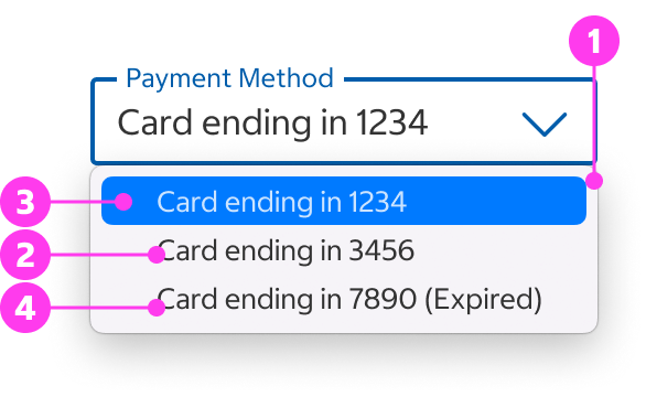
Select Menu
- Select menu
- List item
- Selected item (optional)
- Unavailable item (optional)
- List action (optional)
Mobile
Desktop
Custom
Native App Considerations
There are no Native App specific considerations for this component.
Accessibility
Keyboard Accessibility
[AC1] When there is a select component on the page:
- Focus can be moved to the component using TAB.
[AC2] When the select component is in focus:
- The focus indicator is clearly visible.
- Pressing SPACE toggles the expand/collapse state of the component.
- When collapsed, pressing UP ARROW or DOWN ARROW expands the component.
- Typing in alphanumeric characters selects the first option matching the typed character or, if multiple keys were typed, the first option matching the full string.
[AC3] When a user expands the select component:
- Pressing DOWN ARROW moves focus to the next option.
- Pressing UP ARROW moves focus to the previous option.
- Pressing ENTER or SPACE selects the option in focus and collapses the select component
- Pressing ESCAPE collapses the select component.
- Pressing HOME moves focus to the first option.
- Pressing END moves focus to the last option.
- Typing in alphanumeric characters selects the first option matching the typed character or, if multiple keys were typed, the first option matching the full string.
Screen Reader Output
[AC1] When a screen reader user TABS to a select component:
- Name: The name of the select component is announced.
- Role: The role of “combobox” is announced (note the exact role name may vary across screen readers, other names include: “menu button”, “listbox”, or “select”).
- State: The current state of the component (“expanded” or “collapsed”) is announced.
- The currently selected value is announced.
Example Output: “California, State, combobox collapsed”
- Name: “State”
- Role: “combobox”
- State: “collapsed”
[AC2] When the screen reader triggers the expands or collapses the select component:
- State: The change in state of the component (“expanded” or “collapsed”) is announced.
[AC3] When a screen reader user presses DOWN ARROW to an option inside the select component:
- Name: The name of the option is announced.
- State: If applicable, the current state (ex. “Selected” or “Current”) is announced.
Example Output: “Texas, selected, 2 of 10”
- Name: “Texas”
- State: “Selected”
[AC4] When focus is moved to a select component is in its error state:
- Name: The name of the select component is announced.
- Role: The role of “listbox” is announced (note the exact role name may vary across screen readers, other names include: “menu button”, “popup”, or “select”).
- State: The invalid state is announced.
- The currently selected value is announced.
- The corresponding error message is announced.
Example Output: “New York, State, invalid entry, combobox collapsed”
- Name: “State”
- Role: “listbox”
- State: “Invalid entry”, “collapsed”
- Current Value: “New York”
Developer Notes
- Use semantic HTML:
- Use <select> and <option> to create the select component.
- Use <label> to label the select component.
- Add the “required” attribute to the select component if it is required.
- For errors:
- Use aria-describedby to associate the select component with its corresponding error message.
- Use aria-invalid=”true” to indicate an invalid entry.
- Custom select components are difficult to make accessible and best to avoid.