
Quantity Selector
A Quantity Selector allows users to increase or decrease numerical quantities in increments.
 View in Storybook
 View Figma Specs
 View Source Code
Guidelines
When to Use
- Use the quantity selector when you want to give users the ability to quickly increase or decrease numerical quantities, e.g., updating quantities in the shopping cart.
- quantity selectors work best when working with a small range of numbers.
When Not to Use
- If the numerical range exceeds 10 increments, consider using a text field instead (e.g., for bulk ordering items, allow business users to enter quantities directly).
- If increments have specific requirements or varying increments (e.g., products must be ordered in quantities of 2 at a time) consider using a select or text field component. If using the quantity selector, ensure error messages and context are clear.
- Use the select or radio button components when values are non-numerical.
Variants
Quantity Selector
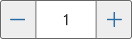
Quantity Selector + Button
Button Bottom
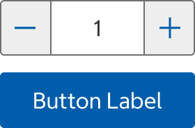
Button Right

States
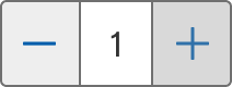
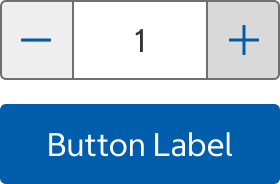
Default
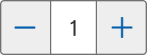
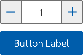

- The state before the user has interacted with the component

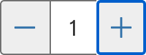
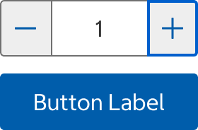
Focus
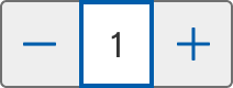
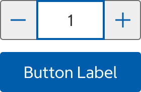

- The focus state appears when the user has tabbed to the input field or is entering a quantity.

Disabled
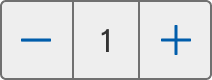
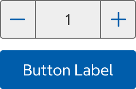

- Use the disabled state sparingly. The most common use case is when the Quantity Selector is communicating with the server; it is temporarily disabled to prevent users from making additional selections until the submission is processed.
Submitted (Available for Quantity Selector + Button)
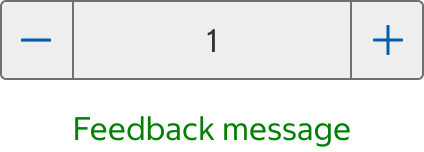
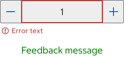
- Use this state if you want users to make changes without resubmitting the form. The button disappears after the initial submission.
Error
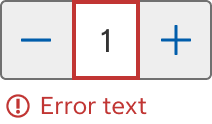
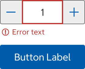
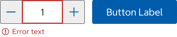
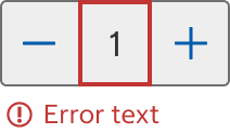
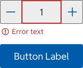
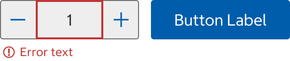
- When the selected increment is not accepted, error text should display instructions on how to fix it.
Usage
Ensure that the Quantity Selector is accompanied by sufficient context, and when necessary, provide additional text near the Quantity Selector to clarify the meaning or purpose.
Content
- Always set a default value. Typically, this is the first increment. For example, on the Product Listings Page (PLP) and Product Details Page (PDP), the Quantity Selector is set to 1.
- When the Quantity Selector’s increment unit is not clear, consider adding the unit in the input field
Error Text
- Error text provides instructions on how to fix the error.
- Use sentence case with end punctuation.
Behavior
- When the user selects the increment button, the input field increases by one increment.
- When the user selects the decrement button, the input field decreases by one increment.
- The user can input the quantity directly into the input field, and the input should be limited to numerical values.
- When the component is interacting with the server, the Quantity Selector is momentarily disabled.
- When using the Quantity Selector's input field on touch devices, the virtual keyboard should display the numeric keypad.
- In the Quantity + Button variant, if the submitted state is active and the user navigates away or refreshes the page, the component reverts to its default state.
Error
Quantity Selector
- An error message displays under the Quantity Selector.
Button Placement on Bottom
- An error message displays under the Quantity Selector, above the button.
Button Placement on Right
- An error message displays under the Quantity Selector with Button.
Structure
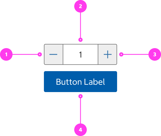
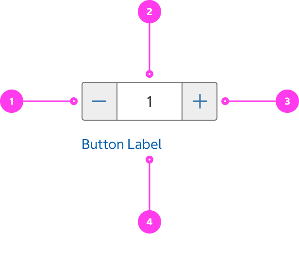
- Decrement button
- Input field
- Increment button
- Button: accepts a primary button or text button
Accessibility
Keyboard Accessibility
[AC1] When there is a quantity selector on the page:
- Focus can be moved to the quantity selector’s input field as well as the increase and decrease buttons.
[AC2] When focus is on a quantity selector’s input field:
- The focus indicator is clearly visible.
- Numbers can be typed inside the input field.
[AC3] When focus is on the increase or decrease buttons:
- Pressing ENTER or SPACE increases or decreases the current quantity.
[AC4] When an error is triggered:
- Focus should move to the input field.
Screen Reader Output
[AC1] When a screen reader user TABS to the increase and decrease buttons:
- Name: The name of the button is announced.
- Role: The role of “button” is announced.
Example Output: “Increase Quantity button”
- Name: “Increase Quantity”
- Role: “button”
[AC2] When a screen reader user TABS to the input field:
- Name: The name of the input field, “Quantity”, is announced.
- Role: The role of “edit” is announced.
- The current value in the input field is announced.
Example Output: “3, contents selected, Quantity, edit”
- Name: “Quantity”
- Role: “edit”
- Current value: “3”
[AC3] When the user triggers the increase or decrease buttons:
- The new current quantity value is announced.
Example Output: “4 Quantity” [AC4] When the user triggers an error within the quantity selector:
- The error message is announced.
Example Output: “Error: We’re sorry, only 5 are available for item 167116. Please adjust your quantity and try again.”
Developer Notes
- Use semantic HTML:
- Use <button> elements for the increase and decrease buttons.
- Use <input type=”text”> for the input field.
- Use inputmode=”numeric” on the input field to enable the numeric input keyboard for mobile users.
- Use aria-label to label the quantity selector buttons and input field.
- Use aria-describedby to associate the error text with the input field.
- Use aria-label to provide an accessible name for the error icon.