
Date Picker
A visual way to select a date from a calendar.
 View in Storybook
 View Figma Specs
 View Source Code
Guidelines
When to Use
- Use when a single date close to today’s date needs to be selected.
When Not to Use
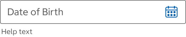
- If the expected date is many years in the future or past, such as date of birth, use a set of Text Fields instead.
Do
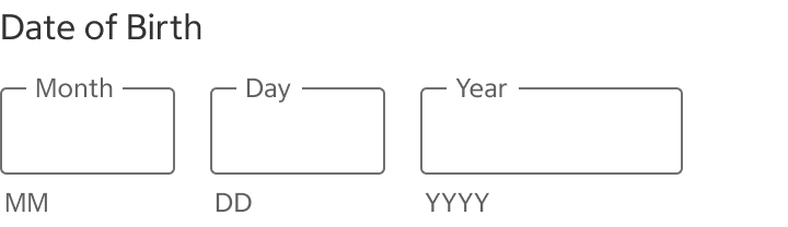
Do Not
Variants
Date Picker Field
- The date picker field shows what type of date is needed and any related information (such as errors or help text).
Date Picker Calendar
- The date picker calendar shows how the calendar displays. There are two different calendars: Mobile (Phone and Tablet) and desktop. The mobile calendar displays like a modal while the desktop version displays beneath the date picker field.
Date Picker Field
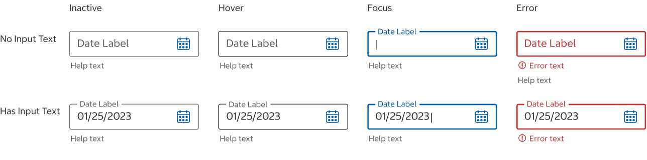
States
Inactive
- The default state before the field is hovered, focused, or selected.
Hover
- The hover state appears while the pointer is over the field and indicates that it’s interactive.
Focus
- The focus state appears when the user has tabbed to the field.
Error
- When an input isn’t entered into a required field, error text should display instructions on how to fix it.
Content
Label
- The label should indicate what type of date is needed, such as Delivery Date.
- Keep label text concise and always visible.
- Use title case for the label.
Input Text
- The input text date format is MM/DD/YYYY.
- The input text should be left-aligned.
Help Text
- The date format (MM/DD/YYYY) may optionally be shown as help text below the field.
Error
- Error text provides instructions on how to fix the error.
- Use sentence case with end punctuation.
Behavior
Label
- When the field is selected, its label moves to the top of the field as a floating label. Do not use placeholder text instead of labels.
Input Text
- Selecting the input area will open the date picker calendar.
- Dates can only be selected by choosing a date from the calendar.
- Manually entering a date into the date picker field is not supported at this time.
Error
- Error text appears below the field. If using help text, error text should appear above the help text.
- Error text is displayed until the error is fixed.
Structure
Date Picker Field
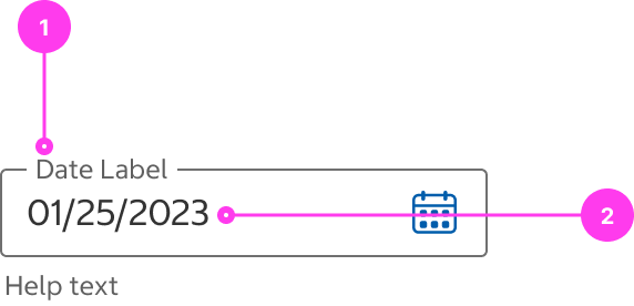
- Input area
- Label
- Calendar icon
- Help text (optional)
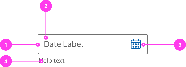
Date Picker Field with Input Text
- Floating label
- Input text
Sizing
- The date picker field has a fixed height.
- The width of the date picker field can be resized.
Date Picker Calendar
Content
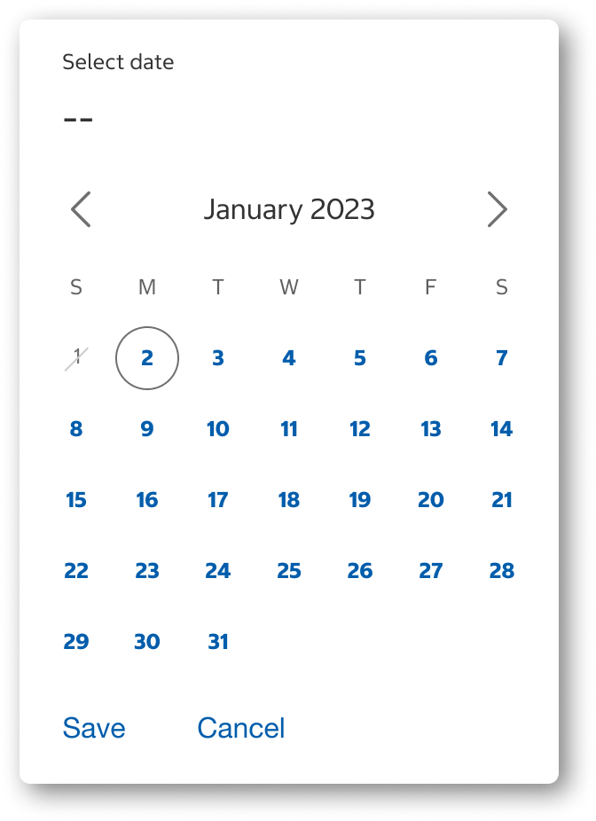
- The current month should display by default with today’s date circled.
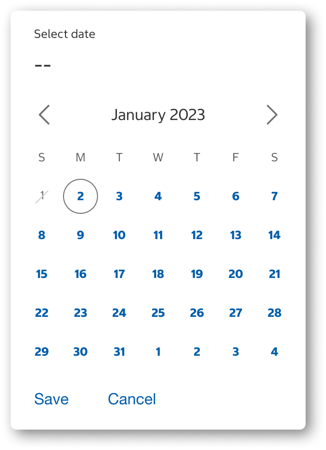
- Only dates for the displayed month should be shown in the calendar.
- Additional rows for weeks can be added or hidden, as needed.
Do
Do Not
Behavior
All Calendars
- Enabled/available dates are selectable.
- Disabled dates cannot be selected.
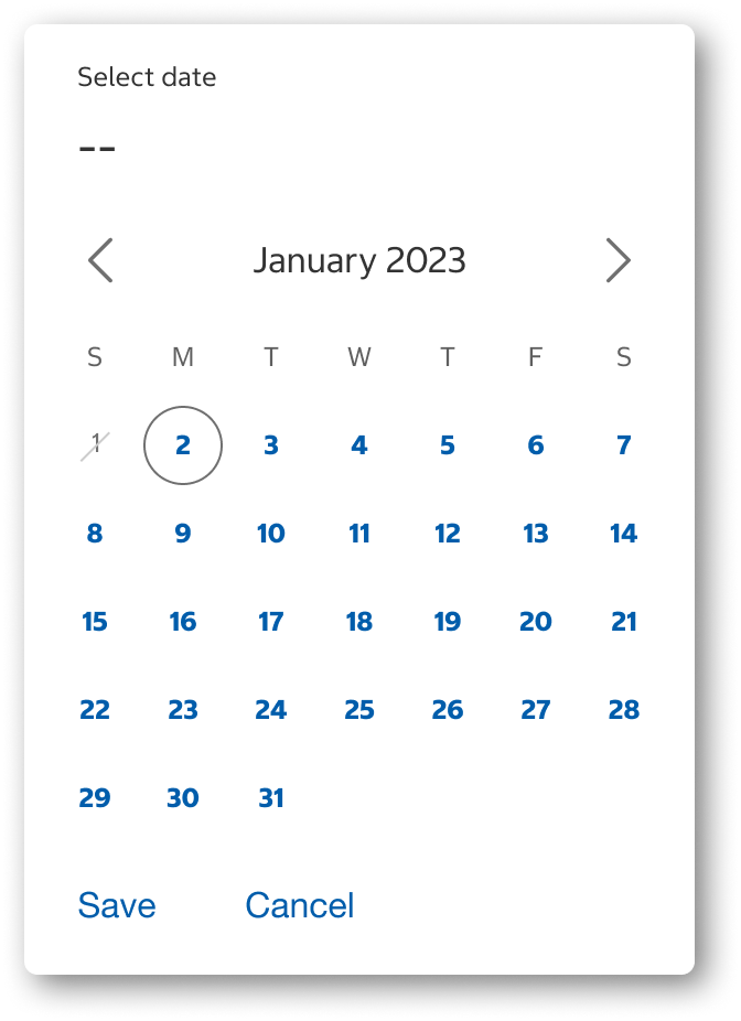
- Today’s date may be in an enabled/available or disabled state.
Today's date enabled
Today's date disabled
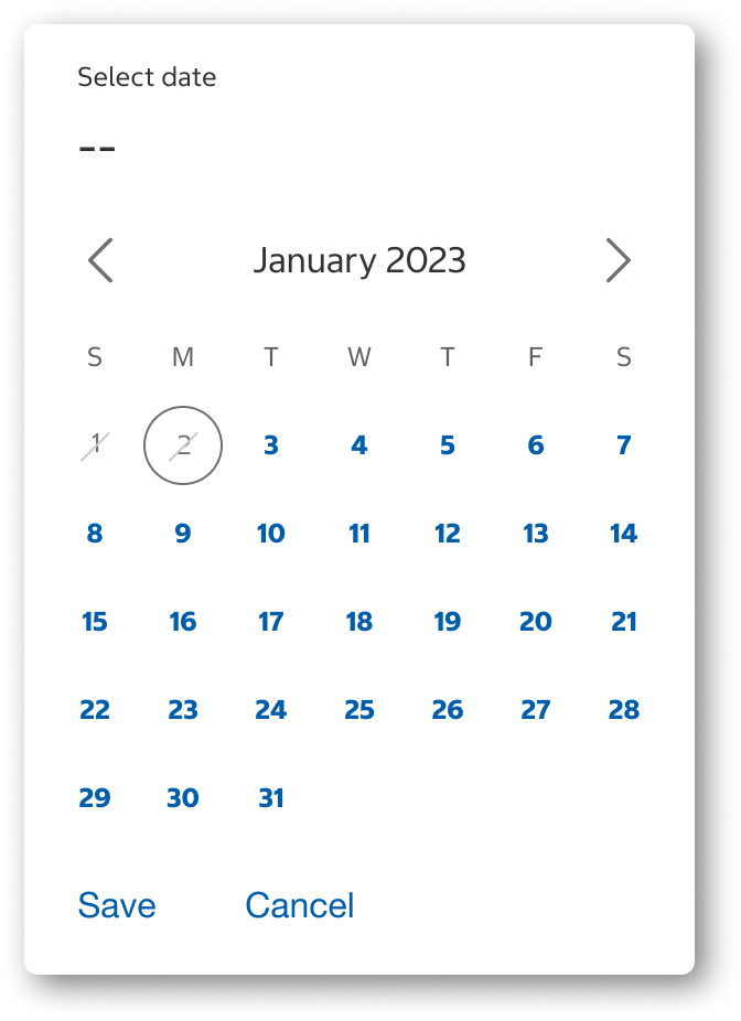
- Dates can only be selected by choosing a date from the calendar.
- Manually entering a date into the date picker field is not supported at this time.
- If a date has been chosen and the calendar is opened, the selected date will display in a selected state in the calendar.
Selected date shown in calendar
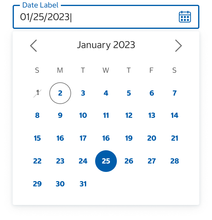
- Selecting the left chevron will display the previous month.
- Selecting the right chevron will display the next month.
Mobile (Phone and Tablet) Calendar
- When a date is selected from the calendar, the date will display below the “Selected Date” text.
- After a date is chosen and “Save” is selected, the calendar will close and the date will display in the date picker field.
- The mobile calendar can be closed without choosing a date by selecting “Cancel” or selecting outside the calendar.
Desktop Calendar
- When a date is selected from the calendar, the date will display in the date picker field and the calendar will close.
- The desktop calendar can be closed without choosing a date by selecting outside the calendar.
- If help text is shown with the date picker field, the desktop calendar should be displayed below it so the help text is still visible.
Placement
Mobile (Phone and Tablet) Calendar
- The mobile calendar is centered horizontally and vertically on the screen.
Desktop Calendar
- The desktop calendar will display below the date picker field in a left-aligned docked state.
- If there is not enough room to show the calendar below the field, the calendar will display above the field in a left-aligned docked state.
Structure
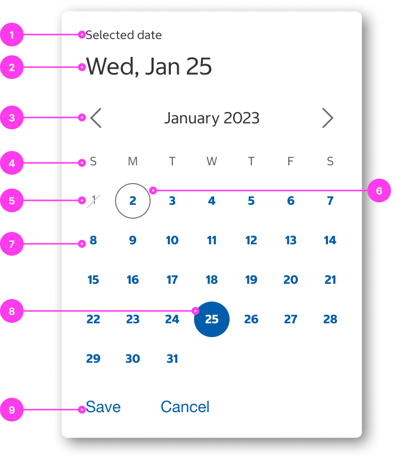
Mobile Date Picker Calendar
- Select/Selected date label
- Selected date text
- Calendar month navigation
- Weekdays label text
- Disabled date
- Today’s date
- Enabled date
- Selected date
- Buttons
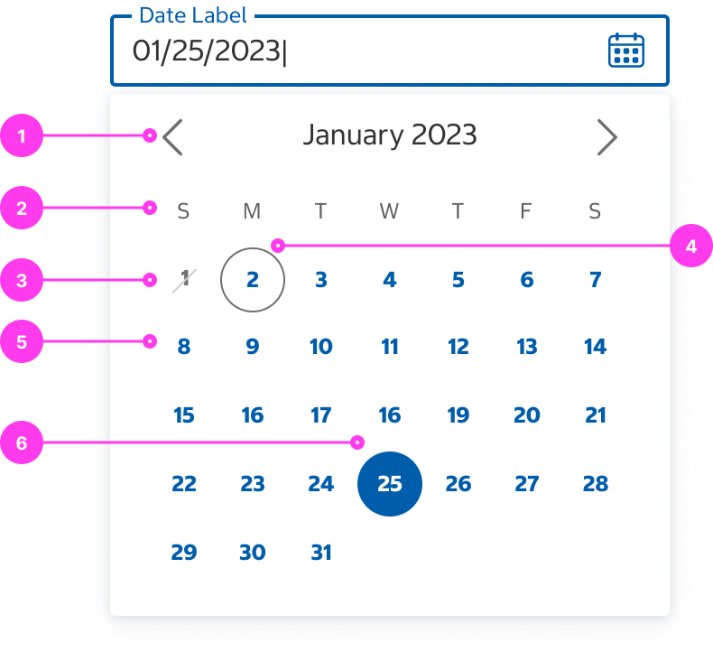
Desktop Date Picker Calendar
- Calendar month navigation
- Weekdays label text
- Disabled date
- Today’s date
- Enabled date
- Selected date
Sizing
- The height of the calendars depends on the number of weeks in the displayed month. The width is fixed. They do not resize responsively.
Accessibility
Keyboard Accessibility
[AC1] When there is a date picker on the page:
- Focus can be moved to the date picker button using TAB.
[AC2] When focus is on the date picker button:
- The focus indicator is clearly visible.
- Pressing ENTER or SPACE triggers the date picker calendar.
[AC3] When the date picker calendar is triggered:
- Focus moves to the date grid.
[AC4] When the date picker calendar is open:
- Pressing ESCAPE closes the calendar.
- Pressing TAB moves focus to the different TAB groupings within the calendar (month navigation buttons, date buttons, and save/cancel buttons).
- The date grid is navigable using the ARROW KEYS.
- When focus is on a date button, pressing ENTER or SPACE selects the date.
[AC5] When the date picker is closed:
- Focus returns to the date picker button.
Screen Reader Output
[AC1] When a screen reader user TABS to the date picker:
- Name: The name of the button, “Choose Date”, is announced. If a date is currently selected, the current date is announced.
- Role: The role of “button” is announced.
Example Output: “Choose Date, selected date is Mar 17th, 2025 button”
- Name: “Choose Date, selected date is Mar 17th, 2025”
- Role: “button”
[AC2] When a screen reader TABS to the calendar navigation buttons:
- Name: The name of the button is announced.
- Role: The role of “button” is announced.
Example Output: “Next month button”
- Name: “Next month”
- Role: “button”
[AC3] When a screen reader user presses DOWN ARROW into the date grid:
- Name: The month and year are announced.
- Role: The role of “table” is announced.
- The number of columns and rows in the table is also announced.
Example Output: “February 2026 _table with 7 columns and 6 rows”
- Name: “February 2026”
- Role: “table with 7 columns and 6 rows_”
[AC4] When a screen reader user presses DOWN ARROW to a date:
- Name: The day of the week and day number are announced.
- Role: The role of “button” is announced.
- State: If applicable, the current state is announced (“selected” when a date is currently selected).
Example Output: “Friday 14 button selected”
- Name: “Friday 14”
- Role: “button”
- State: “selected”
Developer Notes
- The date grid should be nested inside a semantic HTML table.
- The HTML table should have an aria-labelledby pointing to the month and year.
- Days of the week should have aria-labels exposing the full day name to screen reader users.
- Example: <span aria-label=”Monday”>M</span>
- Use aria-labels to label calendar navigation buttons.
- Use aria-selected=”true” to indicate when a date has been selected.
In the Wild
Coming soon.