
Formatting Text
Dollar Amounts
Dollar amounts should be highly visible, easy to scan, and easy to understand when displaying on the website or app.
Use Consistency Within the Same UI Context Users compare prices quickly. Consistency helps scanning. Use one dollar amount format across an interface (ex. Lists, Order History). For additional main price or total cost of an item guidance, see Using the Pricing Features Format.
General Guidelines
| ✅ Do | Why |
|---|---|
| Display cents with the same typography baseline, in the same readable type treatment and as part of one price: $49.99 | Easy to scan and understand. |
| Drop the .00 if the amount is a whole number: $25, $50, $100 | Easy to scan and understand. |
| Use .00 when it adds clarity or supports comparison: $25.00, $50.00, $100.00 | For tabular format or comparison heavy layout or for better visual alignment. |
| Always use thousand separators (commas): $1,000 | Easy to scan and understand. |
| Abbreviate large amounts using capital letters, but drop cents entirely: $1.2M or $45K | Easy to scan and understand by reducing cognitive load on overly large numbers. |
| 🚫 Don't | Why |
|---|---|
| De-emphasize (i.e. use different font colors, styling or layouts) cents so much that users have to work to read the full amount | More difficult to scan and interpret price clarity quickly. |
| Mix amounts with and without .00 in the same UI context: $25, $50.00, $100 | Not easy to scan. Adds unnecessary visual noise because users have to normalize the formatting. |
Using the Pricing Features Format
The Costco Sans font includes a specific feature called Price Figures that can be used to format the main price or total cost of an item using a smaller “$” and superscript cents.
Example
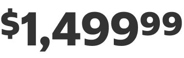
Price Figures (used in Figma, Adobe and referred to in code) are not meant to be used to display price in every instance, and is not permitted for use in Canada. For additional pricing guidelines, see Dollar Amounts.
| ✅ When to Use | 🚫 When NOT to Use(See Dollar Amounts) |
|---|---|
| Marketing (eComm Content) | Inline with text |
| Product Details Page or Product Tiles (Search, PLP, Cart, Checkout) | Product prices on other web/app pages (Lists, Order by Item, Wallet, Order History etc.) |
| Order Summary “Order Total” in Checkout & Order Details | Order Summary line items: Subtotal, discounts/promo codes, fees, tax, etc. |
| US website/app, International websites/apps | Canada website/app |
Page Titles
Ensure page titles are consistent on all pages and clearly identify the purpose of the page. Page titles should be the largest font size relative to other section headers to maintain visual hierarchy and clearly stand out (see Typography). Keep them concise, clear, and always use title case. Avoid unnecessary filler words such as “Welcome to” or “Page for”.
Example: Checkout
Example: Add New Address
Phone Numbers
Consistent formatting should be used for usability and legibility.
The North American Numbering Plan (NANP) Formatting
The NANP is used in the US, Canada, and several Caribbean nations. The standard format consists of a 1-digit country code (1), a 3-digit area code, and a 7-digit local number.
NANP Display Format
For display purposes use the following:
| Number | Format | Example |
|---|---|---|
| Non-Toll Free Number (country code optional) | +1 (XXX) XXX-XXXX | +1 (425) 555-0123 |
| Toll Free Number | 1-XXX-XXX-XXXX | 1-800-545-0123 |
Outside North America / International Phone Number Formatting
International numbers follow the E.164 standard, which dictates that a phone number should be formatted as: [+][country code][national destination code][subscriber number].
- Maximum length: Up to 15 digits
- Required prefix: Always include the + sign
- No parentheses or hyphens
- Spaces may be used to separate country code, national destination code, subscriber number
Display Format and Components
For display purposes use the following format:
| Country(Example) | Country Code | National Number | Format | Full E.164 Example |
|---|---|---|---|---|
| UK | +44 | 20 7946 0000 | +44 XX XXXX XXXX | +44 20 7946 0000 |
| France | +33 | 6 12 34 56 78 | +33 X XX XX XX XX | +33 6 12 34 56 78 |
Dates
Maintain a consistent date format within the same design context instead of switching formats unnecessarily.
Numeric Date Formats: MM/DD/YYYY
Use numeric date formats to improve scannability and quick comparisons in compact layouts.
Example: 12/31/2014
| ✅ When to Use | 🚫 When NOT to Use |
|---|---|
| Data grids, Repeated lists, Spatially constrained designs, such as transaction history, logs, receipts, and timestamps | Page titles, Section headers, Marketing banners |
Leading Zeros
-
Omit leading zeros in single-digit months and days for most member-facing designs.
Example: 1/4/2015
-
Leading zeros may be retained in data-heavy contexts or in fixed-length contexts to maintain consistent string length.
Example: 01/04/2015
-
When in doubt, use textual formats to eliminate confusion between month and day. For international designs or technical documentation, consider using the ISO standard format, displaying largest to smallest units: YYYY-MM-DD.
Example: 2015-01-04
Textual Date Formats: Month DD, YYYY
Using textual formats improves visibility and comprehension and helps prevent any confusion between the month and day.
Example: December 31, 2014
| ✅ When to Use |
|---|
| General titles, Body copy, Legal disclosures, High-visibility UI elements, such as membership details, card titles, delivery estimates, and appointment details |
When communicating time-sensitive information in the near future, such as delivery windows, warehouse closures, or appointment slots, include the day of the week for maximum clarity.
Example: Wednesday, December 31
Abbreviation
Always spell out March, April, May, June and July. When paired with a date, abbreviate as follow:
| Month | Abbreviation |
|---|---|
| January | Jan |
| February | Feb |
| March | March |
| April | April |
| May | May |
| June | June |
| July | July |
| August | Aug |
| September | Sept |
| October | Oct |
| November | Nov |
| December | Dec |
| ✅ Do | 🚫 Don't |
|---|---|
| April 25 | Apr 25 |
| Sept 25 | Sep 25 |
Phonetic Helpers
Omit all phonetic helpers.
| ✅ Do | 🚫 Don't |
|---|---|
| Sept 25 | Sept 25th |
Punctuation
Do not put a comma between the month and the year.
| ✅ Do | 🚫 Don't |
|---|---|
| September 2026 | September, 2026 |
Include a comma between the day and year.
| ✅ Do | 🚫 Don't |
|---|---|
| Sept 25, 2026 | Sept 25 2026 |
Include a comma between the day of the week and the month.
| ✅ Do | 🚫 Don't |
|---|---|
| Wednesday, September 25 | Wednesday September 25 |
Put a comma on either side of the year if the day and the year fall in the middle of a sentence.
| ✅ Do | 🚫 Don't |
|---|---|
| The warehouse will open Sept 25, 2026, in Utah. | The warehouse will open Sept 25, 2026 in Utah. |
Relative Dates
Use relative date formats for recent or immediate actions such as notifications and tracking. It saves users from having to do extra mental math to figure out the exact timeframe of an event.
Examples:
- Delivered today
- Open at 9 AM tomorrow
Form Fields & Inputs
When designing forms, match the date format to the input method to optimize data entry and reduce submission errors.
Typed Inputs
Use numeric formats when members type a date into a text field or masked input. Include leading zeros to maintain input alignment and match system mask constraints.
Examples:
- Filter, Date Picker, or free entry in Text Field: 01/04/2015
- Payment Expiration Dates: 01/28 (MM/YY to match the actual payment card)
Selection Inputs
Use textual formats when members select dates from Select dropdown menus, device native segment controls, or picker menus. Textual formats reduce cognitive load and eliminate month/day confusion during selection.
Examples:
- Month Selection Menu: January, February, March
- Day Selection Menu: 1, 2, 3 (omit leading zeros)
- Year Selection Menu: 2026, 2027
Long Date Formats
Use long date formats sparingly. Combining four date units (Day of Week, Month, Day, Year) creates dense text that reduces scannability. Reserve this format exclusively for high-impact moments where maximum clarity is essential.
Example: Wednesday, December 31, 2014
Date Ranges
When displaying a range of dates, use an en dash ( — ).
Numeric Date Ranges
Use an en dash without spaces on either side for numeric ranges. This creates a tight, unified block that is easy to scan in data tables and filter inputs.
Example: 12/1/14—7/5/26
Textual Date Ranges
Use an en dash with spaces on either side for textual ranges. The spaces prevent adjacent letters and numbers from feeling crowded, improving legibility in marketing banners, savings schedules, and delivery windows.
Example: June 1 — July 5, 2026
Same-month Ranges:
Drop the repeated month to reduce clutter.
Example: June 1 — 6, 2026
Cross-year Ranges:
Include the year on both dates if the range spans across multiple years.
Example: June 1, 2026 — May 31, 2027