Status Badge
The Status Badge is a non-interactive, informative component that displays a status.
 View in Storybook
 View Figma Specs
 View Source Code
Guidelines
When to Use
- Use Status badges to indicate the state of a process or item, such as "Success,","Not Verified,", or "Expired."
- Use Status badges to notify users of important events or changes that require immediate action, such as “4 New”, or “Low Balance.”
When Not to Use
- Do not use Status badges to inform users of a change in our system’s state, such as if the system is down—Instead use a [Notification] 1.
Variants
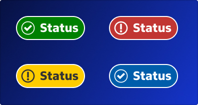
There are four types of status badges and two color variations for each:
Types
Success
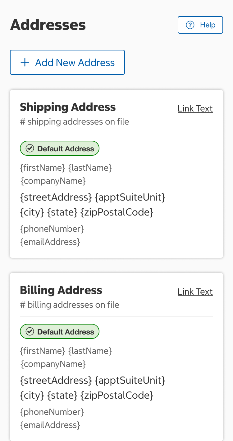
- Green success badges identify if something is ready for an action to be taken, such as "Ready for Pick-Up”, or an action was set, such as “Default Address.”
- An icon (circle with checkmark) is optional.
Alert
- Yellow alert badges identify something is in progress, such as “Contacting Insurance.”
- An icon (circle with exclamation point) is optional.
Critical
- Red critical badges identify if something needs attention or an action is required such as "Expired."
- An icon (circle with exclamation point) is optional.
General
- Blue general badges identify if something is informational in nature, such as “Preparing”, or “Delivered.”
- An icon (circle with checkmark) is optional.
Colors
Light Background
- Light background color variant of the status badge should be used on light backgrounds.
Dark Background
- Dark background color variant of the status badge should be used on dark backgrounds.
Usage
- Dark background color variant should be used on dark backgrounds, and light background color variant should be used on light backgrounds.
Status badge in use where background is a dark color.
Content
- Status text should be short and written using title case.
- An icon may be used with the status text for additional emphasis. The icon must have a strong association with the text.
- Status badges can be used without an icon, but all status badges should have text.
- The status text will wrap to the next line if it does not fit in the available horizontal space.
Structure
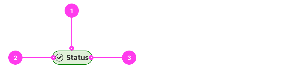
Key
- Container
- Icon (optional)
- Status text
Sizing
- Status badges grow in width with the status text. The height grows if the text wraps to multiple lines.
Spacing
- When using multiple Status badges use an 8px gap between each badge horizontally. Space multiple badges 8px vertically if they wrap to multiple lines.
Accessibility
Keyboard Accessibility
- No considerations for keyboard accessibility need to be made as status badges are not actionable.
Screen Reader Output
[AC1] When a screen reader user presses DOWN ARROW to navigate to a status badge:
- Name: The name of the status badge is announced.
- The icon should be hidden from screen readers.
Example Output: “Default Address”
Developer Notes
- The badge text alone should clearly convey the purpose of the badge. Badge colors and icons should only be for decorative purposes.
In the Wild
- Status badge use in Address Book