
Icon Implementation Guidelines
This page provides guidelines for implementing icons consistently across Web. It covers supported formats, platform-specific implementation, accessibility requirements, and best practices. It is intended for developers and Design System contributors to build consistent, production-ready UI.
Where to Find Icons
- All icons are available in Foundations and can be accessed in the internal asset library.
- Developers can also find icons on Forge.
Supported Formats
Icons are provided in different formats depending on the platform to ensure optimal performance and scalability. These guidelines are specifically focused on web. SVGs (Scalable Vector Graphics) are the supported format for web.
What is an SVG?
SVG (Scalable Vector Graphics) is a lightweight XML-based vector image format that allows for infinite scalability without loss of quality and is ideal for responsive web applications. Unlike raster images (PNG, JPG), SVGs remain sharp at any size, making them ideal for web and UI applications. Use SVGs over PNGs for scalability and performance.
Naming Conventions
Icons follow the Icon Naming Convention guidelines for consistency and standardization.
Platform Specific Implementation
Web
Using SVGs
For instance, to include the Calendar icon within your design implementation, you would use the following piece of code.
import { Calendar } from '@nxt-costco-com/forge-icons/icons/Calendar'
Accessibility Requirements
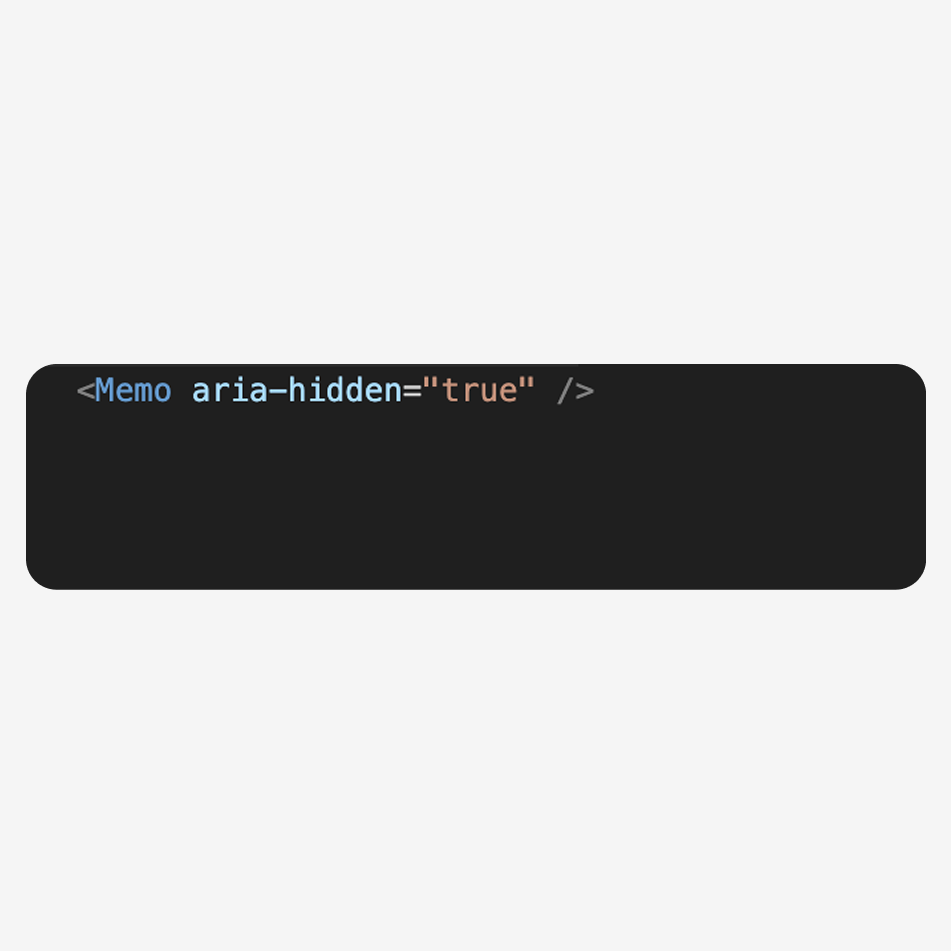
- Use aria-hidden="true" for decorative icons.
- Provide aria-label for meaningful icons.
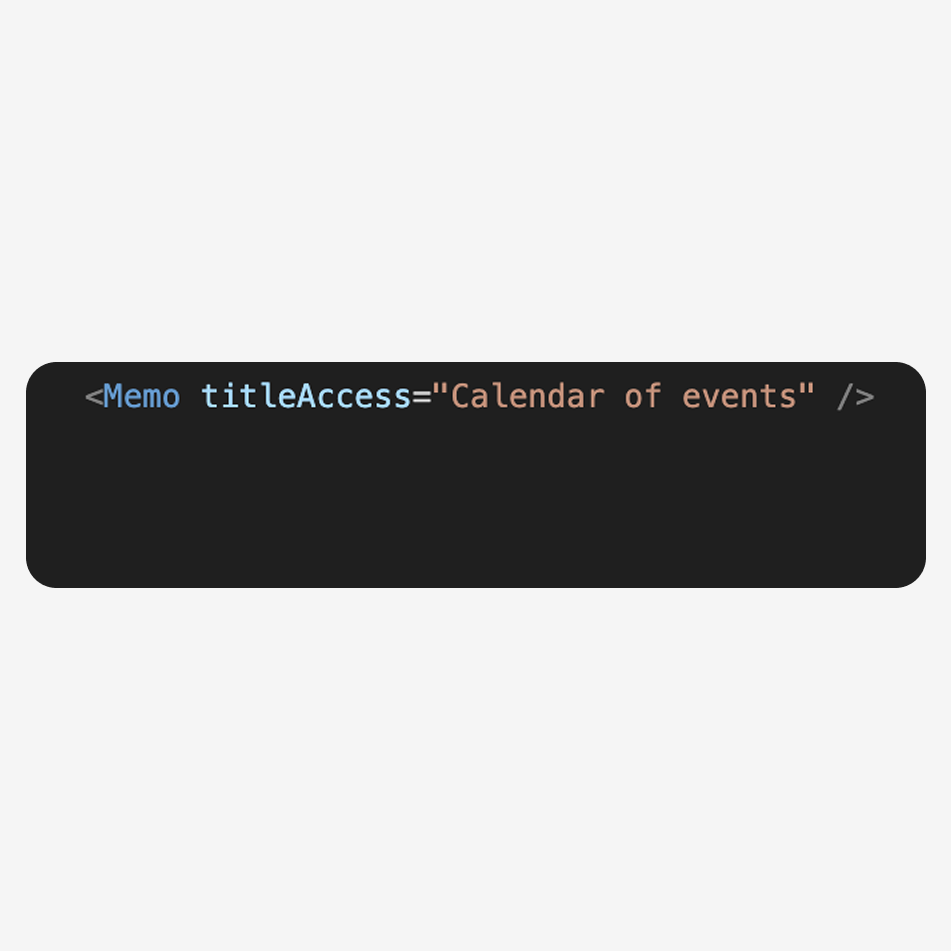
- Use the titleAccess property for screen readers. It is used to provide a descriptive title for an SVG element.
- This property is not used in case of decorative icons.
Here's a code snippet that shows how you would use the titleAccess property for informative icons.
<React.Memo titleAccess="Calendar of events" />
Common Mistakes & Best Practices
Do
Use vector-based icons like SVGs for scalability, performance, and crisp rendering.

Do Not
Use raster images such as PNG or JPG unless necessary.

Do
Ensure icons are accessible by adding an aria-label.
Do Not
Use icons for purely decorative elements without marking them aria-hidden="true".
Do
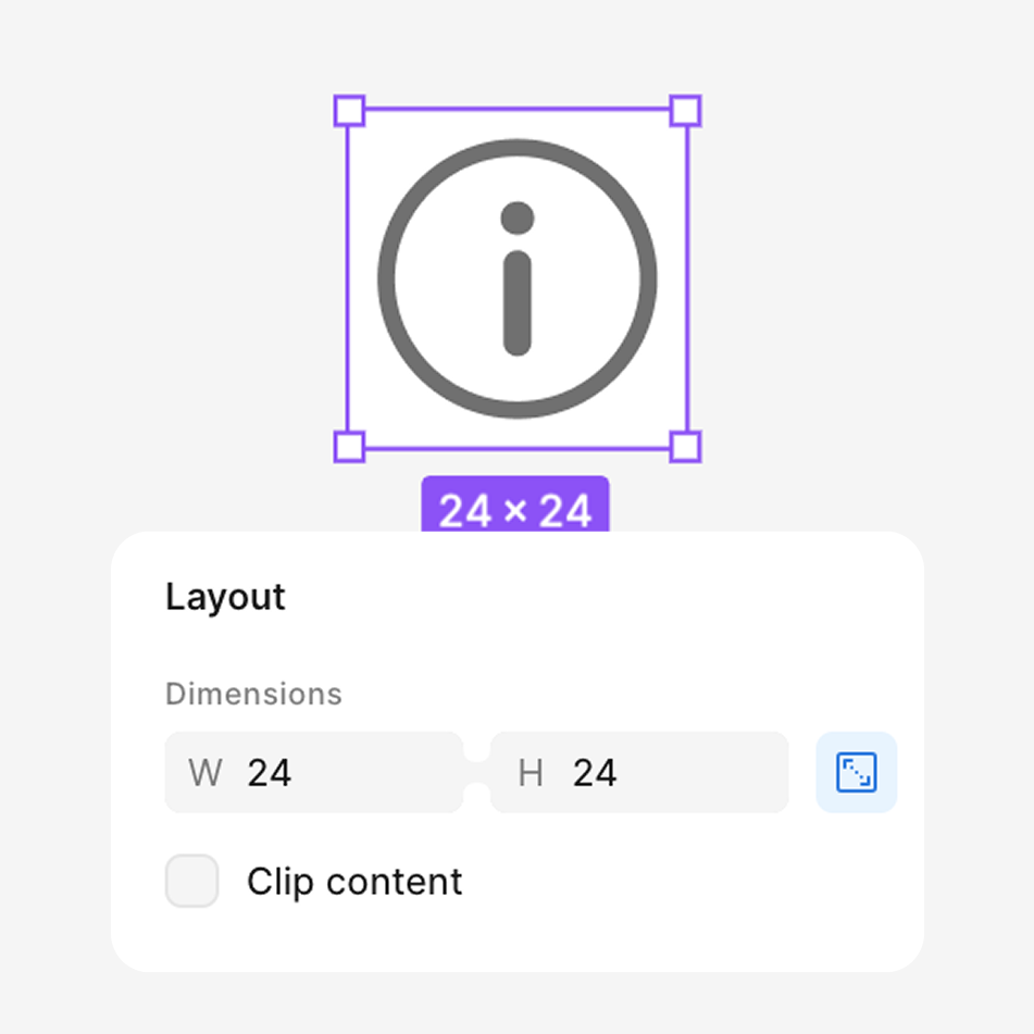
Follow platform-specific icon sizes and guidelines for optimal rendering.
Do Not
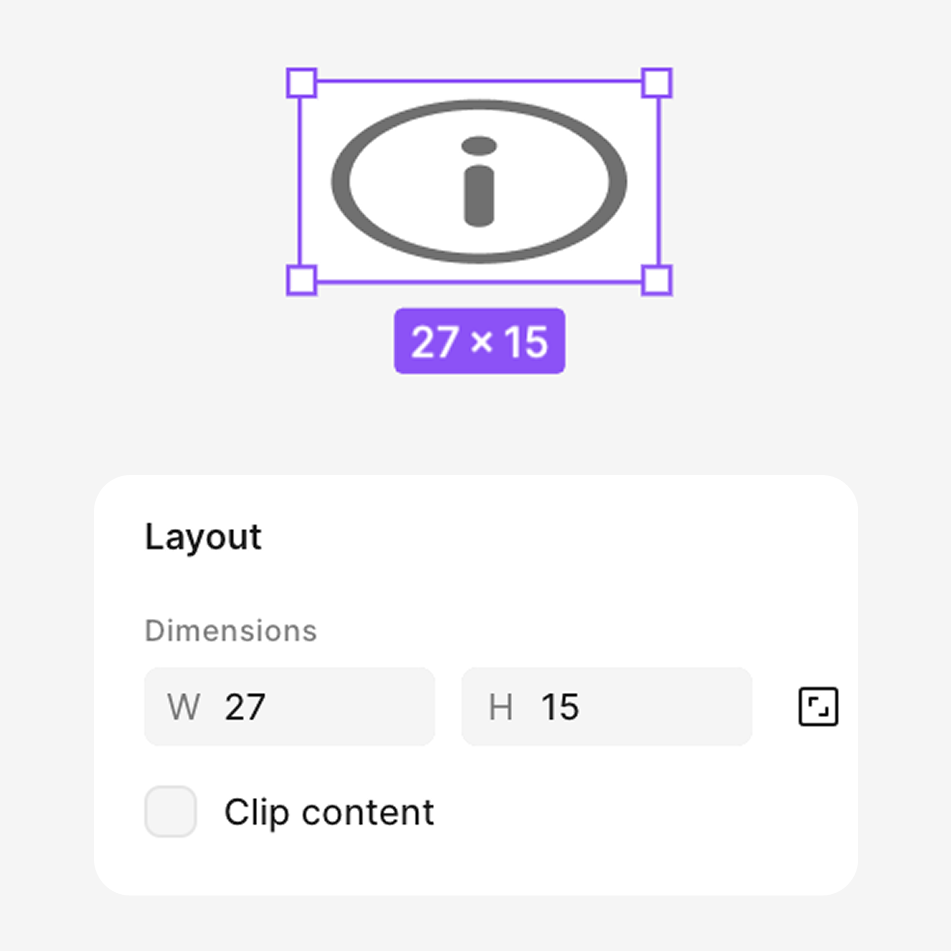
Stretch or distort icons; always maintain aspect ratio when resizing.
Do
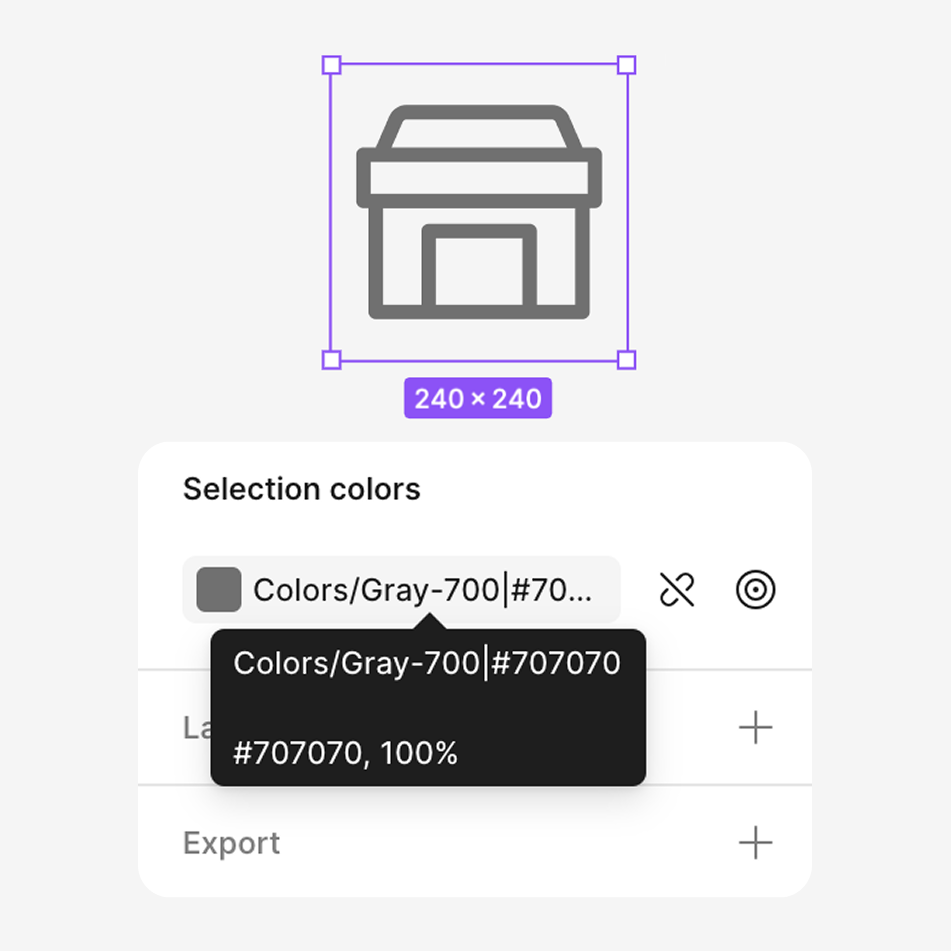
Use theming variables for colors instead of hardcoding values to support customization.
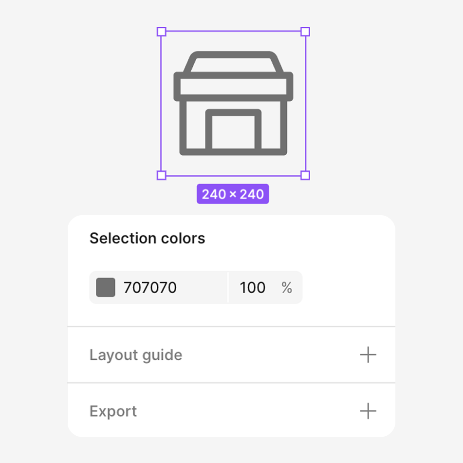
Do Not
Hardcode colors in your implementation, as this can break theming and accessibility.
Testing & QA
- Test on different screen sizes.
- Use accessibility testing tools like screen readers.
Resources & Support
- Pallet Design System's Icons (Figma)
- For support, reach out to designsystem@costco.com