
Design Tokens
Design tokens are the design system's named design decisions: every color, spacing step, and type style, defined once and generated for Web, iOS, and Android. Tokens originate in Figma and reach every platform through an automated build. Token definitions follow the DTCG format, an industry standard from the W3C Design Tokens Community Group for describing design tokens in JSON, so any compatible tool can read them. See the DTCG specification for details.
The Tier Model
Tokens are organized into three tiers. Semantic and composite tokens reference base tokens; references never point the other way.
| Tier | What it holds | Examples |
|---|---|---|
| Base | Raw values: color ramps, font primitives, spacing, radius, sizes, breakpoints | color.blue-40, space.md, font.size.300 |
| Semantic | Base colors assigned a usage role: text, border, state feedback | color.text.error, color.border.success, color.semantic.caution |
| Composite | Multiple properties that travel together as one token (unlike a token group, which is just a named collection). E.g., typography tokens, both standard and marketing, are composed of font size, line height, and weight. | typography.t1.lg, typography.b2.xs |
Only color has a semantic tier today. Spacing, radius, sizes, and breakpoints are consumed directly at base.
The rule: Use the tier that names your intent.
- Color: If a semantic token describes the role, use it: text (e.g.
color.text.link), border (e.g.color.border.error), state feedback (e.g.color.semantic.success). Reach for a base ramp (color.blue-40) only when no semantic token fits. If the same base value keeps recurring for the same purpose, request a new semantic token via the Pallet Design System Intake form [INSERT URL]. - Typography: Use a
typography.*style. The exception is a one-off "snowflake" text style with no matching typography token. Compose a style from the font primitives rather than raw values, and if the same combination keeps recurring, propose it as a typography token.
   One-off 14px semibold, tight leading — no matching typography token:

   snowflake style
   ├─ fontSize:    {font.size.200}         14px
   ├─ fontWeight:  {font.weight.semibold}  600
   └─ lineHeight:  {font.line-height.sm}   1.3
- Everything else (spacing, radius, size, breakpoints): Use the base token.
One Value, End to End Support Text




In the source JSON, each link in this chain is a DTCG alias: curly-brace syntax pointing at another token ("$value": "{color.semantic.error}"). Note the chain has two semantic links: semantic tokens may alias other semantic tokens. color.semantic.error holds the system-wide meaning of "error" and color.text.error narrows it to text, so a change to either lands at the right scope.
Change color.red-40 in Figma and every platform symbol updates on the next release, with no app code changes. The generated code preserves aliases (val error = red40 on Android, // alias of color.red-40 comments in the ES6 output).
Naming Conventions
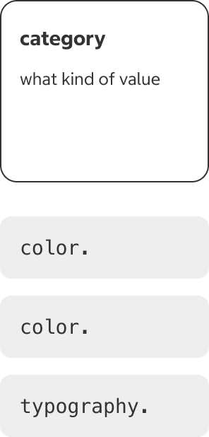
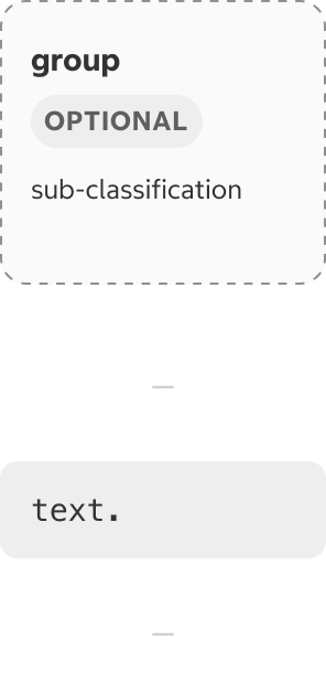
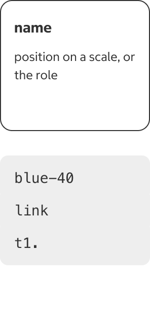
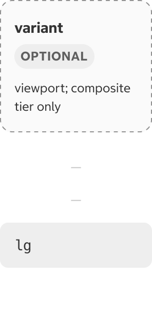
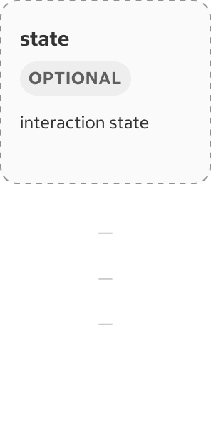
Every token name is assembled from the same ordered parts, called Slots. Each slot answers one question about the token (e.g., what kind of value? which one? which state?), and they run general to specific:
The Case Transform Rule
Source names are lowercase kebab-case (words joined by hyphens) in the JSON token files:
{
  "color": {
    "costco-blue": { "$value": "#005dab", "$type": "color" }
  }
}
Each platform applies one transform at build time; never hand-translate a name:





Using Tokens in Code
The tokens are in production; what's missing is a browsable token table on this site. Until it exists, the generated files delivered to your platform are the complete token list: the package's TypeScript declarations on web, and the Kotlin and Swift files delivered to each app repo.
Web
Install @nxt-costco-com/forge-design-tokens. Tokens are PascalCase ES6 constants with TypeScript declarations.
import { ColorTextError } from '@nxt-costco-com/forge-design-tokens';

<Text sx={{ color: ColorTextError }}>Something went wrong</Text>
See the usage guide.
iOS
Tokens ship as Pallet.swift (SwiftUI) and PalletUIKit.swift (UIKit). Colors are extensions on Color / UIColor; font primitives, spacing, and typography live under the Pallet / PalletUIKit namespace. Do not edit these files; they are generated.
Text("Something went wrong")
    .typography(Pallet.Typography.b2)   // applies font + line spacing together
    .foregroundColor(Color.Text.error)
Use .typography() rather than .font(...) alone, because .font silently drops the token's line height. See the usage guide.
Android
Tokens are delivered automatically as Kotlin objects: PalletColor, PalletSpace, PalletFontSize/PalletFontWeight/PalletLineHeight, and TypographyTokens (Compose TextStyles).
Text(
    text = "Something went wrong",
    style = TypographyTokens.b2,
    color = PalletColor.Text.error
)
See the usage guide.
Which Token Do I Use?
| I need… | Use | Not |
|---|---|---|
| A text color | color.text.default / color.text.medium / color.text.light / color.text.link / color.text.link-visited | color.gray-20 directly |
| An error / success / caution color | color.semantic.* (surfaces, icons), color.text.* (text), color.border.* (borders) | color.red-40 |
| A heading or body style | typography.t1–t4, b1–b3, l1–l3 | font.size.* + font.weight.* composed by hand |
| Padding, margin, gap | space.xxs–xxxl (or space.inset.* for uniform padding) | a raw px/dp value |
| A color with no matching role | the base ramp (color.blue-40); consider proposing a semantic token | a hex value |
| Marketing surface type | marketing-type.*, for marketing components only | using it for app text |
Anti-Patterns
- No hardcoded values. No hex colors, no raw px/dp/sp where a token exists. If no token expresses your intent, request one rather than inlining a value.
- Never edit generated files. Anything stamped
Do not edit directly(Pallet.swift, the delivered.ktfiles) is overwritten on the next release. - Don't invent tokens locally. New tokens enter the system through the Design Token team, so all platforms stay in sync. A constant defined in an app repo may look like a token, but it is disconnected from the system: it never updates when the design changes in Figma, and no other platform sees it. It is a hardcoded value with a token-style name.
- Don't use deprecated scales in new work. The color
100–900scale and v1 typography exist only for backwards compatibility. Each deprecated token's description names its replacement. - Don't skip a tier downward. A component shouldn't reach past an existing semantic token to the raw ramp. That breaks the cascade that makes rebrands and theming possible.