
Creating Icons
In this guide, we discuss the fundamentals of iconography in our design system. You’ll see below how we utilize keylines and grids to establish consistency, define stroke weight and style to ensure clarity, as well as create meaning through thoughtful naming. We also cover positioning, orientation, and proximity to improve usability, pair icons with text for accessibility, and apply strategies to avoid icon bloat.
Using Keylines and Grids
Keylines
Keylines in icon design guide proportions, spacing, and alignment to ensure consistent visual weight and harmony across icon sets. They typically include circles, squares, rectangles, and diagonal or perpendicular lines.
Keylines
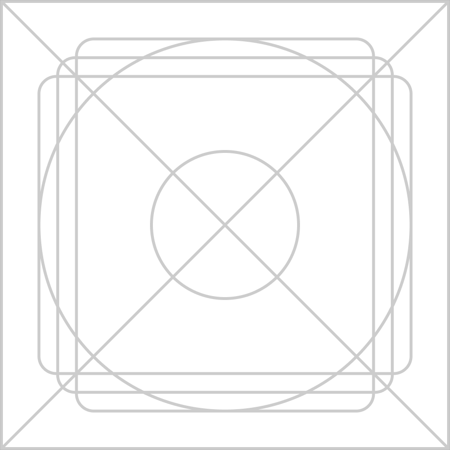
Rectangles
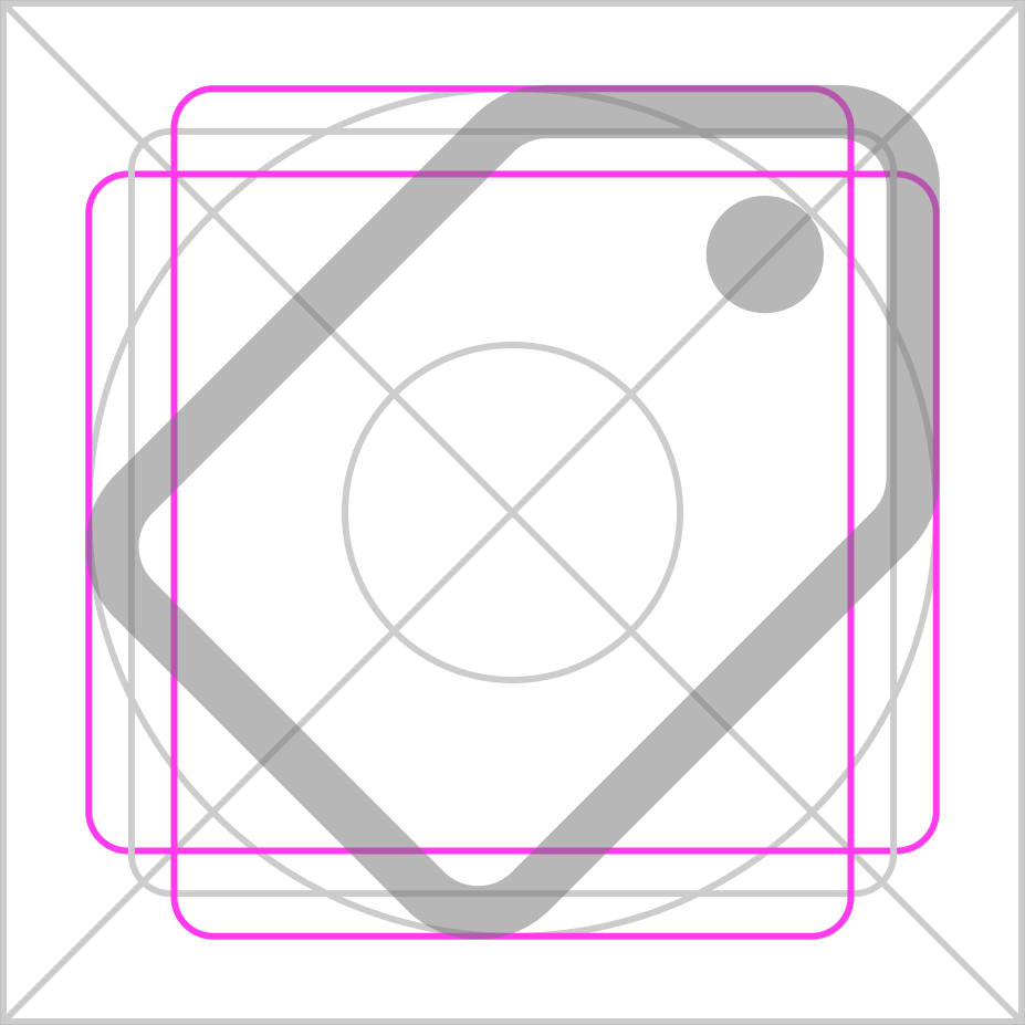
Circles
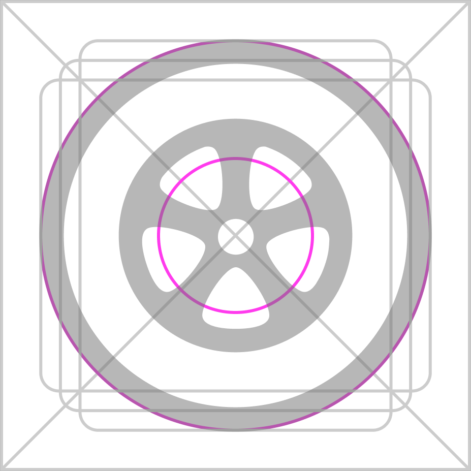
Grids
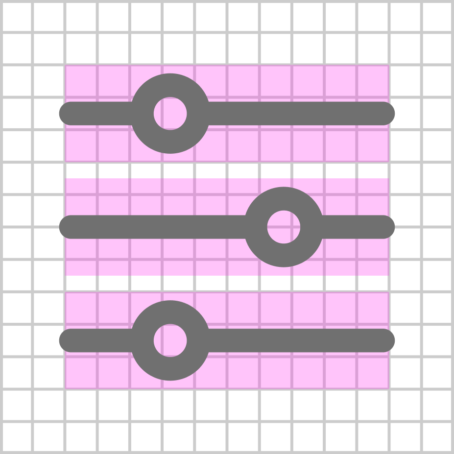
Grids provide a blueprint for visual harmony, ensuring icons stay consistent in size, spacing, and alignment. They guide element placement, making icons easier to create, update, and maintain across designs.
Grid
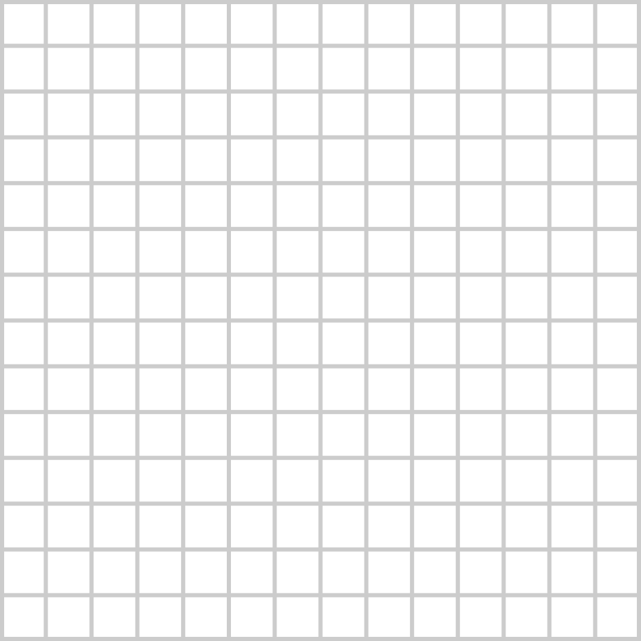
Icon designed to align with grid
Design
Size
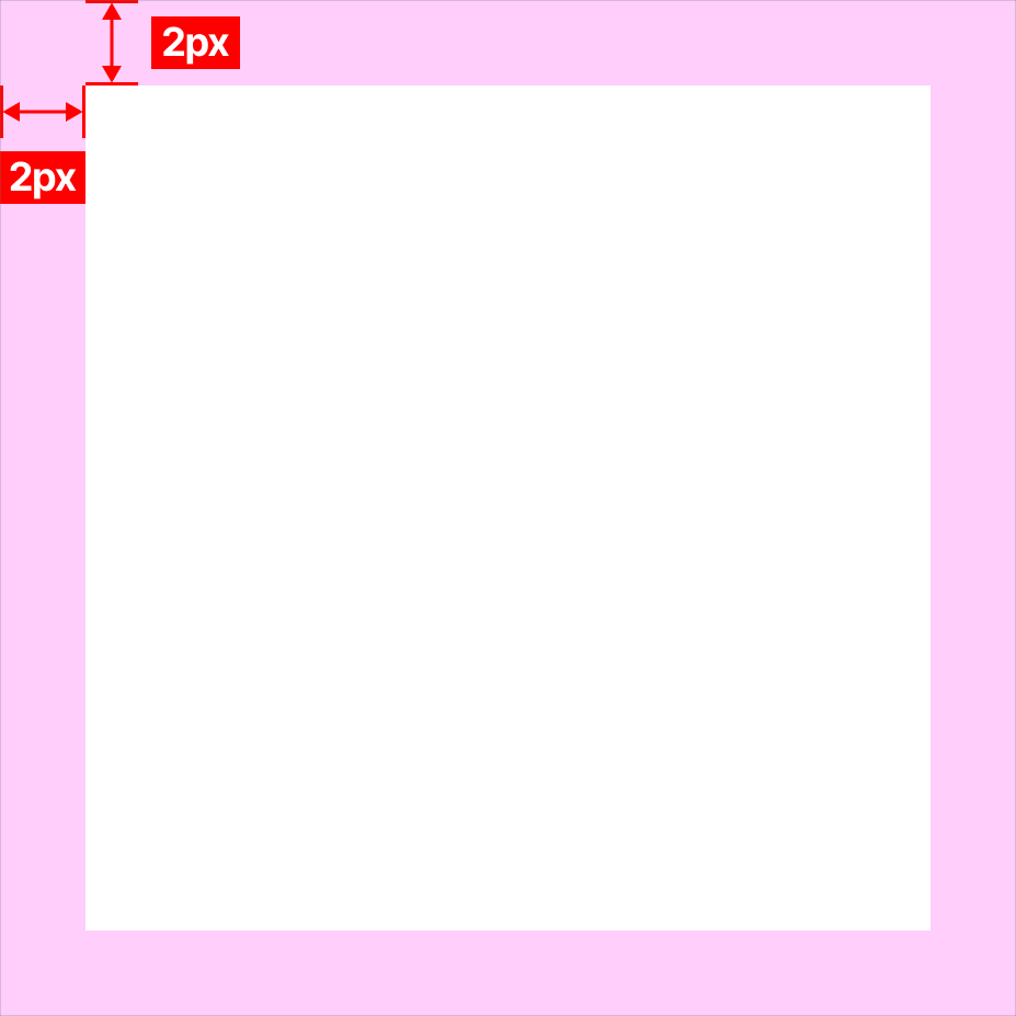
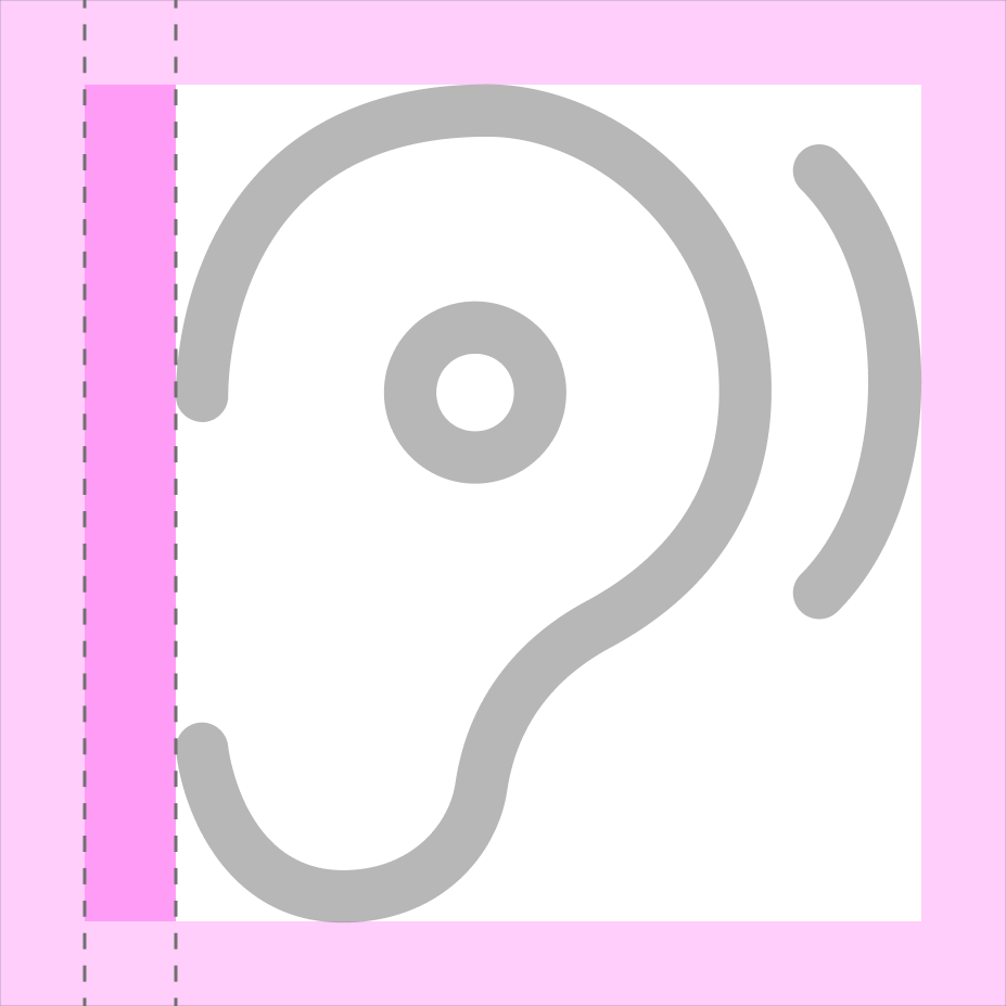
Each icon resides within a 24×24px frame and includes 2px padding on all sides to ensure clean boundaries and consistent spacing. Icons with non-square ratios or uneven visual weight may use extra padding or offsets to maintain balance and symmetry.
2px padding on all sides
Non-square ratio
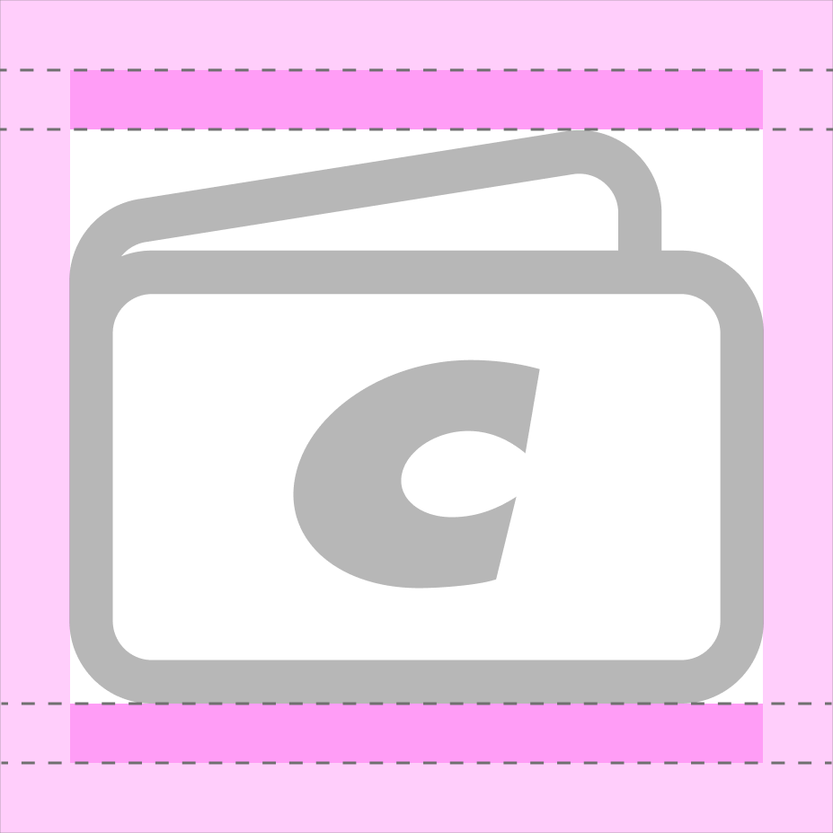
Uneven visual weight
Stroke Weight and Style
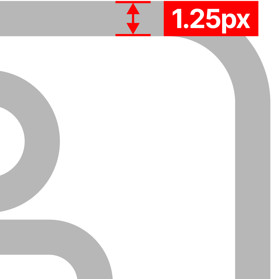
Use a 1.25px stroke for most icon elements to maintain consistency. Apply thinner strokes (0.75–1px) for finer details, and heavier strokes (up to 2.5px) for simple shapes like chevrons or checkmarks to enhance visibility. Rounded endpoints give icons a polished feel, while corner radii between 1–3px are standard for primary shapes. For smaller icons, minimal or no radius may improve visual clarity.
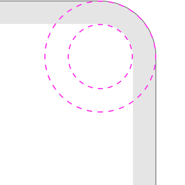
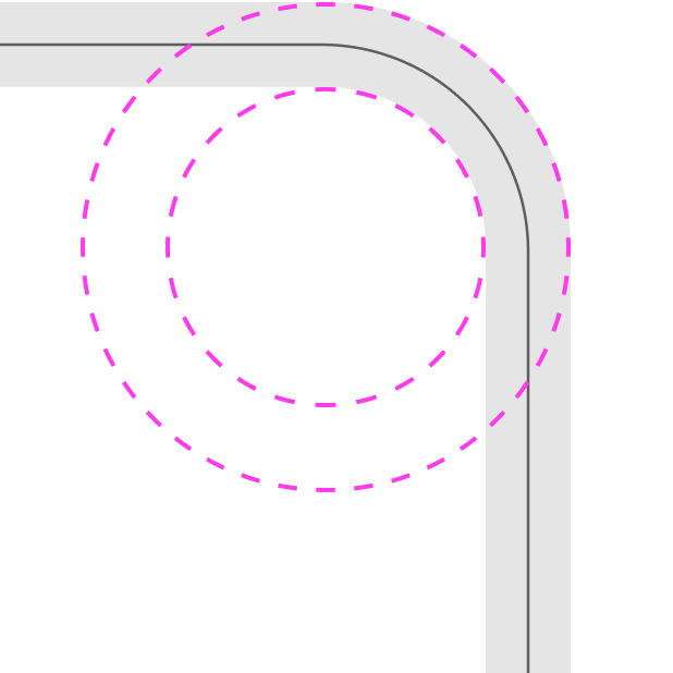
A corner’s apparent radius changes with stroke position, with the goal being optical consistency rather than strict mathematical precision.
- A centered stroke sits half inside and half outside the path, effectively expanding the visible corner by half the stroke width, which makes the corner look rounder than the numeric radius alone would suggest.
- An inside stroke stays fully within the shape, keeping the outer silhouette unchanged but tightening the visible corners, which makes the same numeric radius look sharper.
Stroke weight of 1.25px
Radius applied to a stroke with inside positioning
Radius applied to a stroke with centered positioning
Creating Meaning and Naming
Meaning
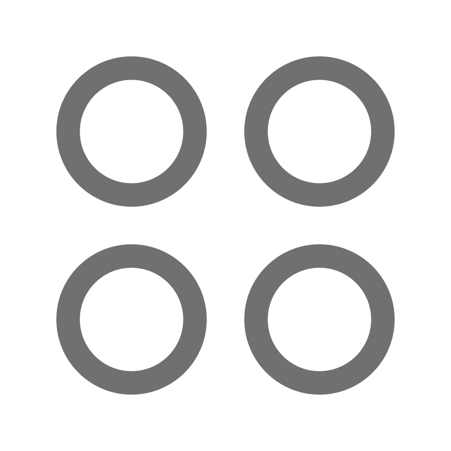
Costco primarily adopts a resemblance approach for icon design, ensuring icons depict the physical objects they represent. This fosters consistency, guessability, and future adaptability. For novel or less familiar concepts, an arbitrary approach may be employed.
Naming
Our icon naming guidelines are detailed in the Icon Naming Conventions guide.