
Tabs
A horizontally tabbed container for organizing content into grouped sections
 View in Storybook
 View Figma Specs
 View Source Code
Guidelines
When to Use
- Use tabs to organize related content into a single container when you need to save vertical space.
- Use tabs when content can be logically separated into distinct categories that users might want to switch between.
When Not to Use
- If comparing text content side-by-side, use a table instead.
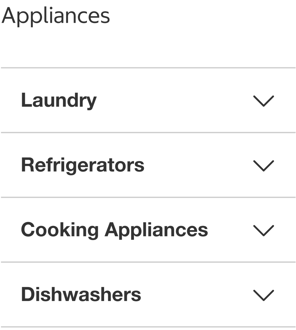
- If displaying and organizing content vertically without the need for grouping, use an accordion instead.
- Do not use tabs for navigation between different pages or sections of the app or website. Use navigation components (such as links, buttons, headers, footers, etc.) instead.
- Do not use tabs when all content should be visible simultaneously for comparison or reference.
- Do not use tabs to toggle between different views of the same content, use a segmented control instead.
- Do not use tabs to display sequential content.
- A tab should not open a new page or trigger an action.
Variants
Left-Aligned
- Tabs align to the left edge of the container.
- Tabs are spaced 16px apart regardless of container width.
States
Active
- The active state is used when the tab is currently selected and its content is being displayed.

Inactive
- The inactive state is used when the tab is not selected.

Hover
- The hover state appears while the pointer is over an inactive tab and indicates that it's interactive.

Usage
- Use a minimum of 2 tabs and a maximum of 5 tabs for optimal usability.
- Due to horizontal scrolling and label wrapping behavior, evenly-distributed tabs are recommended for 2-3 tabs with short labels, while left-aligned tabs are recommended for 4-5 tabs.
Tabs vs Single Page
Instead of tabs, consider using a single-page layout with subtitles to separate content when:
- Screen space is plentiful.
- Users are likely to read most or all of the content sequentially.
- Minimal navigation effort is preferred.
In contrast, tabs are ideal when content can be organized into distinct categories, allowing users to focus on one section at a time. This approach is especially effective when:
- Content in each tab is moderately long or complex.
- Users need clear pathways to different topics.
Scrolling through a single page may feel more natural when continuity and full visibility are important, whereas tabs introduce structure and reduce cognitive load by segmenting information.
Tabs vs Accordion
Use tabs when:
- Content falls into separate, non-comparable categories.
- Each section can extend beyond a single viewport without disorientation.
Use accordions when:
- Sections contain short chunks of content that users might want to compare or view simultaneously.
- Keeping all relevant info within the visible screen space is essential.
- Minimizing initial visual clutter is a priority.
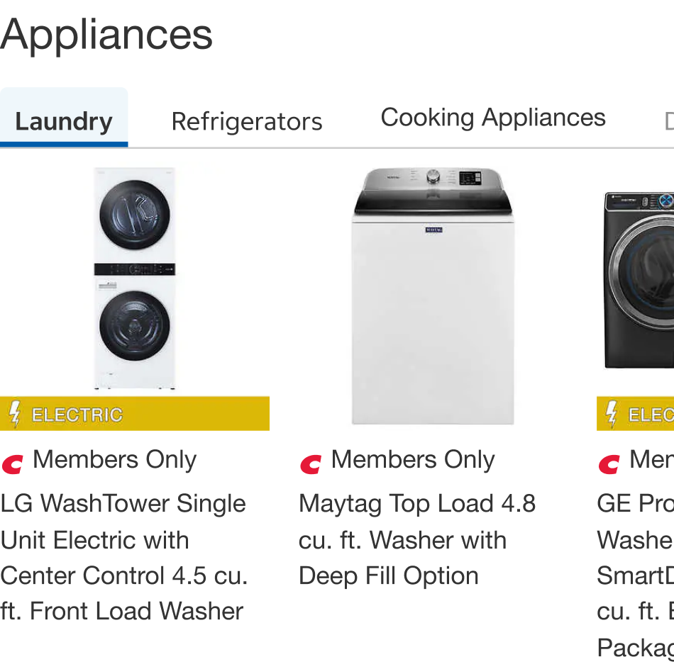
Do
Do Not
Content
Tab Order
- Place the most important or frequently accessed tab first.
- Keep tab order consistent across related views or screens.
Tab Labels
- Use title case for tab labels.
- Be descriptive and concise. Keep labels to 1-3 words to ensure readability and prevent wrapping on smaller screens.
- Avoid using action words in tab labels and instead focus on descriptive nouns that represent the content.
- Use of icons within a tab are optional. When used, icons should be positioned before the tab label.
Tab Content
- Avoid nesting a tab inside a tab.
- Tabs content may include a product slider with product tiles, product slider with category tiles, banners, and accordions
- It is recommended to maintain consistency by using only one content type across all tabs. For example, if using banners in the first tab, use banners in all other tabs.
Behavior
- The first tab should be active by default. Selecting a tab activates it and immediately displays its associated content while hiding other tab content.
- Only one tab can be active at any given time, creating a clear focus for users on the selected content.
- Left-aligned tabs can horizontally scroll.
Placement
- Tabs are positioned at the top of content sections.
- Ensure adequate spacing from surrounding page elements to prevent visual crowding and improve usability.
- Tabs align to the left edge of the container.
Structure
Key
- Section header
- Active tab
- Body content
- Inactive tab
- Tab label
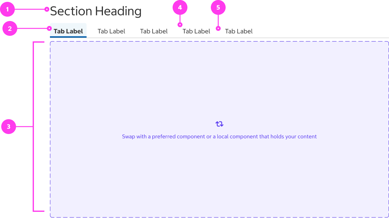
Sizing
- The tab panel adapts to the full container width without fixed dimensions.
- The content area maintains full container width at 100%, maximizing available space for content display.
- Tabs are a minimum height of 33px.
- Individual tabs scale based on their label text length while maintaining consistent internal padding.
- Labels are hugged within the tab, so tabs can vary in width.
- The label wraps if it exceeds 360px.
Spacing
- Tabs are horizontally spaced 16px.
Accessibility
Keyboard Accessibility
[AC1] When there are tabs on a page:
- Focus can be moved to the active tab in the tab panel by pressing TAB.
[AC2] When focus is on an tab:
- The focus indicator is clearly visible.
- Focus can be moved to the other tabs by pressing LEFT ARROW and RIGHT ARROW.
- If focus is on an inactive tab, pressing ENTER or SPACE selects the tab.
Screen Reader Output
[AC1] When a screen reader user TABS to an active tab:
- Name: The name of the tab group is announced. The name of the active tab should also be announced.
- Role: The roles of “tab control” and “tab” are announced
- State: The “selected” state should be announced for the active tab.
- The index should also be announced (i.e “# of #”).
Example Output: "Appliances tab control Laundry tab selected 1 of 5”
- Name: “Appliances”, “Laundry”
- Role: “Tab control”, “tab”
- State: “Selected”
[AC2] ****When a screen reader uses the ARROW KEYS to move focus to an inactive tab:
- Name: The name of the tab should be announced.
- Role: The role of “tab” is announced
- The index should also be announced (i.e “# of #”).
Example Output: "Cooking Appliances tab 3 of 5”
- Name: “Cooking Appliances”
- Role: “Tab”
[AC3] When a screen reader user presses DOWN ARROW to the body content:
- Name: The name of the active tab should be announced.
- Role: The role of “tab panel” should be announced.
Example Output: “Cooking Appliances tab panel”
- Name: “Cooking Appliances”
- Role: “Tab Panel”
Developer Notes
- Use semantic HTML:
- Each tab should be implemented as a <button>.
- Body content not currently on-screen should be hidden from screen reader and keyboard users.
- Focus should be managed for keyboard users:
- The active tab should have tabindex=”0”.
- Inactive tabs should have tabindex=”-1”.
- When a user navigates using the ARROW KEYS, the previously active tab should have tabindex=”-1”, the currently focused tab should have tabindex=”0”, and focus should be set to the corresponding inactive tab.
- Use ARIA to communicate tab semantics to screen readers:
- Role=”tablist” should be applied to the tablist container.
- An aria-label with a meaningful name or an aria-labelledby pointing to a corresponding heading should be applied to the tablist container.
- Each tab element should have the following:
- Role=”tab”
- Aria-selected=”true”/”false” - the value should update when a user selects a tab.
- Aria-controls={BodyContentID}, the body content ID should correspond to the ID of the parent container of respective body content for that specific tab.
- A unique ID attribute.
- Each body content panel should have the following:
- Role=”tabpanel”
- Aria-labelledby={TabID} - the tab ID should correspond to the ID of the corresponding tab.
- Tab labels and body content should properly scale when a user resizes their text.