
Carousel
A scrollable container that displays a series of items, such as images or tiles.
 View in Storybook
 View Figma Specs
 View Source Code
Guidelines
When to Use
- Use a carousel to display a collection of related, visual content (such as banners, product tiles, or images) in a space-efficient format.
- To let users browse through related content when discovery is supplemental and not critical to their primary goal.
When Not to Use
- Avoid using when users need to see all items at once. Carousels hide content by default, which makes comparison difficult. Instead, use a grid or list layout.
- For multi-item carousels in mobile app designs, use the Slider component, which provides better native touch support.
Variants
Single-item
Single-item carousels show one piece of content per page, such as banners and product images.
Multi-item
Multi-item carousels show multiple pieces of content per page, such as product carousels and category sets.
States
Carousel Pagination
- Inactive: The dot displays as an outlined circle.
- Active: The active page's dot has a filled background and appears larger than inactive dots.
- Hover: The dot's background color changes to show it is interactive.
Next and Previous Buttons
- The next and previous buttons use the icon button’s “contained” variant. Refer to [Icon Button] for states.
Play/Pause Button
- Play state: Displays a play icon when autoplay is paused.
- Pause state: Displays a pause icon when autoplay is active.
Usage
- Compose each page of the carousel using other components, like product tiles or banners. Carousels act as a surface for components.
- Show carousel pagination for all screen sizes on the web.
- Show next and previous buttons on larger screen sizes on the web.
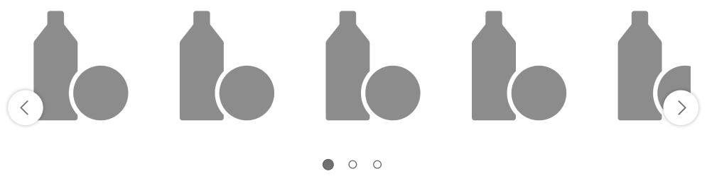
- Multi-item carousels benefit from a peek-a-boo, which shows users that additional content exists beyond the viewport.
- When using peek-a-boo, show enough of the adjacent pages to indicate scrollability without competing with current content.
Content
- Maintain consistent image proportions and UI elements across all pages.
Behavior
Navigation Controls
- Users can navigate using swiping gestures, next and previous buttons, or pagination dots.
- Touch gestures and next/previous buttons advance the carousel by one full page.
- Selecting a pagination dot advances the carousel to the page represented by the dot.
- Carousels use snapping transitions that automatically center pages..
- When only one page exists, all navigation controls are hidden and the carousel acts as a static container.
- Carousel pagination wraps to additional rows when horizontal space is limited.
Wrap-Around
- Wrap-around is disabled by default. When enabled, navigation loops from the last page to the first page.
- The previous button is hidden on the first page (when wrap-around is disabled).
- The next button is hidden on the last page (when wrap-around is disabled).
Peek-a-boo Display
- Peek-a-boo shows a partial view of adjacent pages at the carousel edges.
Autoplay
- Autoplay is disabled by default.
- When enabled, the carousel automatically advances one page every 8 seconds.
- The play/pause button appears only when autoplay is enabled.
Placement
Navigation Controls
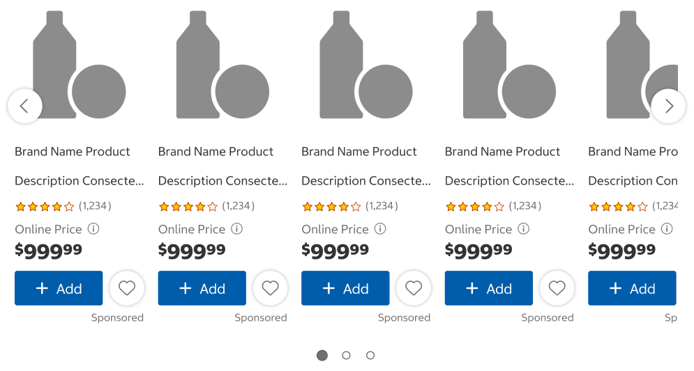
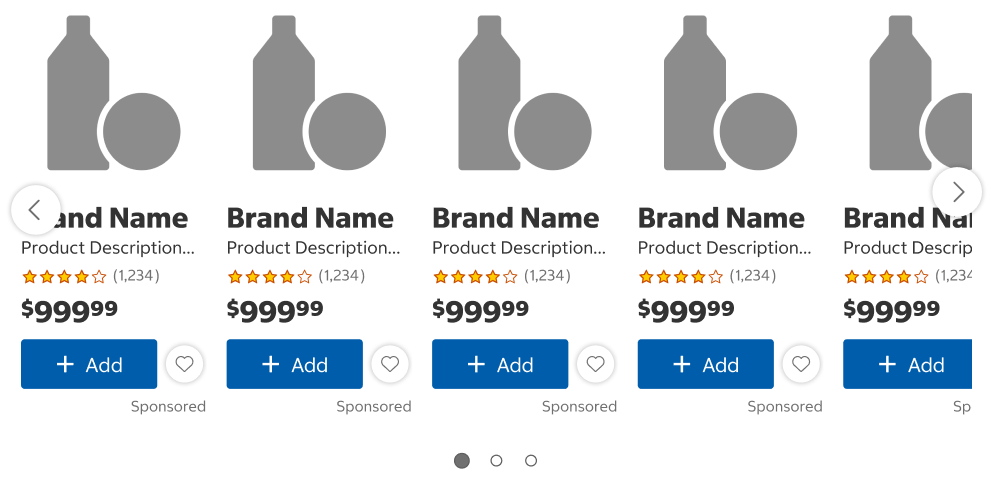
- Position the next and previous buttons so that they do not interfere with important content elements while maintaining readability.
- For example, vertically center buttons on product images in product carousels so that they do not interfere with product details. For banner carousels, top-align buttons with carousel pagination to avoid interfering with banner text.
Do
Don't
Structure
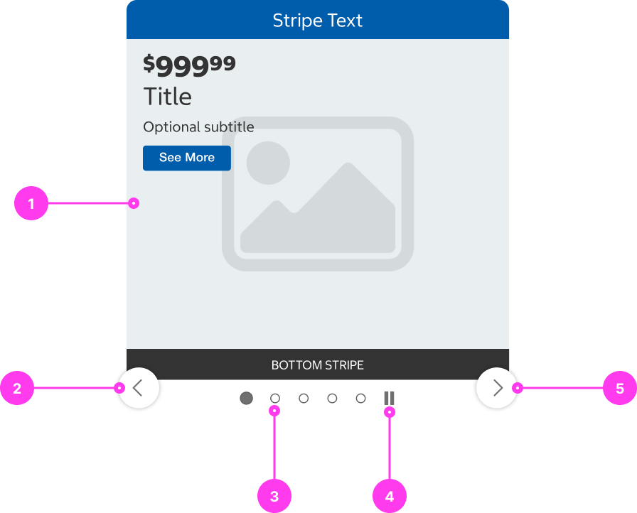
- Content container
- Previous button
- Carousel pagination
- Play/Pause button
- Next button
Accessibility
Keyboard Accessibility
[AC1] When a keyboard activates the next button, the previous button, or any buttons within the pagination indicator:
- For multi-item carousels, keyboard focus should move to the first item within the set of items in the carousel.
- For single-item carousels, keyboard focus should move to the single item in the content container.
[AC2] If auto-play is enabled for a carousel:
- The carousel should pause anytime a user hovers over the region with their mouse, OR when ANY carousel control has keyboard focus.
- Focus should not be moved when the carousel page advances.
Screen Reader Output
[AC1] When a screen reader user presses DOWN ARROW to the carousel container:
- Name: The name of the carousel is announced.
- Role: The role of “carousel” is announced.
Example Output: “ Recommended for You carousel”
- Name: “Recommended for You”
- Role: “carousel”
[AC2] When a screen reader user TABS to a next/previous button:
- Name: The name of the button is announced.
- Role: The role of “button” is announced.
Example Output: “Next promo, button”
- Name: “Next promo”
- Role: “button”
[AC3] When a screen reader user TABS to a button in the pagination indicator:
- Name: The name of the button is announced. The name of the button should indicate the type of content in the carousel (ex. promos, featured products, product categories etc.). Additionally, the page number and total number of pages should be announced.
- Role: The role of “button” is announced.
- State: If a page is in a selected state, then the state of “current” should be announced.
Example Output 1: “Promo 1 of 4, button”
- Name: “Promo 1 of 4”
- Role: “button”
Example Output 2: “ __Featured Products 3 of 5, button current”
- Name: “Featured Products 3 of 5”
- Role: “button”
- State: “current”
[AC4] When a screen reader user TABS to a pause button:
- Name: The name of the button, “Pause”, is announced.
- Role: The role of “button” is announced.
Example Output: “Pause, button”
- Name: “Pause”
- Role: “button”
[AC5] When a screen reader user triggers a pause button:
- The button toggles and turns into the play button.
- The screen reader announces “Play button”.
- Focus does not move.
Developer Notes:
- Use semantic HTML:
- Use <button> to create all next/previous buttons and page indicators.
- Add accessible labels to buttons by applying aria-labels.
- Apply role=”region” on the carousel content container to create a region for screen reader users.
- If there is an existing heading or other on-screen text content labelling the carousel, utilize aria-labelledby to associate the visible carousel title with the carousel region.
- Otherwise, if there’s no visible text to label the carousel, apply a relevant aria-label to the container.
- To indicate that the component is a carousel, apply “aria-roledescription=”carousel” to the carousel container.
- Apply aria-current=”true” when a page indicator button is in a selected state.
- Hide elements in the carousel that are off-screen or partially off-screen.
- To hide elements from screen readers, use aria-hidden=”true”.
- To hide elements from keyboard users, use tabindex=”-1”.