
Back to Top
The Back to Top component allows users to quickly return to the top of long pages.
 View in Storybook
 View Figma Specs
 View Source Code
Guidelines
When to Use
- Use when pages exceed two viewport heights on large/medium breakpoints or four viewport heights on the small breakpoint.
When Not to Use
- Do not use on pages shorter than two viewport heights on large/medium breakpoints or four viewport heights on the small breakpoint.
States
- Default: The Back to Top Link before it is selected.
- Hover: Visual feedback when a pointing device hovers over it.
Behavior
- The link appears when the user scrolls past the first viewport length.
- The link stays fixed in the lower right corner as the user scrolls through content.
- The link automatically hides when the user returns to the top of the page.
- The link's visibility can be controlled by custom scroll-based events, such as hiding when specific page elements enter the viewport.
- The link remains visible whether the user scrolls up or down.
- When clicked, the link triggers a smooth scroll animation to the top of the page.
Placement
- The link is fixed 72px from the bottom of the viewport and aligned to the right edge.
- The link maintains 24px clearance above other sticky components, such as the Popup component [include link] or the Sticky Bar.
- The link appears behind Dialog components (Modals and Drawers).
Structure
- Link
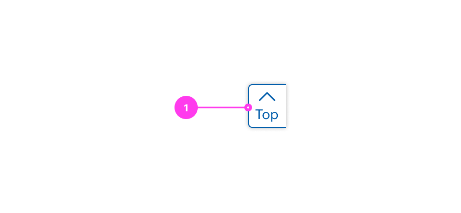
Sizing
- The component has fixed width and height.
Accessibility
Keyboard Accessibility
[AC1] When there is a Back to Top link on the page:
- Focus can be moved to the link using TAB.
[AC2] When Back to Top is in focus:
- The focus indicator is clearly visible.
- Pressing ENTER activates the link and moves focus to an element (preferably a heading) at the top of the page.
Screen Reader Output
[AC1] When a screen reader user TABS to a Back to Top link:
- Name: The name of the link, “Back to Top” is announced.
- Role: The role of “link” is announced.
Example Output: “Back to Top link”
- Name: “Back to Top”
- Role: “link”
Developer Notes
- Use semantic HTML:
- Using an in-page anchor link ensures that both the viewport and focus moves properly to an element at the top of the page. Anchor links then can be styled with CSS to resemble a button. Example: <a href=”#top”>Back to Top</a>
- For hiding the icons from assistive technology, use either an empty alt attribute for <img> elements or aria-hidden="true" for most other element types.
- Keyboard users should be able to navigate to the Back to Top link when they reach the end of the main content. Thus, the link should be at the very end of the main container, right before the footer in the DOM.