
Accordion
A group of vertically stacked sections that expand to display additional information.
 View in Storybook
 View Figma Specs
 View Source Code
Guidelines
When to Use
- Use accordions to condense long information, or when it’s not critical for users to see all of the content upfront.
- Use when it’s likely users will only need to expand a few sections to find what they need.
- Use when there is a limited amount of vertical space to reduce scrolling (especially on a mobile interface).
- Accordions are commonly used for filters, side panels, frequently asked questions, mobile menus, and settings.
When Not to Use
- Do not use accordions if the priority is to have users read the content in full or if you need to display complex information. See the Usage section for more information.
- Avoid using accordions if the page needs to be printed.
States
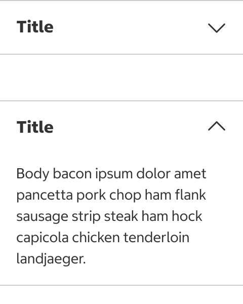
Collapsed
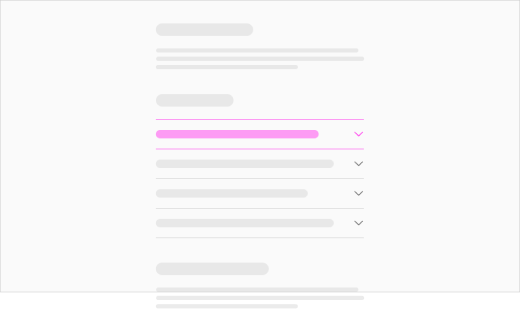
- The content panel is hidden in the collapsed state.
Expanded
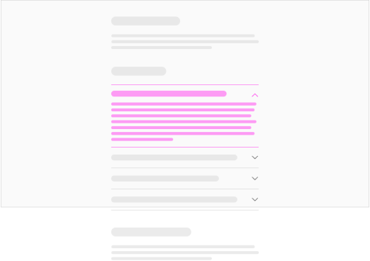
- An expanded accordion item reveals additional information in the content panel.
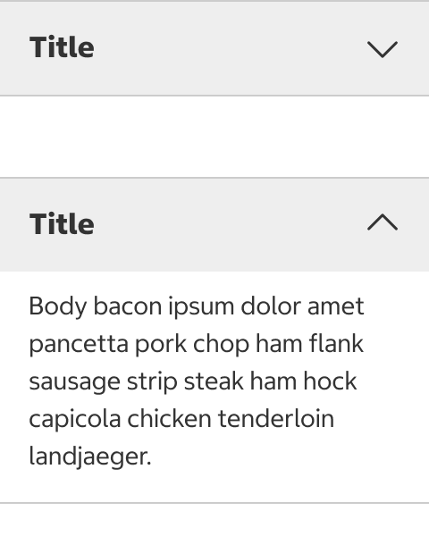
Hover
- The hover state appears when the cursor is placed anywhere over the accordion header indicating the entire header is selectable. The accordion header is highlighted in gray on hover.
Default
Hover
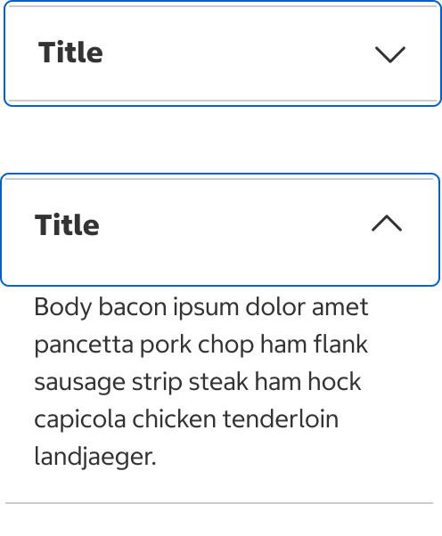
Web Focus Ring / Highlight
Usage
Accordion vs. Single Page
-
Consider using a single page for content, using subtitles to separate content as needed, if space is not limited and users are most likely to read most or all of the content.
-
Remember that an extra step is required to see the content in an accordion, and scrolling is easier than clicking or tapping.
Accordion vs. Tabs
-
Use accordions when the information needs to be compared or accessed simultaneously. To prevent users from being disoriented, accordion content should fit in the viewport. See the Content section for more information.
-
Use tabs to organize content into categories. Content in a tab can span multiple viewports and include more complex information.
To display only one section that expands and collapses, consider using a text button instead of an accordion.
Content
Order and Structure
- List the accordion sections by priority or importance.
- Always include a title, chevron icon, and subsequent content for each section.
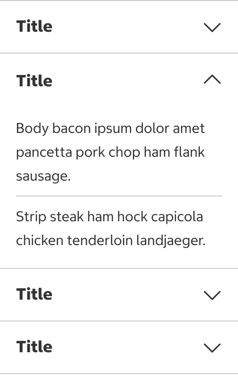
- Avoid using additional dividers within a section.
Do Not
Icon
- An icon may be used with a text label for additional emphasis. The icon must have a strong association with the label text.
- Icons should be used for all or none of the titles.
No icon

Has icon

Title
- Be concise and scannable. If a long title is necessary, the title should wrap to the next line at small viewports.
- When the title is a statement or complete sentence, use sentence case with end punctuation.
- When the title is an incomplete sentence, use title case without end punctuation.
- Make sure to use a consistent visual style for titles.
- Do not link a title to another page.


Content Panel
- The content slot can be replaced with any type of subcomponent.
- Do not include important information or required forms in the content panel as it can be easily missed.
- An accordion can include content that doesn’t apply to most users and reduce clutter in design.
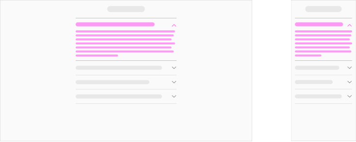
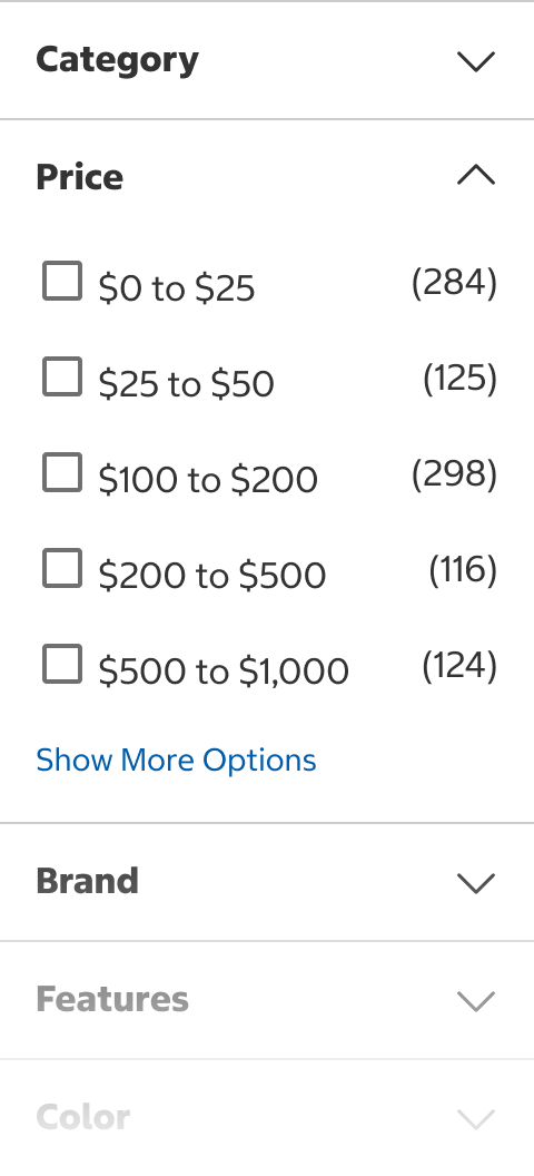
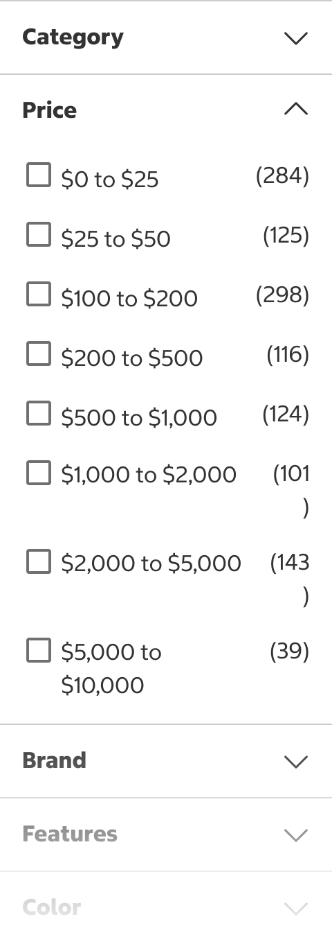
- Make sure that an expanded section fits in the viewport.
Do
Do Not

- When the content is too long, consider using a text button to show and hide the excessive content.
Text Button with Hidden Content
All Content Visible
Nested Accordions
- Do not nest accordions.
Behavior
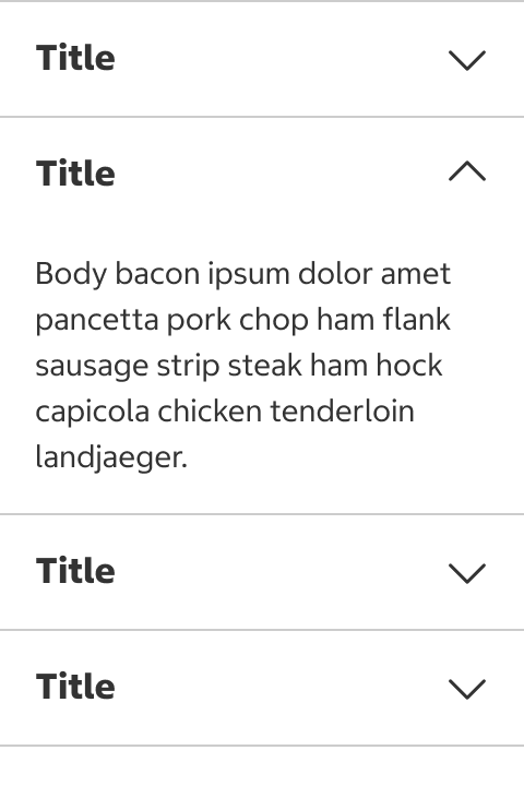
Default View
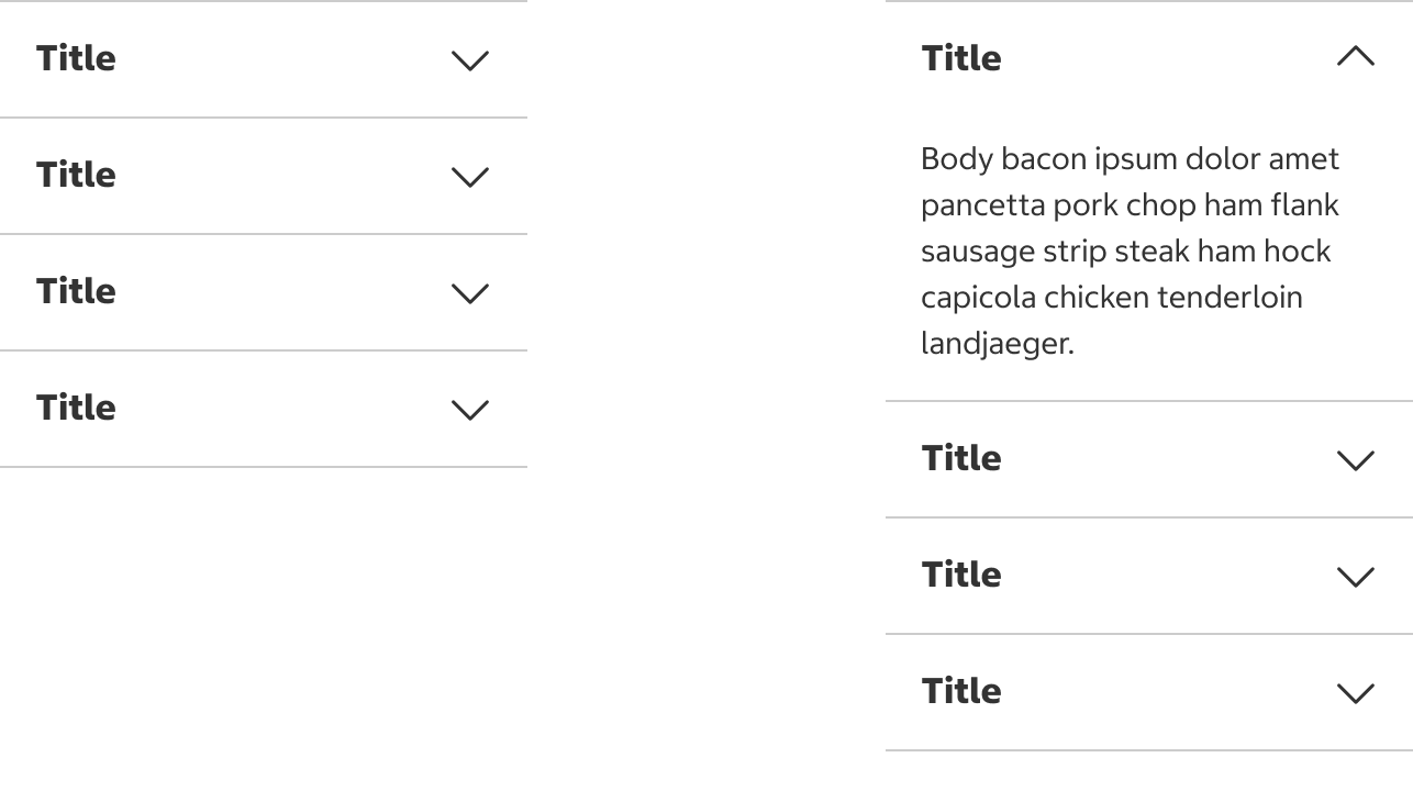
- The default view of an accordion can show a certain section expanded depending on the use case. In this case, expanding the first section is recommended.
Do
Don't
Expand and Collapse
- Accordion sections expand or collapse when selected. The entire accordion header should be selectable.
Selectable Area in Collapsed State

Selectable Area in Expanded State
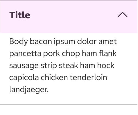
- A Chevron Down icon is displayed when collapsed, and a Chevron Up icon is displayed when expanded.
- When expanded, accordions push the page content down. The page should not scroll as the accordion expands.
Collapsed
Expanded
Expanded
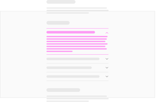
- Accordions have two types of behavior available. Choose a behavior depending on the goal of your design.
- In most cases, multiple accordion sections should expand and collapse independently when selected by the user. Sections that are expanded or collapsed should remain in the same state until the user triggers a change. This behavior is recommended when the contents need to be compared or assessed simultaneously.
- You can choose to show only one expanded section at a time if the contents are text-heavy and don’t need to be compared. Accordion sections automatically collapse when another is expanded.
Placement
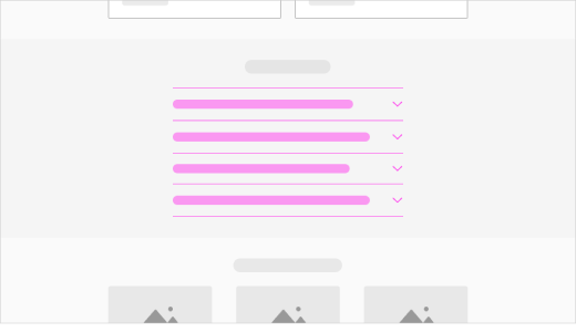
- Main content area
- Side panels
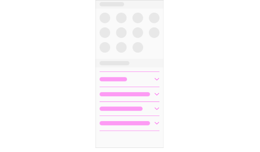
- Mobile menus and settings
Main Content Area
Side Panels

Mobile Menus and Settings
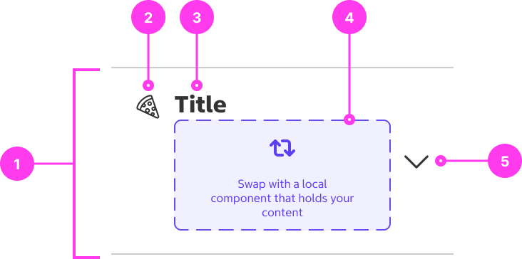
Structure
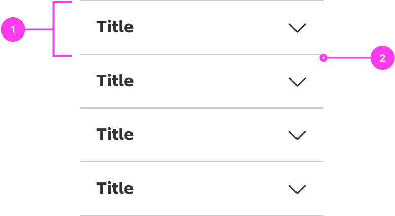
Accordion
- Accordion item
- Divider
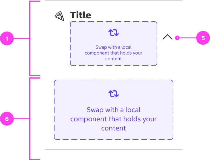
Accordion Item
- Header
- Icon (optional)
- Title
- Secondary title (optional): “Slot” that accepts a subcomponent of any type.
- Expand/collapse control
- Content panel: “Slot” that accepts a subcomponent of any type.
Sizing
- Do not use excessively wide accordions. Learn more about line length for optimal readability.
Accessibility
Keyboard Accessibility
[AC1] When there is an accordion on the page:
- Focus can be moved to the accordion using TAB.
[AC2] When the accordion is in focus:
- The focus indicator is clearly visible.
- Pressing SPACE or ENTER toggles the expand/collapse of the accordion.
Screen Reader Output
[AC1] When a screen reader user TABS to an accordion:
- Name: The name of the accordion is announced.
- Role: The role of “button” is announced.
- State: The current state (“expanded” or “collapsed”) is announced.
Example Output: “Frequently Asked Questions button collapsed”
- Name: “Frequently Asked Questions”
- Role: “button”
- State: “collapsed”
[AC2] When a button is triggered using SPACE or ENTER:
- State: The correct change in state (“expanded” or “collapsed”) is announced.
Developer Notes
-
Use <button> for triggering the expand/collapse.
-
Use aria-expanded=”true/false” to express the change in state.
-
Ensure that hidden content is not browsable by screen readers when accordion is collapsed.
-
Ensure that hidden content is not browsable by screen readers when accordion is collapsed.